About me
Bookshop

Get new posts by email.

About me

Moaning about NHS Mail’s terrible user interface

There’s a certain air of truculence on this blog at the moment. Yesterday, I took NatWest to task (again) over their awful customer charter, and only last Thursday, I slated Who Wants to be a Millionaire HD. And now, I’m about to moan again. Sorry about that – I know it’s spring, and perhaps my disposition should be sunnier, but there seems to be a queue of things I have to get off my chest at the moment.

Today, I want to moan about NHS Mail. This may seem utterly irrelevant to those outside of the NHS, and, in fact, to the majority within the NHS who choose not to have an account, but actually I hope it gives a reasonable insight into how not to design a user interface.

The user interface of NHS Mail is bloody awful. Really, really terrible. It’s designed by Microsoft, which perhaps goes some way to explaining that, but even for them, it’s bad. Let me give you a tour.

Firstly, the homepage, conveniently located at nhs.net. This looks utterly different depending on whether you are accessing it from an N3 connection, or a plain old internet connection. Neither of the homepages is particularly pretty, but the inconsistency bothers me in particular.


This is a bad thing for a whole plethora of reasons, but primarily because a lack of consistent branding surely presents a security risk. Anyone could knock up a log-in page in a couple of minutes, and a lack of branding would not make it appear untrustworthy.

Now, let’s look at that ex-net login page more closely. The password must be entered in two parts – the first three characters must be entered using the on-screen keyboard, presumably as some sort of protection against keystroke logging software. Yet this isn’t explained anywhere on screen, and it clearly reduces the accessibility of the site for those with disabilities. And the username and password boxes don’t even line up, which is just irritating.

You’re also asked to select whether the computer is private or public – but no explanation is given of the impact of this choice. It took me some considerable time to discover that the impact was actually that selecting ‘public’ prevents download of email attachments. This is hardly common behaviour for email systems – perhaps a little explanation might have been useful.

Assuming you manage to log in, you’re presented with this page.

Now consider some common – perhaps predictable – workflows.

Let’s imagine that  I want to send a new fax message. Where do I click? Logically, I would choose to click “New Message”. That sounds sensible. But it’s also very wrong. Perhaps the envelope in the blue bar at the top? No, that just reloads the current page.

In fact, the correct place to click is the “Spanner and Screwdriver” icon at the top – tool-tipped as “User Tools”, which brings up the following page.

From here, you jump to the icon at the bottom-left of the page labelled “SMS and Fax”, followed by a button on the top-left of the resulting page labelled “Create Fax”.

In precisely whose world is that a logical series of clicks?

Another example. We’re back at the inbox, as pictured above. I want to change my password. Simple – I click “Options” in the top-right. Wrong. On some pages, there’s a “Preferences” button appears the top-right, above “Options”. Is it there? No. Sharper readers will already have noticed from the above screenshot that it is, in fact, in “User Tools” again. Bizarre.

Something I frequently forget is the IMAP settings for NHS Mail. So where would one hope to locate those? Perhaps you’d consider clicking the “?” help icon? You’d be wrong. “User Tools”? Yes.

Perhaps you’d then be tempted to click on “Configure Microsoft Outlook”. That would be wrong. Perhaps you’d click “Help”. That would also be wrong. You must click “Guidance”, down on the bottom right, followed by “Training and Guidance” – not any of the other options, which include “User Guide”.

Again, something which should be really easy to locate is hidden away.

Frankly, the organsiation of the UI of NHS Mail is not fit for purpose. It’s virtually unusable, and I suspect that goes a long way to explaining why so few NHS people have NHS Mail accounts. And yet, I understand that Connecting for Health pays Microsoft £1.90 per user per month – that’s over £12m per year – for the service.

You’d think that, for that money, there would be at least some usability testing, yet it’s hard to see that assumption evidenced by results.

This post was filed under: Health, Reviews, Technology, , , , , .

NatWest’s awful charter: Revisited

A little while ago, before I did all that App reviewing nonsense, I blogged about Natwest’s utterly unambitious Customer Charter.

You’ll probably have seen on TV ads and billboards nationwide that they’ve just published their first independent review of progress – it’s online here, and it’s well worth a read and a chuckle.

Let me share with you some of the highlights.

You’ll remember that one of the commitments I derided the most was “We will aim to serve the majority of our customers within five minutes in our branches.” They have two pages dedicated to this commitment in their follow-up report. The first is congratulatory, with big ticks heralding the arrival of more cash machines and a queue management system. Neither of those is the crucial outcome measure, though. That comes on the next page, with this pearl of wisdom:

We know … that there are times and places where customers have waited longer and we have much more to work on … We are testing a new tool to measure queues.

Their solution to improve waiting times is… to change the way waiting times are measured. Because, dear customer, this represents “Helpful Banking”. Presumably, you’ll stand in the queue for exactly the same length of time, but their report will look better. Fantastic.

Another promise was that they’d only piss off 10% of their customers: “9 out of 10 customers will rate us friendly and helpful.” How did they do?

8 out of 10 customers rated us friendly and helpful during 2010.

They failed. But, not to worry, they still include this congraulatory customer quote:

A 9 out of 10 customer satisfaction rate … does help to reassure me that they are serious about their commitment.

Not only would pissing off 10% of customers not go a long way to reassuring me that NatWest is serious about “Helpful Banking”, the fact is that they didn’t achieve it. So it doesn’t reassure anyone about anything!

Some quick-fire ones now.

Promise: “75% of our customers to be satisfied with the way their complaint has been handled.”

57% of our customers were satisfied with the way their complaint was handled.

Promise: “[We will provide] more than 22,000 days each year to community volunteering”

During 2010, [we] gave 7,547 days of volunteering to their local communities.

Promise: “We will answer 90% of calls in less than a minute.”

We answered 91.4% of calls made to our telephone banking centres in less than 3 a minute.

Hmm, that last one looks good. It looks like they’re meeting their target. And, in fact, they are.

I’ve included it because of the ludicrous way they define the target, which is curiously hidden from the main report.

Their published result makes it look like I can phone up, and my call will be answered by a real person within a minute. That’s actually not true, because there’s often an automated machine answer first. They have then gone on to exclude from the sample anyone who fails to get through the automated machine’s ‘screening’ of calls. If you can’t find out how to speak to an actual person, you’re excluded from the figures. If the machine won’t let you speak to a real person – perhaps because “lines are busy, please try later” – you’re excluded from the figures. Extraordinary.

I can only repeat my advice from last time: Switch.

Swtich to Smile. Switch to First Direct. Switch to The Co-op.

Switch to anyone who actually gives a damn about customer service, instead of waiting for change for a bank which clearly doesn’t know how to prioritise customer service, and whose solution to poor customer service appears to commit to more poor customer service.

Don’t put up with it. Switching is quick and painless. The more you put up bad service, the more these corporate idiots think its acceptable, and the more it propagates.

Please, for the good of us all: Switch!

This post was filed under: Miscellaneous, , , , , , .

iPad App Review: Flipboard

20110329-111000.jpg 
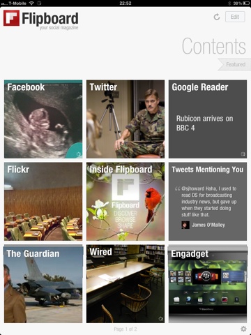
Of all the apps I have installed on my iPad, Flipboard is probably the one that has had the greatest impact on my digital life.

Prior to getting my iPad, I used to view my Facebook and Google Reader feeds via Socialite on my MacBook, and Twitter via the Twitter App for Mac of iPhone, depending on where I was.

Flipboard has now taken over from all the above.

It sucks in all of the above feeds, and produces a personalised ‘social magazine’ that just looks great on the iPad. Twitter links are sucked in, so that the linked webpage is transformed into a magazine article, while non-linking Tweets just appear. TwitPics appear as pictures in my magazine. It really is quite incredible, and very fast – probably quicker to refresh than the Twitter app on my iPhone.

But, importantly, it doesn’t just look good – it is brilliantly functional.

20110329-111113.jpgFlipboard allows me to cross post anything anywhere, so I can share that interesting Tweet on Facebook or post that interesting article from Google Reader to Twitter with just a tap. You can also elect to ‘ignore’ people, without having to ‘unfriend’ or ‘unfollow’ them, which comes in handy.

Flipboard is now the primary way I interact with all of the above feeds. It’s brilliant.

Brilliant, but not perfect. I’d like to see threading of conversations on Twitter. I’d like to see whether Facebook statuses had comments without having to tap on them. I’d like Flipboard to see which Twitter and Facebook updates I’ve read and hide them, like it does with Google Reader (unless they have new comments). I’d really like Flipboard to learn what I like, and push those things to the front of the magazine rather than absolutely sticking to the timeline.

But still, Flipboard is great – in fact, I think it’s my favourite iPad app to date. I’m confident it will retain its place in my Dock for some time to come!


This is the fifth and final in a series of posts reviewing iPad Apps. Yesterday’s review was of Who Wants to be a Millionaire HD. If you enjoyed the series, let me know in the comments or on Twitter (@sjhoward), and maybe I’ll do something similar again sometime.

But that’s it for now… Stay tuned for more posts on different topics coming soon(er or later).

This post was filed under: iPad App Reviews, Reviews, Technology, , , , , , , .

iPad App Review: WWTBA Millionaire HD

I’ve chosen to write about this App not because it’s good, but because it’s not.

That isn’t out of some kind of sadistic wish to be mean, but because I want to demonstrate how it’s hard to get an iPad App just right. But first, a little background.

When Millionaire first burst onto our screens in 1998, I was hooked. The very idea of giving away a million pounds seemed incredible to my teenage brain, and I couldn’t get enough of it.

Soon, the magic faded. I still watched, but mainly with the sound down unless someone got to the £32,000 “safe haven”. And, gradually, my interest waned still further, not bolstered by any revamps, clocks, or anything else that was thrown at it.

But one thing continued to preoccupy my mind – I badly wanted to play the game myself. I used to “play” the game with the quiz books and the CD soundtrack, but I desperately wanted a PC version of the game. Somehow, despite taking some time for the format to cross the Atlantic, they got their PC version out more quickly, and I was insanely jealous.

When eventually Celador got round to cashing in on the format, the resulting PC game seemed incredible to me. And when Version 2 turned up, and Chris Tarrant asked me the questions personally (after the first five), I loved it.

I also loved various Playstation versions of the game, and several phone versions – including the two I have on my iPhone at the moment. I even joined Virgin Mobile at one point because they had an SMS version of the game.

So I’m a bit of a Millionaire format fan, even if I don’t particularly watch the TV show anymore.

Naturally, when I got my iPad, I got the “Millionaire HD” app, which, like it’s iPhone cousin, bizarrely titles itself “2011” below the icon. And what did I get for my money? Essentially, a blown up version of the iPhone title. There really is no discernible difference between the two.

Now, by pure logic alone, that should be a good thing. I really like the latest iPhone version, and find it one of the most addictive editions I’ve ever owned. But it’s not an iPad App.

A screen the size of the iPad’s does not lend itself to blown-up display of a screen the size of the iPhone’s. It doesn’t work. It feels like a jumbo toy. And the great aspect of the iPhone App, which I’d guess you could call it’s “passiveness” in a loose sense, doesn’t work on the iPad. On the iPad, I want an immersive experience, not a passive one.

Now that’s really difficult to pin down. The difference isn’t obvious or clear-cut. Is it CGI video that’s missing, or would that just be deeply irritating? Is it the relatively poor use of music doing that’s stopping this being immersive? Is it the “clock” rushing me towards an answer? Well, no, it’s not the clock, because you can turn that off and it doesn’t improve things.

All the important things are there. The questions seem of the right level, the lifelines offer just the right degree ofdoubt, and even the graphics are slick if oversized.

But there’s an unknowable “something” that turns the iPad edition, in my eyes at least, from a “hit” to a “miss”. I just can’t bring myself to recommend it.


This is the fourth in a series of posts reviewing iPad Apps. Yesterday’s review was of the Sky News App. Check back tomorrow for my review of Flipboard.

This post was filed under: iPad App Reviews, Reviews, Technology, , , , .

iPad App Review: Sky News

I am a Sky News viewer. That’s my guilty confession. I don’t so much sit and watch it as have it on in the background when I’m at home. It’s essentially moving wallpaper for my living room, often ‘watched’ without sound.

I choose Sky News because it’s the least distracting of the news channels. That used to be true of BBC News 24, but there’s something about the presentational style now that distracts me. I don’t know what it is, or whether that’s a good thing for attracting viewers who actually want to watch, but it’s turned me off.

I also like the fact that they respond and change scripts when I send them moany emails pointing out the factual errors in their medical reportage, whereas the BBC generally ignore me.

20110329-083626.jpg So, as a Sky News viewer, the iPad App has been marketed very heavily at me. Frankly, I’m fed up of seeing the adverts.

The app is fairly new, and has received a lot of praise from all over the place: Tech Radar basically loved it, Zath thought it was one of the iPad’s best apps, and Crowded Brain gave it 9/10.

The app is often praised for its innovative presentational style and ‘immersive’ experience. It has two main gateways, both of which are video focussed. There is a traditional ‘order of importance’ approach, where videos and headlines from stories are dynamically (read: messily) arranged with size and position indicating importance. Hit a video and it starts to play, while contextual information flies in from the sides. The contextual information is generally more video content on the same story, textual content, or interactive graphics.

Alternatively, the ‘timeline’ view gives me a virtually minute-by-minute index of what has been presented on Sky News over the last 24 hours, and allows me to jump to any bit of it, with the contextual fly-ins as above.

20110329-083751.jpg Conclusion: I hate it.

I really do very strongly dislike this app. I just don’t think I’m a person who enjoys consuming news through video. I might have Sky News on all the time, but I guess I don’t really watch it. Save for some recent very big stories, few newsworthy items lend themselves to videos – moving pictures rarely add all that much to understanding. I’d far rather scan-read a written article than spend three times the time being spoon-fed a simplified version of the issue via video.

I didn’t realise how strongly I felt about this until this app came along. I rarely click the videos in online news articles, but they don’t bother me – I just ignore them. But when you go down this Sky News route of removing almost everything but the video it becomes painfully clear that this isn’t the way I like to consume my news.

I’ll concede that the app is visually striking – though I wouldn’t necessarily call it attractive. I’ll concede that it’s innovative – I’ve never seen anything quite like it before. But I’ll conclude that it’s not for me – when it moves to a subscription model, I won’t be paying.


This is the third in a series of posts reviewing iPad Apps. Yesterday’s review was of the iWork Apps. Check back tomorrow for my review of Who Wants to be a Millionaire HD. Yes, really.

This post was filed under: iPad App Reviews, Media, Reviews, Technology, , , .

iPad App Review: iWork Apps

I’ve been a Mac convert for about a year now. When I made the leap, I bought both iWork and Office 2008. That may sound extravagant, but the former NHS licence for Office meant that I got a copy for a nominal fee of £5 or so, and the Apple NHS discount when I bought my MacBook meant that iWork was very cheap too.

20110403-082044.jpgHaving made the leap to Mac, I initially tried using iWork, but when I found that Import and Export of Office formats was less than perfect, I moved back to Office.

Many people hate Office 2008, but I’m firmly in the ‘love it’ camp. The transition from PC Office to Mac Office took a few feet-finding days, but the workflow was just dramatically better. On the occasions where I made the leap back to a PC, it felt like making a major leap back in time to a really old version of Office.

In the last couple of months, I’d begun to read more and more about the wonder of iWork, and more specifically, Pages. It too seems to divide people into lovers and haters. Having read so much about it, I decided to give it s go on a couple of pieces of work I had to do. At first, the learning curve was steep, but after no more than a couple of hours, I was flying.

I’ve previously commented on OSX’s brilliant ability to just butt out of the way and let me get on with what I want to do, and now I’ve discovered that the same is true of Pages. It takes care of the document, I take care of the content. This is particularly true now I have all my own templates set up. It’s great.

20110403-082510.jpgKeynote is similarly fantastic, and if I’m doing a presentation from my own laptop, it is always first choice. Unfortunately, it doesn’t degrade to PowerPoint format brilliantly – all transitions are lost for one thing. So I find myself using PowerPoint more often than I’d like.

Numbers is a program I never understood. It looked horribly confusing, and I just never bothered to make that leap.

Then my iPad came along. Page and Keynote went straight on board, and I loved them. I specifically loved the integration with iDisk, which I hadn’t read about in advance. I keep most of my documents on iDisk, and this meant that I could view and edit them on the go.

The software is genuinely powerful, and I was really very surprised by how good it was. It does have irritating niggles, though. Pages on the iPad can’t support footnotes, for example. That would be kind of acceptable if it handled the limitation with grace, but it doesn’t. Almost all of my work documents contain either footnotes or endnotes. If I copy a document containing these from my iDisk, when I open the iPad copy, it strips them all out. If I then edit the document on the go and re-upload to iDisk, there are no footnotes. This effectively means that I can’t edit most of my work documents on the go. Fail.

20110403-082053.jpgKeynote is great for writing and giving presentations on the go, or pulling them from my iDisk and giving them. I thought it would be the iWork App I used the most, but actually, I haven’t really got to grips with it yet, so can’t really give it a fulminent fair review.

Having liked Pages and Keynote on the iPad (despite their limitations), I thought I’d give Numbers a go. I had some data collection to do, and thought doing it on a uber-portable iPad would make life easier. And boy, it did.

The iPad’s form factor was perfect for data collection, and the fact that I could upload the data to my iDisk and thereby access and process it easily in Numbers on the Mac actually converted me to Numbers on the Mac. And, like Pages, now that I know my way around, it is my first choice piece of spreadsheet software. And not all of my spreadsheets are as interminably dull as the one pictured with this post – it’s just the only one that didn’t seem “sensitive”.

Again, the iPad version has it’s foibles – it can’t cope with Headers and Footers, which is just bizarre, and strips them out like Pages strips out footnotes.

But, especially for Numbers, the advantages outweigh the disadvantages many times over.

I’m now firmly in the ‘love it’ camp for iWork on the Mac (though for work purposes, Office is essential too), and I really like iWork on the iPad. There are bizarre bits around the edges that limit the usefulness of the software, undoubtedly, but it still is very usable for a lot of tasks.

I’d recommend it.


This is the second in a series of posts reviewing iPad Apps. Yesterday’s review was of The Times App. Check back tomorrow for my review of the Sky News App.

This post was filed under: iPad App Reviews, Reviews, Technology, , , , , , , .

iPad App Review: The Times

I used to be a regular newspaper reader, and had The Guardian delivered daily for some years. But, in 2007 I moved to my current house and couldn’t find a newsagent who delivered. Being a lazy git, I can’t be bothered to take the hundred or so steps from my front door to the nearest shop to buy a paper, and so my readership lapsed.

Instead, I turned to getting my news online more and more. Especially via the Guardian website, where I could keep up with the writing of my favourite Guardian columnists right up until most of them left the paper, when my interest waned a bit.

Someone once said that from the outside, The Guardian looks like an exclusive club, and hence it struggles to build it’s readership. I think there’s some truth in that. I don’t feel the same connection to The Guardian that I once did. Nancy Banks-Smith’s TV reviews, Guy Browning’s columns, Anna Pickard’s columns, Gareth McLean’s thiny-veiled gossip columns, Emily Bell’s MediaGuardian leaders: These (and others) were the skeleton on which I hung my consumption of The Guardian, and once they evaporated there was nothing left but a mass of unstructured news I could get anywhere else. Heck, it’s not been the same since they axed Ros Taylor’s Wrap, and that wasn’t even a newspaper feature.

I guess what I’m trying to describe is my descent from Guardianista to media tart, moving from news outlet to news outlet depending on the news stories that were being hawked at any given time. And that’s pretty much where I am now. Google Reader gives me selected news from across the web, Twitter fills in the gaps, and I’m out of the habit of reading a single organ’s daily summary.

But then my iPad came along, and the opportunity arose to download The Times on a daily basis. And it is The Times – not some sliced and diced hint of the news, but an actual full-fat version of The Times formatted for the iPad, even including the crosswords and sudoku. And it is great.

One of the most important things about it is its release time. The Times has been available to download every day when I’ve woken up. I believe it’s released around 4am, but I’ve never bothered to wake myself up to check. Essentially, being there for the time I eat my cornflakes is what this app requires – and actually beats the paperboy who used to deliver.

20110329-080501.jpg 
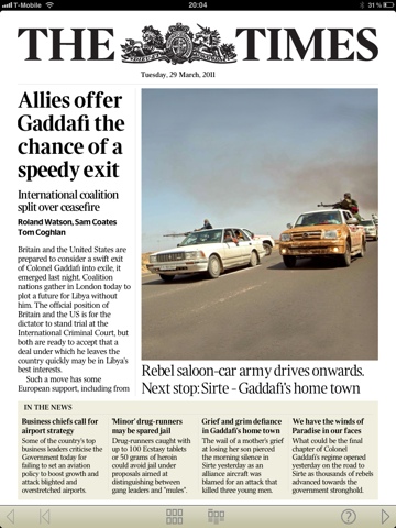
I didn’t used to like The Times’s journalism much. I used to read it quite a lot when it was a broadsheet, but when it switched to tabloid it seemed to simultaneously switch to picture-led storytelling, which is a danger of the format. It gained ‘silly’ page three features, true tabloid style, and lost a lot of the genuinely interesting Times 2 human interest stuff. I don’t know if / when any of that changed in the print version, but it certainly doesn’t seem to be the case so much in the iPad edition, which feels much more like The Times of old.

In iPad terms, the experience is great. Landscape viewing tends to work best for me, with my iPad propped up in its case. News articles cross pages, swiping from right to left, whilst more in depth features tend to have the header on the right-left swipe, with a downwards pagination for the rest of the article. Pictures are often linked to videos or slideshows, accessed with a tap. And a ‘contents’ pop-up bar allows jumping quickly to any part of the paper (or a quick review of the headlines). Like most descriptions of user-interfaces, that makes it sound awfully complicated. It’s really quite intuitive.

The nature of the beast is that copy tends to lag behind current events, but articles are sometimes updated over the course of the day, and on heavy-news days, an additional 5pm edition is published. Brilliant.

20110329-080754.jpg Another benefit is the price… An online subscription, which includes access to the pay-walled website and the Sunday Times app costs £2 per week – bizarrely cheaper than the £9.99 subscription to the Times App alone.

But it’s not all good news. Because The Times is paywalled, there’s no social features. No ‘share this’, no ‘this is what others liked’, no ‘leave a comment’. It’s one-way communication, and feels a little out of step with modern life.

There’s also no search, which is a little bit of an odd omission, and there are ads – I’d estimate about five full pages per edition – though they’re easy enough to flick past and ignore.

Overall, I think the iPad experience of The Times is great, and I plan to stay subscribed. Whether that will change when The Guardian’s app is released later this month remains to be seen, but it will take something very impressive to blow The Times out of the water.


This is the first in a series of posts reviewing iPad Apps. Check back tomorrow for my review of the iWork Apps.

This post was filed under: iPad App Reviews, Reviews, Technology, , , , , , , , , , , .

iPad App Reviews: All next week on sjhoward.co.uk

The iPad 2 was released in the UK a couple of weeks ago, and caused quite a stir. Just a week or so beforehand, I’d bought an original iPad at a bargain price, and I’ve been loving it ever since. I haven’t coveted the iPad 2 at all – the original one is perfect for my needs.

So, with the number of iPads increasing, I thought it would be nice to review some of the Apps I’ve loaded onto my device, to help new owners decide what they want.

Hence, all next week on sjhoward.co.uk, I’ll be doing a series of App Reviews – one a day, published at midday.

If you’ve read my reviews in the past, you’ll be familiar with the fact that I’m not a great reviewer, and tend to ramble more than a bit without ever really reaching a conclusion. I don’t think it’s ruining the blogging magic too much to say that this series of five reviews is already drafted, and fits in with that pretext pretty well.

The first App coming before me for judgement is News International’s “The Times” iPad App.

Will I like it? Will I hate it? The suspense is killing me!

Find out on Monday!

This post was filed under: iPad App Reviews, Reviews, Site Updates, Technology, , .

My Big Fat Theological Question of the Day

Love Never Dies

Love Never Dies Poster

I really, really like Love Never Dies. I saw the original production and loved it, and saw the revised version and loved it still more. Well, maybe not more, but at least equally, and I appreciated that the changes were necessary for those less familiar with the backstory.

ALW is on the media circuit down-under at the moment due to the Antipodean opening of the aforementioned musical. In a recent interview (that I now can’t find), there was some tangential comparison between Love Never Dies and Jesus Christ Superstar, including the assertion that the latter was never intended as as a stage show, but merely a concept album.

Jesus Christ Superstar is something that I probably grew up with, and never really understood. So I dug it out on Spotify for a re-listen, and ultimately found that it bore several re-listens over several days. I actually found that I really quite liked it, but there was something missing.

It was the search for the thing that was not-quite-right that lead to me listening to the album more times over than is probably healthy, frequently on may way into or home from work. The album seemed to have everything: love, lust, jeopardy, moral complexity, and, of course, great music.

But something didn’t “hang” right.

The last time I had this feeling was over the wildly successful Wicked. I eventually realised that the missing ingredient here was moral complexity: the story is fairytale simple, with “good” and “evil”. This removes the intrinsic interest of moral complexity, and any sense of jeopardy, since the moralistic absolutes mean that the outcome is clearly predetermined.

And if anyone points out that this is obvious in a musical that’s aimed at children, I’d point them in the direction of Captain Scarlet, possibly the most morally complex TV series ever made, which was aimed squarely at children. The concepts explored in that are essentially the same concepts that Tony Blair battled with when deciding whether to invade Iraq. But I digress…

Jesus Christ Superstar

Jesus Christ Superstar

Moral absolutism meant that Wicked‘s outcome is predetermined. In itself, that’s not a problem that affects Jesus Christ Superstar. The morality is absolutist, but not out-and-out so. Jesus is not always immediately perfect in the musical – he gets angry, shouts, and is generally portrayed as having a human temperament, even if the backstory makes clear that ultimately he was on the side of the angels. So to speak.

The problem with Jesus Christ Superstar is Judas: his character’s storyline is never completed, which makes the whole musical unbalanced. In the musical, it is predetermined that Judas will betray Jesus. Judas duly betrays Jesus, Jesus gets cross and berates Judas who hangs himself, Judas’s ghost gives his reasons for his betrayal (whilst simultaneously knowing that it was predetermined and not really his fault), and Jesus promptly dies.

There’s no forgiving of Judas. There’s no relief for Judas from his wracked guilt. He’s left at the low-point of his story-arc, despite the musical constantly reminding us that Jesus, and by extension God, are forgiving. There’s no resolution.

This seemed a really odd choice. A couple of lines in the penultimate song (“Crucifixion”) with Jesus asking God to forgive Judas would fix it – yet he merely asks God to forgive everyone else. Obviously, Judas being stopped from hanging himself would be all the better, but hey-ho.

So why does the musical leave this story, ahem, hanging?

Luca Lionello as Judas

Luca Lionello as Judas in a movie I've never seen

Well, it turns out that it’s based on the Biblical story. As a non-believer, I’m not sure if it’s right for me to write posts poking holes in Christian theology, but I see no problem with pointing out holes in the plot of the book.

It is make explicit that Judas had no choice but to betray Jesus. It was prophesied that he would do so, hence his fate was effectively pre-determined. Luke says that he was possessed by Satan at the time, which adds yet more weight to the argument (Luke 22:3).

Given that Judas effectively had no say in the matter, it seem logical that his actions should be forgiven. Judas even confesses his sins (Matthew 27:4). Jesus has previously said that he would view anyone who did God’s will as his blood relative (Matthew 12:50). Punishment for actions over which there was no choice, and fulfilled God’s predetermined plan, and for which Judas has asked forgiveness, seems sadistic and vengeful.

Because of that, what happened to Judas after the betrayal becomes really important. A forgiving Jesus who “turns the other cheek” should absolve Judas, and all should live happily ever after.

Yet, bizarrely, the Bible is really unclear on what happened afterwards. Matthew says he committed suicide (Matthew 27:9-10). This doesn’t seem a great ending: Follow the path that God has laid for you and you’ll end up so guilt-ridden that you’ll kill yourself. Though perhaps that explains why suicide rates are higher in Christian than Muslim countries. Still, not something you here being preached every day.

Acts has a different story. Here, Judas buys a field, and falls over in it, causing his entire body to explode with bowels gushing everywhere (Acts 1:18). It’s difficult to imagine that this is intended to have happened by natural means, so it seems that God is directly punishing Judas on Earth for something that God had planned for Judas to do. How rewarding.

The non-canonical Gospel of Judas describes Judas being stoned to death by the other disciples. That’s Peter stoning to death Judas for following God’s pre-determined path. How does that sit with the Catholic church?

Barnabas reckons that, by some miracle, Judas was crucified instead of Jesus. Not friendly treatment.

And, lastly, Papias preached that Judas swelled up to quite an extraordinary size, until he was crushed by a chariot which was so huge it couldn’t get past him. That sounds worse than crucifixion. Again, apparently divine punishment for following a divine path.

Whichever one you choose, it represents a sticky end for Judas which seems entirely unjustifiable given that he was doing things which were pre-determined.

So the treatment of Judas is my Big Fat Theological Question of the Day: Why is Judas punished in the most horrendous way for following the will of God?

To my non-religious mind, that seems like a big ‘plot hole’ in the Biblical story.

This post was filed under: Miscellaneous, , , , , , , .


The content of this site is copyright protected by a Creative Commons License, with some rights reserved. All trademarks, images and logos remain the property of their respective owners. The accuracy of information on this site is in no way guaranteed. Opinions expressed are solely those of the author. No responsibility can be accepted for any loss or damage caused by reliance on the information provided by this site. Information about cookies and the handling of emails submitted for the 'new posts by email' service can be found in the privacy policy. This site uses affiliate links: if you buy something via a link on this site, I might get a small percentage in commission. Here's hoping.