Photo-a-day 241: Mixed messages
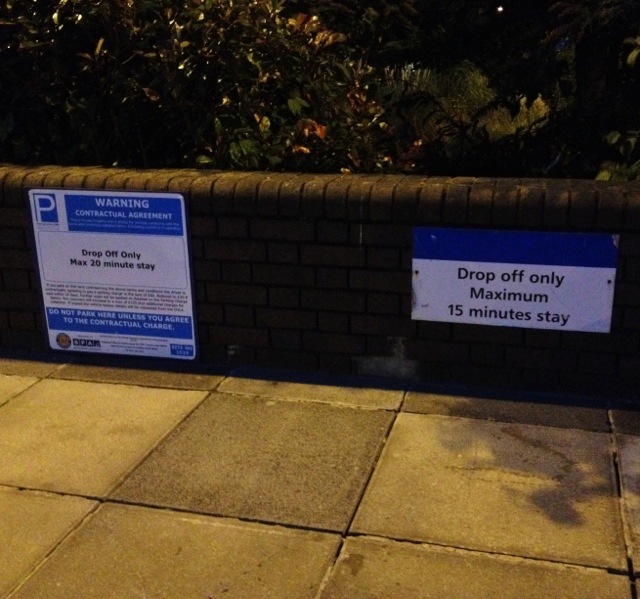
This pair of signs features in the car park of one of my local hospitals. It’s hardly the end of the world that two nearby signs contradict one another, but I would’ve liked to think, even if only for the sake of neatness, that the person putting up the new sign on the left would have obscured or removed the old sign on the right.
I wonder, too, whether the new sign is more effective: how many people would bother to read the small print, and how many would miss the main message given the reduced font size?
This post was filed under: Health, Photo-a-day 2012, Medicine, Newcastle-upon-Tyne.