About me
Bookshop

Get new posts by email.

About me

Introducing the Diary
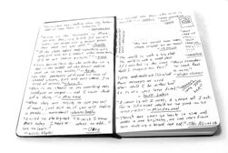
Diary
Photo by Paul Watson, modified under licence
The experiment in mini-posts seems to have worked well, and has received positive feedback from readers whilst being very easy for me to use. I therefore intend to continue with it.

As you may have already noticed, I’ve made some changes to the display of the posts to give them a more permanent identity, as I felt that having a screaming headline format didn’t really work for the mini-posts. For that reason, I’ve renamed them ‘My Diary’, and given them their own special design, which I feel works rather well – and I hope you do too.

Let me know what you think, keep commenting, and help the very discussion to thrive.

This post was filed under: Site Updates.

Recently published posts


Random posts from the archive

BBC censorship / 24 June 2005

Jeremy Paxman: On Royalty / 21 June 2007

Entry #99 / 06 May 2004

Photo-a-day 259: Northumberlandia / 15 September 2012

What I’ve been reading this month / 01 November 2016

Kennedy’s drinking an on-going problem? / 30 August 2006


Comments and responses

Comment from Jonathan Rothwell


    10.34, 01/03/2008

I suggest making the diary headers a little smaller, and perhaps toning down the background colour – maybe it could be a sort of blue instead of yellow?

I do like the idea of them having their own design though.


Comment from sjhoward (author of the post)


    18.07, 01/03/2008

I quite like the variation of the yellow – and a couple of people have commented that it brightens things up a bit. It’s supposed to bear a passing resemblance to a physical diary.

That said, clearly, it’s a bit rough around the edges at the moment, and I will get round to tidying it up at some point in the next decade…


Comment from sjhoward (author of the post)


    21.29, 09/03/2008

Hmm, I’ve changed things again now… The yellow didn’t really work, did it? I’ve gone for an edited photo as a background now, which I think adds more of a personal touch. You like?


Comment from Jonathan Rothwell


    22.04, 09/03/2008

That is better by an order of magnitude. I like it more now that it’s been toned down a bit and that the headers aren’t as shouty and cheese-tastic as before.


Compose a new comment

I'm not taking comments on my blog any more, so I'm afraid the opportunity to add to this discussion has passed.


The content of this site is copyright protected by a Creative Commons License, with some rights reserved. All trademarks, images and logos remain the property of their respective owners. The accuracy of information on this site is in no way guaranteed. Opinions expressed are solely those of the author. No responsibility can be accepted for any loss or damage caused by reliance on the information provided by this site. Information about cookies and the handling of emails submitted for the 'new posts by email' service can be found in the privacy policy. This site uses affiliate links: if you buy something via a link on this site, I might get a small percentage in commission. Here's hoping.