About me
Bookshop

Get new posts by email.

About me

Morrisons’ rebranding exercise hurts my eyes

Old and New Morrisons Logos

Morrisons is rebranding. It should have rebranded about twenty years ago. Still, you might say, better late than never. Until you see the effort they’ve come up with.

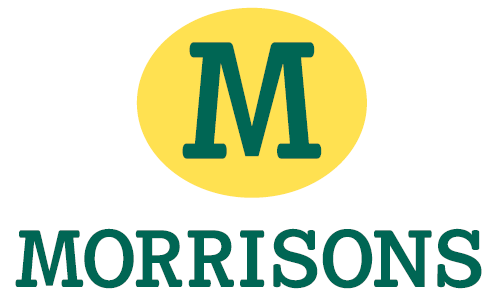
They’ve managed to turn something ugly, dated, and memorable into something uglier, tackier, and instantly forgettable. It’s really quite an achievement. It’s a circle with the letter ‘M’, and ‘Morrisons’ written underneath. They’ve taken the first letter of their name, and stuck it in a circle. They’ve swapped black for a wishy-washy greeny colour. It looks like something a colour-blind medical student with no design skill might have designed in Paint.

I’m really struggling to find something positive to say about it. Erm… I don’t think I can find anything. But you know what would’ve looked better? This.

This post was filed under: News and Comment.

Recently published posts

‘The Reluctant Traveler’ / 19 April 2024

Circled / 18 April 2024

‘Fallen leaves’ / 17 April 2024

A manifestly different outcome / 16 April 2024

Forgotten promises / 15 April 2024

Souter Lighthouse / 14 April 2024


Random posts from the archive


Comments and responses

Comment from Ken from Glos


    19.58, 25/04/2007

Spot on!!


Comment from workhard


    13.00, 26/04/2007

You have too much time on your hands.


Comment from verny


    17.32, 08/05/2007

Like all City sponsored prannocks, new Morrison boss Marc Boland has to make an impact, so he chooses softest and most predictable target of all – the logo. All these red-bracered twazzacks do it, but this takes some beating – a £450 million budget purely on graphics with 10% of the impact and memorability of the one he’s dumped. And what a world-shattering slogan…”fresh food every day for you”…what a bloody stupid cliche that EVERY retailer claims, including the local chippy. Still, Marc has made his mark, and fully justified the £6 million he has been promised in the next 3 years….plus loot from selling this great old firm down the river to his buddies in the City. Which is where we came in.


Comment from Tom


    23.55, 18/06/2007

Why do people persist in sticking up for the Safeway branding – IT WAS LOSING MONEY and is now making a profit having been rebranded to Morrisons


Comment from sjhoward (author of the post)


    05.40, 19/06/2007

I don’t think it was Safeway’s branding that was losing it money – I think the infrastructure had more to do with it. I’d wager that if Morrisons had retained Safeway’s branding, it would be doing better now than it currently is.


Comment from Adam Clarkson


    14.28, 20/09/2007

I just wish that our company had been let loose on Morrisons branding. We would have given them what they need to rival the powerhouse that is Tesco and the branding to wipe ASDA and LIDL off the UK supermarket map


Comment from sjhoward (author of the post)


    18.03, 26/09/2007

Thanks for all your comments.

Adam – With the best will in the world, I don’t think even the best of branding could make Morrisons take on Tesco, nor wipe ASDA off the map. It’s branding is poor, and it would’ve been interesting to see what other agencies could have produced, but I think the problems run deeper than branding.


Comment from Tom


    00.48, 29/10/2007

in my opinion the Morrisons fresh lines (especially meat and fish) completely blow all the other three competitors away and i dont like to shop anywhere else. I genuinely believe it is cheaper, comes in far more useful portion sizes, there is a much larger range of fish, and it’s all of the same quality and possibly better presented. Also, the packaging is the same size as the meat/fish cuts – NOT twice the size like in Asda and Tescos. The branding is the main problem because people percieve the place as rubbish and believe Tescos totally false (in my experience) claims that they are cheaper etc etc. They are also bad at promoting their good points aggresively like the others do.

And incidentally, the new logo etc is in place in a new store in Johnstone near Glasgow and surprised me by looking very fresh, modern and generally appealing. It’s a funny thing but often the best logos seem to look bad at first, and grow on you!


Comment from Gerwyn


    17.53, 09/05/2008

ok…. i actualy WORK at Morrisons…. and i have to say the author of this blog is dead right, the “new” logo makes me sick too… just think in a couple of weeks time their bringing in new uniforms….. supposably similar in colour to the “new” logo….. think i might quit….. 😛


Comment from sjhoward (author of the post)


    20.35, 09/05/2008

Surely anything’s an improvement on the old uniform?


Comment from Anni


    20.49, 20/09/2008

I also work for morrisons and i can quite frankly say that the new uniform has grown on me but is still rubbish the market street departments look like cheap and tacky sticks of rock but according to the senior management at head office that dont have the pleasure of wearing it day in day out the think it looks good Not

on a previous point i personally dont think its the branding or the logo that lets the company down it is indeed the management infrastructure.

the bosses at the top get paid for sitting on their backsides all day when its us at the bottom that do al the work take all the flack from customers and have the unfortunate task of dealing with first aid call outs that dont end up with a happy ending

something needs sorting


Comment from gwernj


    18.10, 07/01/2009

this is a shit shop i was working here for my work exceperience


Comment from Denyerec


    23.29, 10/02/2009

I was looking for the Morrisons logo to include as part of a photo-joke for a forum signature (Don’t ask) and had to go with ASDA instead because I didn’t wanna use their new one and have it make me look like a lousy designer.

Eesh. People get paid for this stuff? *shakes head*


Compose a new comment

I'm not taking comments on my blog any more, so I'm afraid the opportunity to add to this discussion has passed.


The content of this site is copyright protected by a Creative Commons License, with some rights reserved. All trademarks, images and logos remain the property of their respective owners. The accuracy of information on this site is in no way guaranteed. Opinions expressed are solely those of the author. No responsibility can be accepted for any loss or damage caused by reliance on the information provided by this site. Information about cookies and the handling of emails submitted for the 'new posts by email' service can be found in the privacy policy. This site uses affiliate links: if you buy something via a link on this site, I might get a small percentage in commission. Here's hoping.