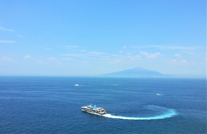
I’m currently reading My Brilliant Friend, which is the first of Elena Ferrante’s Neapolitan novels. I’m not particularly enjoying it… but it does remind me of the lovely couple of weeks Wendy and I spent in Naples back in 2014. While Naples is not a universally loved tourist destination, Wendy and I had a wonderful time, and it ranks among our favourite holidays together.
There is frequent mention in My Brilliant Friend of Ischia, the distinctive volcanic island on the edge of the Bay of Naples, famous for its thermal spas. Wendy and I didn’t go there.
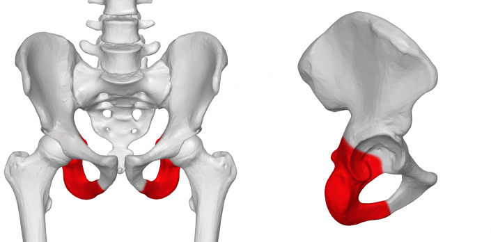
The source of the name ‘Ischia’ is much disputed. But seeing it written down so many times (and with so little distraction from meaningful plot) I started to wonder about two medical words which bear a striking resemblance: ischaemia, where a part of the body receives an inadequate blood supply, and ischium, which is part of the pelvic bone and the hip joint.
Two different views of the ischium
I didn’t imagine that either of these were connected to Ischia, which is just as well, as they are not. But I did think that there much surely be an etymological connection between ischaemia and ischium – but couldn’t for the life of me work out what might connect the two. I even asked Wendy, and she also couldn’t think of a plausible connection, and she’s far cleverer about this sort of thing than me.
Neither the Collins, Penguin nor the Oxford Compact dictionaries on my shelf offered any etymological notes, but nevertheless increased my sense of intrigue by listing no other words which start with an isch- prefix. So surely they must be related!
And so to the OED online – this confirms that both words are derived from Greek, and that the isch- prefix comes from the Greek ‘to hold’. In the case of ischaemia, to ‘hold blood’, and in the case of ischium, to ‘hold’ the hip.
The OED also lists a few other lovely medical isch- words that have long since fallen out of use: ischuria, for urinary retention, is my favourite of these. Health protection rarely calls for reference to urinary retention, but “I’m sure it’s ischuria” could become a favourite refrain should I ever return to hospital medicine!
The photo at the top of this post is my own. It doens’t show Ischia, but it does bring back happy memories. The anatomical image is a composite of two images deposited in WikiMedia Commons from Bodyparts3D, both of which are used here under their Creative Commons licences: an anterior and lateral view of the ischium
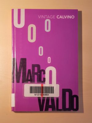
I loved this book. First published in 1963, this was a collection of twenty short stories about Marcovaldo, a poor Italian man who was fond of nature and rural life but lived with his family in a big city. The stories followed a seasonal cycle, so that there were five set in each of spring, summer, autumn and winter.
In each story, Marcovaldo engaged with nature or the physical world in some way, and the outcomes were always unexpected. There was a lot of humour (I could imagine Marcovaldo being reduced to a comedy character on TV), but there was an equal amount of philosophy and some melancholy.
The writing was wonderful, simple and yet poetic. But then I really like Calvino’s style, and know that it isn’t universally loved. The translation I read was by William Weaver.
I enjoyed this so much that I didn’t want it to end, and tried to give myself time to reflect on each story before reading the next.
This satire was first published in 1948, but if I didn’t know that, I’d have guessed that it was published last year. (In fact, it was republished by Persephone in 2018.)
The plot followed five people who, having been marooned on a desert island for some years, returned to England in 1945 to find it transformed into “the England of all decent Conservatives’ dreams.”
The country was divided along strict class lines, with every citizen receiving one of five Government-assigned grades, and required to live in accordance with what would be expected of their class. The novel primarily focused on the experiences of the privileged James Leigh-Smith (indistinguishable from Jacob Rees-Mogg), and largely left the reader to fill in the blanks and draw the moral lessons.
This was a really easy and fun read with a clearly enduring underlying message.
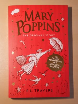
Wendy loves Mary Poppins, so after 16 years of not entirely voluntary viewings of the Julie Andrews film, the more recent Saving Mr Banks and Mary Poppins Returns, and countless features and documentaries, I decided it was time to engage with the original source material.
Obviously, it was a children’s book, but I was surprised how dark it was—and it was more interesting for it.
Mary Poppins, a truly memorable character, was acid-tongued, cold and vain. Mr and Mrs Banks had little interest in or interaction with their children.
I think many younger children would be scared by the situations into which Poppins lures the children, such as the full moon birthday party in which shes surrounded by snakes.
Neither the book nor the character have the redeeming and nurturing warmth I expected, which left me more intrigued than if this had been the more saccharine tale I imagined.
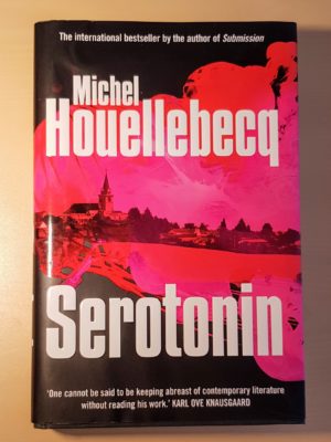
I had never read anything by Houellebecq before, but knew of his reputation for gloom. This book lived up to that reputation, mostly in a good way. I read the translation by Shaun Whiteside.
The protagonist was a depressed agricultural advisor to the French government on farming and agricultural matters. He was prescribed a novel antidepressant which increased his serotonin level (hence the title). The novel followed this not entirely likable character as he made increasingly strange life choices.
The high suicide rate among agricultural workers is well known, but this novel made me think a bit more about the myriad causes of this, especially in modern society. It was also good at giving a slightly different perspective on the experience of depression and medication. There was a good dose of dark humour mixed in with the tragedy.
There was a fair amount of gratuitous sex, including bestiality and paedophilia, which seemed like it was there more to shock than to perform any intrinsic function. Also, in one of those bizarre turns of fate, there’s a section in this reflecting on Arthur Conan Doyle’s short stories, which I was reading at the same time!
This was a book that started off as a crime procedural narrated by a policewoman called Mike, but turned out not to be a crime procedural at all. It was rather a sort of dark fictional philosophical exploration of suicide.
By pure coincidence, I had Miles Davis playing as I read much of this, and I was struck by how the writing seemed ‘jazzy’: police procedural cliche played with, improvised, turned on its head, and using the same forms to different ends. I enjoyed it.
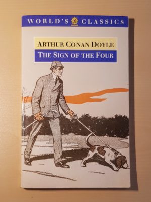
Contrary to most of the reviews I’ve flicked through, I enjoyed this less than A Study in Scarlet. It felt like there was more padding, and the long narrated resolution at the end felt more tedious than than the second part of the first book.
While I of course accept that the casual racism and pejorative language used by Conan Doyle reflect the social mores of the time it was written, the quantity of it in this volume became a bit wearing.
I picked this up because it was featured in an article about how brilliant ‘young adult’ fiction had become and how we should all be reading more of it. It was a ‘love through secret correspondence’ story with a gay 16-year-old high school student as the protagonist and narrator.
The straightforward plot dealt with issues of contemporary high school life, including traditional tropes like bullying and blackmail, and some more modern concerns, such as emails and blogging.
It felt tightly targeted at its audience: many of the cultural references passed me by somewhat (though I can’t be certain whether that was an age thing or a not-being-American thing). It is narrowly focused on high school life, and it limited itself to the sort of language teenagers use. There is a very teenage dichotomy in which almost everything in the book is either “freaking awesome” or terrible, which felt true to life, but a little wearing. Overall, the writing felt a bit teenage, which is what the author was going for, but doesn’t really have a great deal of interest for me.
All things considered, this seemed like a well-constructed book, but it didn’t really convince me that we should all be reading more young adult fiction.
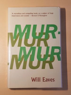
This was a novel based on the imagined thoughts of Alan Turing as he experienced chemical castration and the associated psychological therapy.
In fact, the main character was a sort of ‘version’ of Turing called Alec Pryor, but having read a biography of Turing relatively recently, I recognised that many of the peripheral characters share the forenames of similar characters in Turing’s life. As if that wasn’t a complicated enough premise, several of the sections were dream sequences imagined by Pryor.
This layer upon layer of narrative complexity allowed Eaves to explore all sorts of interesting territory relevant to Turing’s life, from the morality of his treatment to the nature of consciousness to the development of artificial intelligence.
This was a very clever book which I think would reward multiple close readings. I often found myself a bit disorientated in terms of the plot, and while that sometimes made it a bit of a chore, I mostly found myself carried along by the writing, the fantastically poetic imagery, and the exploration of complex ideas.
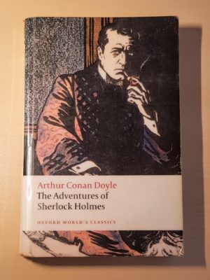
A collection of twelve short stories about Sherlock Holmes cases narrated by Dr Watson. Obviously a classic and one where everyone knows what they’re getting!
I personally preferred getting engrossed in the full-length novels earlier in the series than these short stories, but I still enjoyed seeing how the characters developed over the course of the collection.
Tortoise Quarterly is more magazine than book—it features thematic collections of longer articles from the Tortoise website.
In this edition, I particularly enjoyed Matthew D’Ancona’s account of experiencing delirium while he was a patient on a high dependency unit, Ian Ridley’s moving story of his wife’s death from cancer, and Tanyaradzwa Nyenwa’s reflections on working as a cold caller.
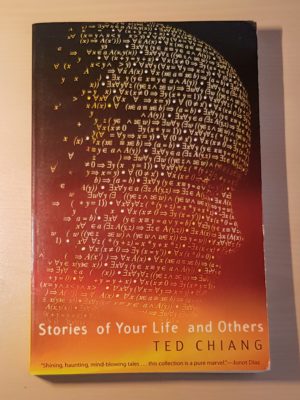
I fully recognise that this has a reputation as one of the greatest collections of short science fiction stories ever written, but it was just not for me.
I don’t usually enjoy science fiction but decided to challenge myself with this: it has a reputation for being so accomplished that it appeals to people who don’t usually enjoy science fiction. But I found it a real slog to get through.
I’m not sure what it is that generates such a negative reaction in me. I think it might be something to do with the fantastical nature of much science fiction—I don’t like fantasy stories either, so perhaps my imagination is limited to stuff grounded in reality.
I think it might also be something to do with the writing, which often struck me as inelegant, despite clearly being loved and respected by better informed people than me—to me it often felt more scientific than poetic, and I think I prefer poetic descriptions of emotions (not ‘Neil was consumed with grief after she died, a grief that was excruciating not only because of its intrinsic magnitude, but also because it renewed and emphasised the previous pains of his life.’)
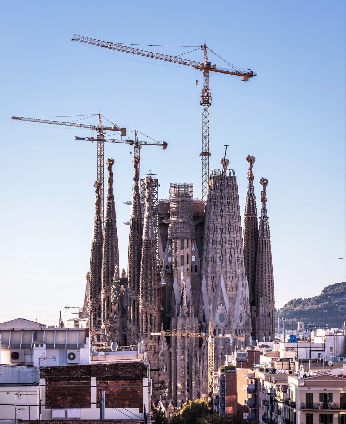
Earlier this week, I was in Barcelona for one of my occasional solo weekends in Europe. Normally, I like to spend these brief breaks doing absolutely nothing: I like simply to wander around with no particular destination in mind, taking in the sights and sounds of somewhere new and occasionally stopping on a bench or in a coffee shop to read for a little while. I enjoy spending time with my own thoughts.
This time, however, I made an exception to my rule. When I told people I was going to Barcelona, several people exhorted me not to miss the Sagrada Família.
Construction began on the Catholic ‘Church of the Holy Family’ in 1882, and from 1883 Antonio Gaudí became its chief architect. Much of his life was dedicated to design and construction of the church, and indeed he lived on site for quite a number of years. Following his death in 1926, construction has continued—often slowly, and often with considerable controversy—and it is currently estimated that the building will be finished in 2026, give or take a few years for the final bits of decoration to be finished.
Prior to visiting, I wasn’t particularly familiar with Gaudí’s work. I’ve never previously visited Barcelona, where his influence is pretty much unavoidable, and I can’t claim to be well-read in architecture, so it’s probably no surprise that I don’t think I’d ever really come across Gaudí before. Nevertheless, I couldn’t ignore the exhortations of friends, and so bought myself a ticket to visit.
In fact, due to the illogical position that “entry only” tickets had sold out, I ended up buying an extra-expensive ticket which included an “audio guide”, as if to add an extra layer of interruption to my planned day of wandering and contemplation.
The reason I’ve felt compelled to write about this visit is that I’ve never before felt so profoundly conflicted about a building. Several friends who encouraged me to visit have since asked what I thought of it, and I’ve struggled to string together a semi-coherent response, because I have such strongly logically inconsistent opinions. And so I thought I would try and set down here the answer to the question of what I thought of the Sagrada Familía. But, as with some of my other recent posts, I’m only publishing it twelve months later, so you may have been waiting quite a while for an answer.
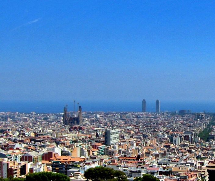
La Sagrada Família dominates the landscape
La Sagrada Família is a building of awesome scale: it dominates the landscape in a way which seems almost out of place in a city. The basilica covers an entire city block and, even in its incomplete form, has an imposing height to figure alongside its great mass. I was staying in a hotel three miles away, and could still clearly see the building from my hotel’s window, across the city’s rooftops. From this distance, there is something oddly other-worldy and inhuman about it. Seeing its mass within Barcelona’s grid system, conforming to a city block’s size yet still being utterly disproportionate in scale, reminded me of nothing quite so much as one of those occasionally odd buildings that would spring up in Sim City 2000.
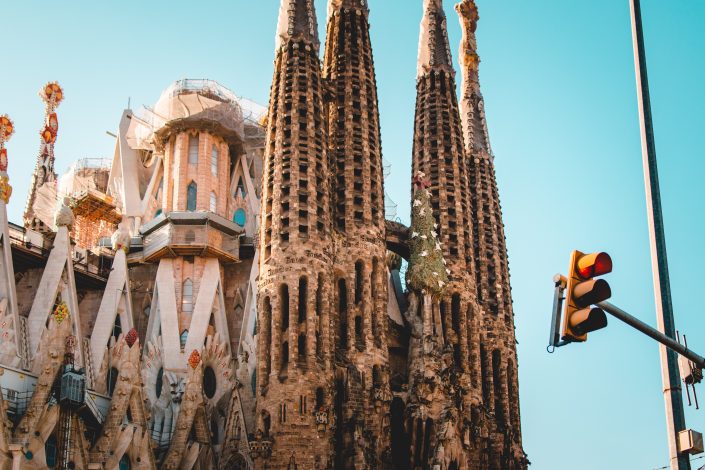
Four of the basilica’s distinctive spires
I approached from the east, walking along Avinguda Diagonal, meaning that the basilica came in and out of view according to the gaps between the buildings. The closer I got, the more spectacularly ugly the spires appeared, covered in horizontal openings. These opening serve to let the wind blow the tubular bells yet to be installed within, and also to lend a ‘natural’ appearance to the architecture: something repeated throughout Gaudí’s work.
I have no doubt that to create huge spires which are open structures from stone requires true architectural genius. How could it not? They are clearly both intricately constructed with an eye toward delicacy, and yet strong enough to withstand enormous forces acting upon them. Delicacy and strength rarely go together.
And yet, to my eye, they look like nothing quite so much as insect nests that I’d call Rentokill about. They strike me as thoroughly aesthetically unpleasant. This impression was only reinforced when I got close enough to see that they have occasional fragments of text carved into them at huge sizes visible from the ground. They really are arrestingly ugly.
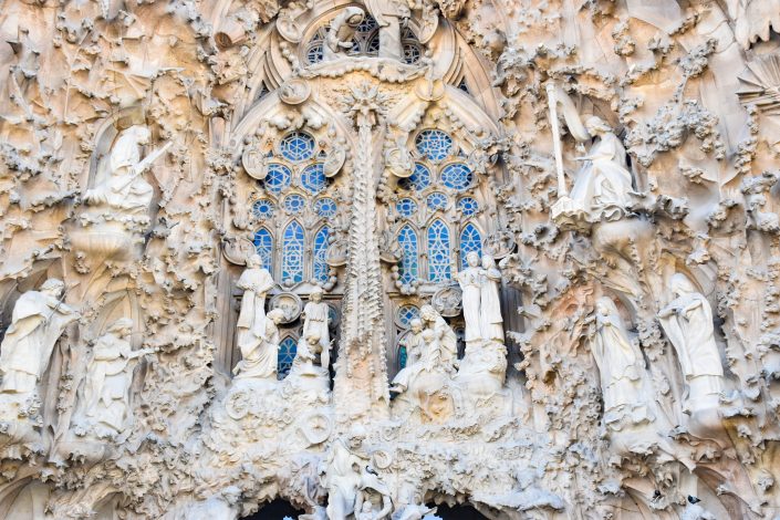
The Nativity Facade
The Basilica will eventually have three facades, capturing different points in the Holy Family’s life as described in the Bible. The first I came to, and indeed the only one constructed in Gaudí’s lifetime, was the Nativity facade. This astounding structure makes stone look as malleable as clay. The entire facade is covered in leaves, plants and statues which are so detailed and intricate as to be quite astonishing. Gaudi’s original plans for this facade was for the stonework to be painted to make it even more lifelike, which hasn’t happened and (for reasons I didn’t quite pick up) no longer seems to be part of the plan. Many of the features are no longer original, having been damaged in protests over the years, but none stands out as inauthentic.
Yet, for all the obvious skill and talent which has gone into the construction of the facade, it looks like the dictionary definition of religious kitsch. The interpretation of the Nativity is, even to an unbeliever like me, almost offensively literal. The facade looks as though the intention was to jam-pack it with decoration, and anything and everything that could be literally represented in stone has been stuck on, with no particular thought to any religious or spiritual significance. Hence, “Joseph was a carpenter” becomes a sculpture of a carpenter with a young boy looking on.
The skill and detail is astounding – but the overall effect is that of a desperately tacky and overwrought Christmas decoration that might be erected each December outside one of the US Bible Belt’s megachurches. Or perhaps, if a little more gold were added, like something Donald Trump would construct at one of his homes. It struck me as being in the most awful taste.
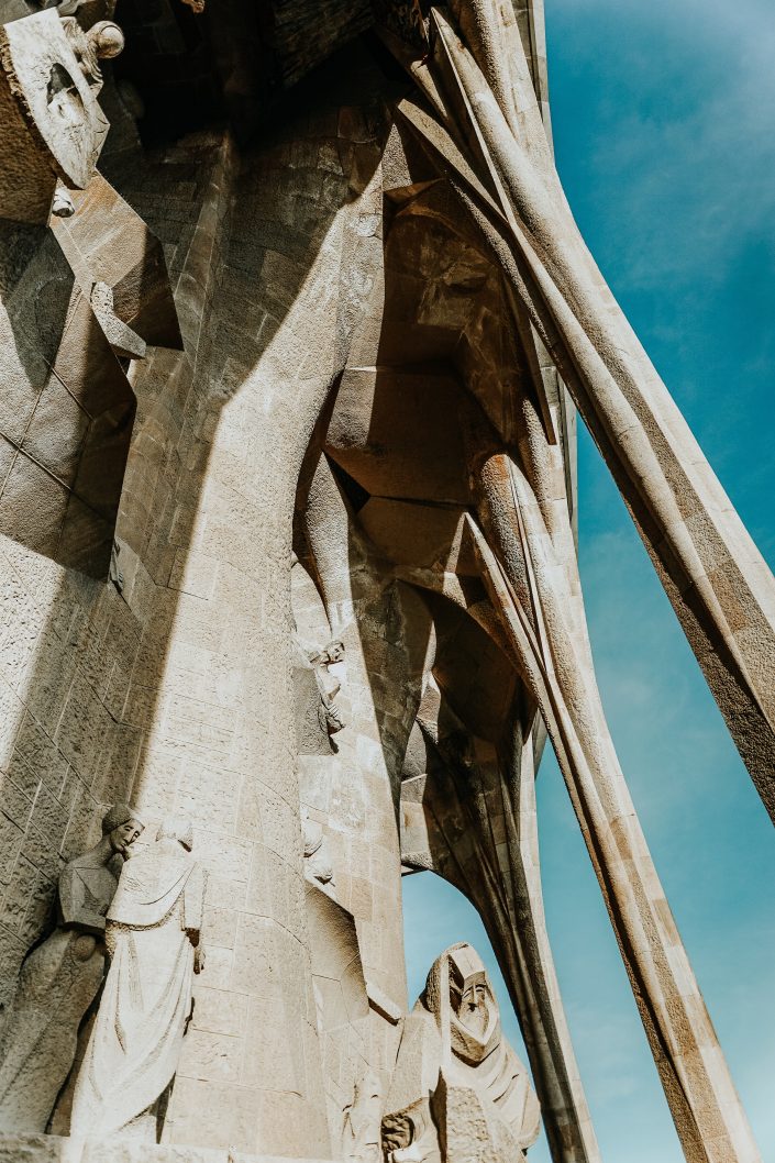
The Passion Facade
On the opposite side of the Sagrada Família, directly across the transept from the Nativity Facade, one finds the Passion Facade. This provides an extreme contrast to the exuberance of the Nativity Facade: it is relatively sparsely decorated, angular and severe. There is a clear intention to provoke a contrasting emotion among viewers of this facade as compared to the Nativity Facade: indeed, Gaudí’s intention was to provoke fear among viewers.
On the Passion Facade, the architecture is more exposed as as result of the reduced decoration, and it struck me as all the more impressive for this. The visual trick of making thin ‘ribs’ of concrete appear to support the (still ugly) massive spires above is neat, inspired, and clearly related to the ecclesiastical meaning of the events the facade represents, which gave me a much greater sense of overall coherence than the literal presentation of the Nativity Facade.
And yet, the literal interpretation is still very much in evidence, particularly in the angular sculptures by Josep Maria Subirachs. These sculptures are so angular that the figures portrayed all appear to have cubic heads. This provides an echo of the surrounding angular architecture, but has the unfortunate side-effect of rendering the figures pretty emotionless. This was particularly striking for me in the figures of Jesus—who looks mildly fed up—and the figure of St Peter—who looks a bit sad.
The most interesting consideration in the Passion story, at least for me (but I would also have thought it pretty fundamental in Catholicism) is the emotional toll on the primary characters. The scale and complexity of their emotional states is mind-boggling, and this complexity well-represented in enigmatic portraits through the centuries. Rendering them as figures out of Minecraft provides a neat continuity with the architectural style, but man it sucks all of that emotion out of the scenes, and leaves them once again being little more than a story-telling diorama.
There’s also the confounding inclusion of a magic square stuck on this facade. I can’t fathom why this grid, not obviously associated with Catholicism or Christianity, is incongruously included in a prominent position on this facade. The solution to the magic square is the age at which Jesus died, but why represent this using a technique associated with both paganism and mathematics, rather than something more obviously religious? It is particularly out of place given the generally sparse decoration.
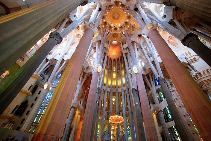
Part of the interior of the basilica
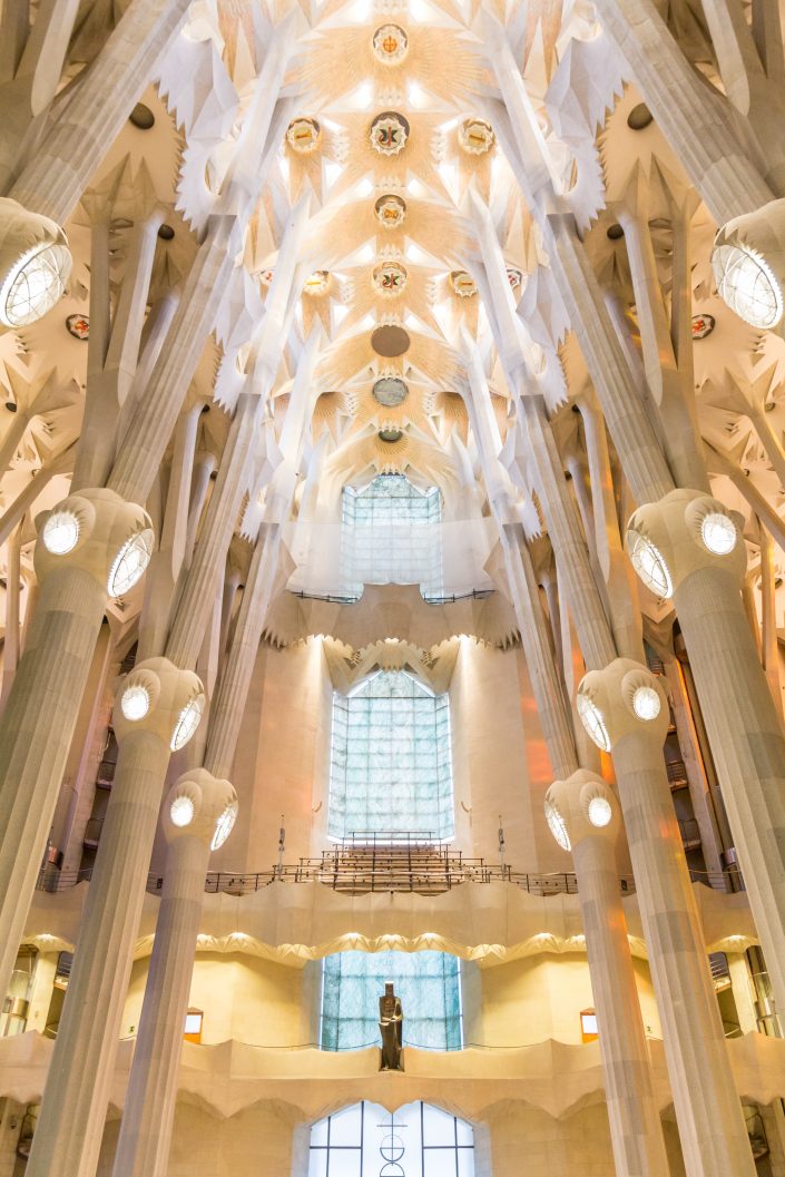
Entering the basilica, I found the interior to be utterly breathtaking. The scale of the space is hard to comprehend, and it seems almost implausible that the narrow branching columns within can support the load of the ornate roof which seems to be hovering at something like sky-height. And then one remembers the massive spires towering even above that, supported by those self-same columns. It is genius.
The basilica is flooded with light from the stained glass windows, brightened by the more delicate leadwork than is commonly seen in older church buildings. The dominant colours of the windows on each side of the Basilica are carefully chosen to bathe the inside in particular hues of light, giving it a strangely ethereal feeling. It is an awesome space, arresting and moving all at once.
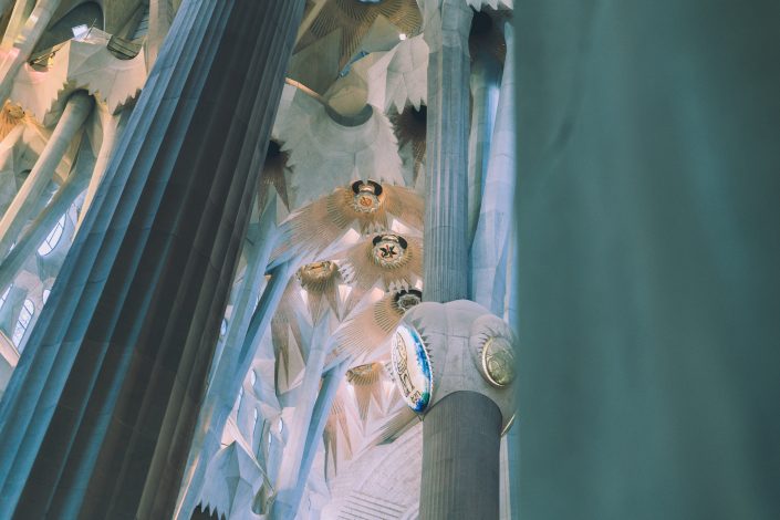
Interior detail of the basilica
Unfortunately, the decor of the interior continues the profoundly kitsch theme, mostly notably with four huge back-lit medallions representing four saints situated high up on the four largest columns. These wouldn’t look out of place on a fruit machine.
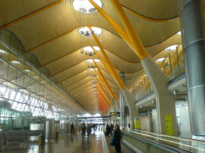
Madrid Barajas Terminal 4
The comparison may be unflattering, but the construction of the interior reminded me of Richard Rogers’s Terminal 4 at Madrid Barajas airport. Of course, it is all the more impressive to see this sort of structure built from stone, and on a much greater vertical scale, than it is to see the steel equivalent. But it is interesting to contemplate the way in which Terminal 4 was lauded for it’s shockingly open and modern design, and yet note how similar it is to something designed almost two centuries ago.
Underneath the basilica, there is a museum which explains much of the architectural significance of the building, which is well worth a visit (particularly if, like me, you know nothing about architecture). I was particularly taken by a series of scale models which demonstrate how the structure was derived from the classical Gothic architecture originally proposed for the Sagrada Família, before Gaudí got involved.
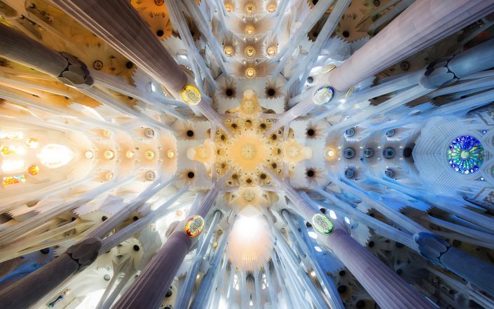
Detail of the ceiling
As I wandered round the basilica, I kept trying to reconcile my mixed feelings. How could I be awed and appalled at the same time? Exactly what was it about the decor of the building that made me feel so uneasy? Why couldn’t I just appreciate the undeniable beauty that was before me? I kept thinking back to something I read in Alain de Botton’s uncharacteristically disappointing book, Religion for Atheists:
The most boring and unproductive question one can ask of any religion is whether or not it is true.
The kitsch literal descriptions of Biblical events that flow throughout the Sagrada Família seem to invite no more contemplation than wondering whether or not the tales were true. They did not inspire, in me at least, any deeper reflection on their meaning, and nor was the imagery arresting and memorable. I found myself thinking that if Disney made cathedrals, they’d be much like this basilica.
Safe to say, then, that the exterior decoration was not at all to my taste. Not at all.
And yet, for all that, there was a style and theme that carried throughout the building. There was a vision of how it should look, and despite over a century’s worth of opportunity to dilute that vision, it is clearly being maintained. There is something deeply admirable and impressive about this scale of implementation of a vision, even if that vision seems as tacky as hell. It may not be inspirational to me, but it must clearly be inspirational to many people to have persisted for so long. It is hard not to be awed.
Interior of the Glory Facade – the main entrance to the basilica, still under construction
As for the architecture and the space it creates: it is incredible. The scale and ingenuity of the project is inspiring, and the interior is breathtaking. It is almost unbelievable that something so firmly modern could have been designed so long ago. There is no doubt in my mind that Gaudí was a genius.
There is a lot of debate about whether the basilica should ever have been finished. It is said that Gaudí always refined his ideas as he built, and that the plans would have changed considerably after his death as he continued to refine them during building. So, the argument goes, this is not truly Guadí’s work any more, even though the plans and design were his. I mention this because it strikes me as an interestingly prospective Ship of Thesus question. But whether or not it is Gaudí’s work, it is clearly the fulfillment of a cohesive vision, underpinned by architectural foresight, understanding and masterwork that may well have been unrivaled. The basilica cannot fail to impress.
So, what did I think of Barcelona’s Sagrada Família? My utterly contradictory conclusion is that the basilica is a masterpiece, an incredible and breathtaking work of profoundly kitsch bad taste that is both truly beautiful and as ugly as sin.
None of the photos in this post are my own: mine were crap. They are all pictures taken by people with much better photography skills than me, and used here under Creative Commons licences. The first (the wide shot of the Sagrada Família) is an edited version of a photo by Angela Compagnone. The second (the city skyline) is a cropped version of a photo by Joe Lin.
The third (the spires) is by Danil Sorokin. The fourth (the Nativity facade) is a photo by Greg Nunes. The fifth (a brilliantly framed detail of the Passion Facade) is by Jessica To’oto’o. The sixth (showing part of the interior) is by Eleonora Albasi. The seventh (another interior shot) is by Paulo Nicolello. The eighth (the shot of Madrid Barajas) is by Ángel Riesgo Martínez. The ninth (the ceiling detail) is by Claudio Testa. The final photo (the interior of the Glory Facade) is by Won Young Park.
The content of this site is copyright protected by a Creative Commons License, with some rights reserved. All trademarks, images and logos remain the property of their respective owners. The accuracy of information on this site is in no way guaranteed. Opinions expressed are solely those of the author. No responsibility can be accepted for any loss or damage caused by reliance on the information provided by this site. Information about cookies and the handling of emails submitted for the 'new posts by email' service can be found in the privacy policy. This site uses affiliate links: if you buy something via a link on this site, I might get a small percentage in commission. Here's hoping.


.png)