About me
Bookshop

Get new posts by email.

About me

Review: Public Parts by Jeff Jarvis

In Public Parts, Jeff Jarvis counterbalances arguments about the sinister effects of erosion of privacy in the modern world. He argues that openness and sharing, on balance, improve the world. He coins the word 'publicness' to describe open sharing, and argues convincingly that 'publicness' is not the polar opposite of 'privacy'.

This is a book which stimulates thought. I particularly appreciated Jeff's elucidation of the argument that regulation should focus on the use of information that has been shared, rather than the sharing of information itself. I had never considered the concept in this way before, despite it being a common one. I am a doctor: people tell me all sorts of things in confidence because they have a clear understanding that to do so is the best way to allow me to understand their condition, and diagnose and treat them. Occasionally, much of what a patient discloses – which is often deeply private – turns out to be irrelevant. But the code of ethics, not to mention the law, around these interactions means that they can share without fear.

While the patient freely discloses the information, the way in which the information is used remains within their power. They are free to allow me to share it with colleagues if they believe that this might help them (referring them on), or equally free to restrict me from doing so. Even if something deeply embarrassing turns out to be irrelevant, the patient is left no worse off for having disclosed it – and the possibility of benefit was probably worth the disclosure.

This is a single example of the effect Jeff's book has on many of the concepts around privacy and 'publicness'. He helps the reader to assume a different viewpoint on issues. The viewpoint is often one grounded in experiences that the reader already has, or can conceive of, but which they have perhaps not understood from the viewpoint described. This is a powerful technique.

Public Parts also discusses the trickier aspects of online life. It discusses cases where people share things that they perhaps should not have, and where this lack of privacy has caused harm. But he makes a convincing point that we all need to become more 'media competent', and that making the debate about 'publicness' more mainstream will serve to educate and inform, as well as helping to craft social norms in a more considered way.

The style of writing in the book is certainly fast-paced, and I know that others have been critical of this. Few things irritate me more than incomplete, superficial arguments, and so I was a little reluctant to read this book on the basis of those reviews commenting on the fast-paced nature, which I thought would be indicative of superficiality. On the contrary, I found the book well-paced. It discusses issues concisely, not ad infinitum, which I found refreshing. It leaves the reader to do some of the work around thinking through the issues surrounding the arguments. The author does not lead the reader step-by-step through every possible permutation and combination of situations and ideas, as other authors are wont to do.

I particularly enjoyed the discussions around the historical aspects of privacy and 'publicness'. Consideration of these issues is, in my opinion, far too often framed as part of the discussion around modern technology. In reality, there is little that is new about the issues themselves, merely new situations in which they need to be applied. The discussion was illuminated by description of how these debates progressed around the new technologies of the past – from Gutenberg's printing press to Kodak's camera. Similarly, the interviews with leaders in social media (and similar fields) helped to give some real-world perspective on the theories being discussed.

It seems a shame to me that this book has received so little attention in the UK. I get the impression that it hasn't been particularly widely read, which is a shame given that its discussion is relevant to us all. It strikes me that it is a book that could catch on among the political classes, and become widely read via that route. At least, I hope it might.

This book packs an awful lot in to 250 or so pages. It's a genuinely enjoyable read that provides a large amount of food for thought. I highly recommend it.

Public Parts is available now from amazon.co.uk in hardback and on Kindle.

This post was filed under: Book Reviews, .

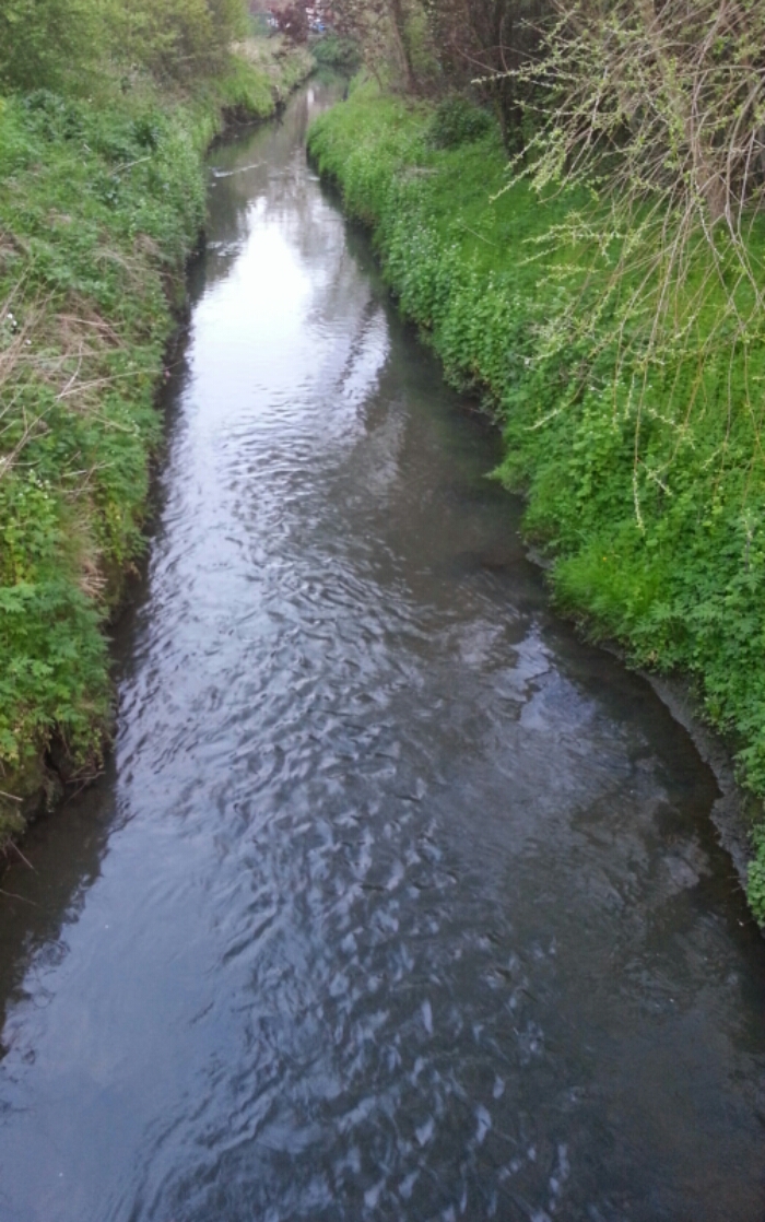
Photo-a-day 96: It’s the Ouseburn!

This post was filed under: Photo-a-day 2014, .

A personal apology to @jeffjarvis

Tomorrow, I'm going to post a review of Jeff Jarvis's Public Parts. Before I do, I feel compelled to write this post, which I probably should have written a long time ago, and certainly before my review of Gutenburg the Geek.

I think Jeff Jarvis is brilliant. I don't always agree with everything he says, but I certainly agree with him far more than I disagree with him. And, beyond that, I respect him. I respect his thoughtful consideration of issues. I respect his decision to live life in public. I respect his high quality writing.

In fact, Jeff's one of the few people whose writing I actively seek out, as I'm always keen to hear his view. I've read BuzzMachine since the beginning. I can't remember how I found his blog – I guess somebody must have linked to it – but I vividly remember reading his first post in the aftermath of 9/11. And I don't think there's any other blog I've followed so consistently since. I also love watching him on TWiG, though I arrived rather late to that party.

But, in the spirit of Public Parts, I feel like I should say something publicly. Jeff: I'm sorry.

I'm sure Jeff won't remember a tiny interaction we had nigh on a decade ago, but it has played on my mind for some time. In the run up to the 2005 UK General Election, Jeff kindly posted a link to my blog on his. This was kind of a big deal. He was (and is) a well-respected, highly trafficked blogger and journalist. I was a teenager blogging from my bedroom. And yet, for reasons I either can't recall or didn't even formulate at the time, I wrote a snippy post about being called a "British blogger" – which I was – and admonishing him for not using the site's trackback facility. Jeff responded with a comment that I've always taken as infused with (entirely appropriate) bemused frustration. Ever since, I've worried that my post might have pissed him off.

I can't explain why I wrote what I wrote. I don't know why my response to praise was criticism. I can only put it down to a certain teenage immaturity and egotism.

You talk in Public Parts about some of the jerks that lurk online. You probably won't remember the incident, but I do, and I think, on this occasion, that I was a bit of a jerk towards you. And I'm truly sorry.

With all of that said publicly, I hope that I can get on and review Public Parts with everything on the table. Which I will do tomorrow.

This post was filed under: Miscellaneous, .

Photo-a-day 95: On a Monday?!

image

After a busy set of weekend nights for Wendy, and a busy few days for me, we decided to go for a cheeky bit of cake tonight… even if it is only Monday!

This post was filed under: Photo-a-day 2014, , .

A new design for sjhoward.co.uk

As of 7th May, I will have been blogging for 11 years, mostly here at sjhoward.co.uk. Until today, the structure of the site had changed little in that time.

A few moments ago, I flipped the switch on the biggest ever overhaul of the site. I've rewritten every single template file (the files that power the design of the site) from scratch, and cut the number from 16 to 5. This helps to make the site zippier. More importantly to me, it means that the morass of code which I've cultivated over the last decade has been cut down to size and made navigable again, making maintenance a heck of a lot easier.

When people come to this site, they tend to access specific posts rather than the homepage. In the new incarnation of the site, the content of posts is front and centre. To make content easier to read, I've increased the text size considerably, and stripped back the design excesses. Templates no longer differ by type of post. I've reduced the colour palette and applied its principles more consistently across the site. I've drastically cut the number of extraneous links to irrelevant things scattered around the page. For example, while every page had a link to Radio 4's Desert Island Discs in the old design, this has now been removed. I think you can probably find your own way there.

Similarly, I've radically simplified the typography, now relying almost exclusively on two typefaces: Playfair Display and Raleway. I think some people might criticise the use of Playfair as the main typeface for copy – but I think it works well given the larger font size in use throughout. I'd be delighted to hear your thoughts.

I've moved contextual information to a smaller sidebar accompanying each post. This effectively reduces the prominence of this information in many cases, but by having it appear in a consistent position throughout the site, it is perhaps easier to find.

The redesign remains a work in progress, and I'll no doubt tweak it over time. That said, this hasn't been a rushed job… I've been plugging away at it, off and on, since early 2011.

Overall, the design is much cleaner, and (I like to think) easier on the eye. As I've experimented over the years, some people have commented that this sort of design is a bit sparse – especially compared to the smorgasbord of fonts, colours and styles used in the previous version. I think the new version looks better – but if you disagree, rest assured that, whatever my intentions now, clutter will no doubt accumulate as assuredly over the next eleven years as it has over the past eleven.

Anyhow, please do leave any thoughts or comments you have on the new design. After all, as the designer, it's hard for me to be objective – and the design is, in the end, aimed more at the reader than the writer.

This post was filed under: Miscellaneous, Site Updates, .

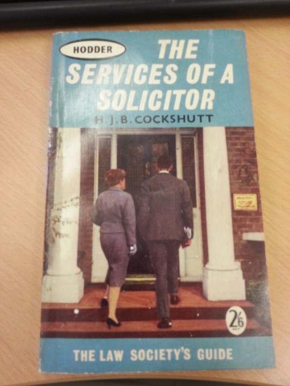
Photo-a-day 94: Services of a solicitor

CZ20140424105333554

I found this book on the floor behind my desk at work. It’s approximately twice my age. The casual sexism on every page is really quite disturbing. There’s a whole chapter called “Does your wife drive the car?”. I think it’s sometimes easy to forget the degree of (very welcome) social change that’s been experienced over the last century.

This post was filed under: Photo-a-day 2014, Scrapbook.

Weekend read: I will not make bad graphs

On New Year’s Eve, when I first came across this Full Fact post, I was in the midst of creating the images for the CMO’s annual report. So, then, the humour was a little on the dark side for me at the time, and I resolved not to feature in next year’s edition.

On reflection, though, the collection of spectacularly poor infographics is worth a look, as is the featured XKCD cartoon. So it’s my recommended read for this weekend.

This post was filed under: Weekend Reads, .

Photo-a-day 93: Pull

image

There are days when I wonder if this is somehow symbolic…

This post was filed under: Photo-a-day 2014, Scrapbook.

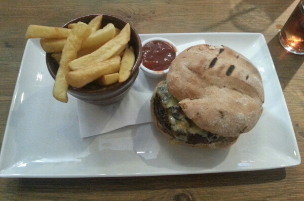
Photo-a-day 92: Birthday lunch

image

This post was filed under: Photo-a-day 2014, Scrapbook.

Photo-a-day 91: Wi-i-fi

image

Dad often likes to make this Geordie-themed joke about the Nintendo Wii, so might be especially pleased to see the Metrocentre using it!

This post was filed under: Photo-a-day 2014, Scrapbook.


The content of this site is copyright protected by a Creative Commons License, with some rights reserved. All trademarks, images and logos remain the property of their respective owners. The accuracy of information on this site is in no way guaranteed. Opinions expressed are solely those of the author. No responsibility can be accepted for any loss or damage caused by reliance on the information provided by this site. Information about cookies and the handling of emails submitted for the 'new posts by email' service can be found in the privacy policy. This site uses affiliate links: if you buy something via a link on this site, I might get a small percentage in commission. Here's hoping.