About me
Bookshop

Get new posts by email.

About me

Photo-a-day 2: Mango
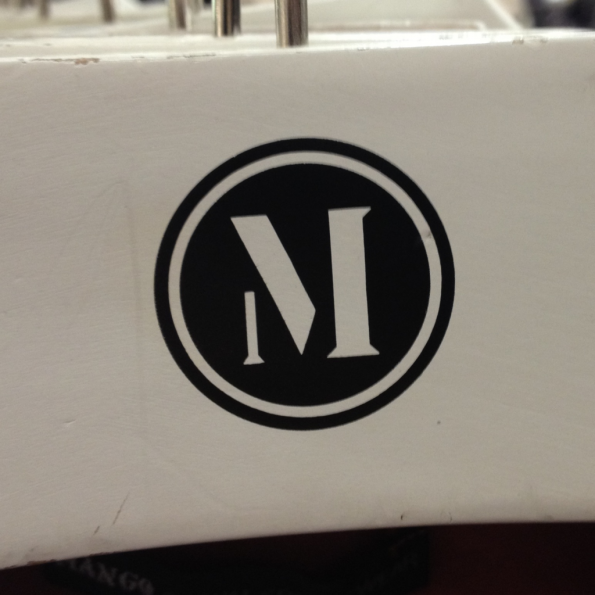
I’m always impressed by the typography of Mango’s logo – clearly communicating the letter “M”, as distinct from “N”, using only 3 strokes. Alas, they’re in the process of ditching this logo for an altogether blander alternative.

This post was filed under: Photo-a-day 2012, , , , .

Recently published posts

‘Sinterlation’ by Ian Randall / 21 November 2024

‘Landed’ by Les Johnson / 20 November 2024

A incurious ego / 18 November 2024

‘Types of Happiness’ / 17 November 2024

Herring gull / 16 November 2024

‘Small Things Like These’ / 15 November 2024


Random posts from the archive

I’ve been to visit ‘Hieroglyphs’ / 05 February 2023

12,000 / 08 March 2005

Mysterious ways / 09 November 2023

Photo-a-day 320: Souvenir / 15 November 2012

Weeknotes 2022.26 / 03 July 2022

The dirtiest tricks yet / 27 March 2005


Comments and responses

Trackback from elsewhere on the site


20:18
7th January 2012.

This post has been referenced by another on this site:
sjhoward.co.uk » Photo-a-day 7: New Mango


Compose a new comment

I'm not taking comments on my blog any more, so I'm afraid the opportunity to add to this discussion has passed.


The content of this site is copyright protected by a Creative Commons License, with some rights reserved. All trademarks, images and logos remain the property of their respective owners. The accuracy of information on this site is in no way guaranteed. Opinions expressed are solely those of the author. No responsibility can be accepted for any loss or damage caused by reliance on the information provided by this site. Information about cookies and the handling of emails submitted for the 'new posts by email' service can be found in the privacy policy. This site uses affiliate links: if you buy something via a link on this site, I might get a small percentage in commission. Here's hoping.