‘On Confidence’ by The School of Life
A hotel room I recently checked into had a small bookshelf, which was nice. This was one of four volumes squeezed between two unmatched bookends.
I have a vague cultural awareness of The School of Life: I enjoy and follow Alain de Botton’s writing, so I heard about this project when he founded it. The School of Life Press is a small offshoot, and I was mildly intrigued to see what it offered.
I therefore plucked this from the shelf and dived in, reading it from cover to cover in a single sitting (it’s quite short).
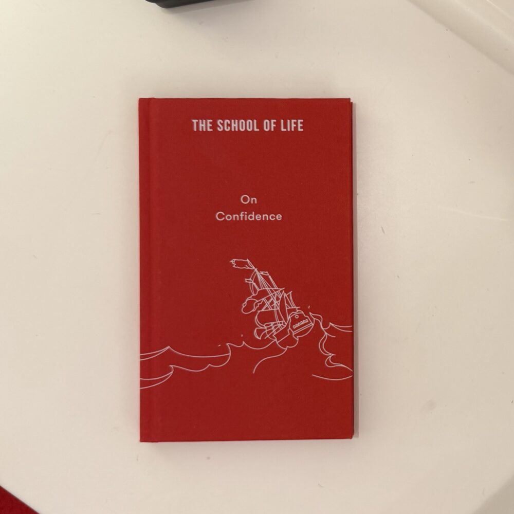
It discusses confidence as a learned skill, which is always a helpful reminder. The cover image of a ship being tossed by the waves exemplifies this: the new seafarer will be terrified, whereas the old hand has learned to trust the ship and so is confident in even the roughest waters.
That observation probably isn’t new to you, and that’s typical of this book. It’s a concise summary of well-worn wisdom, but it doesn’t have much new to say. There was one observation that was new to me: that those who see the good in others are likely to be less confident themselves, as they tend to place a higher value on the opinions of others (rather than seeing everyone else as idiotic and therefore relying on one’s own view and drive).
I’d have enjoyed a meatier and more challenging book on the topic, with a little more personality to it… but then again, a book like that would probably be too long and divisive to be left in a hotel room.
It was certainly more welcome than a bedside Bible.
This post was filed under: What I've Been Reading, Alain de Botton.