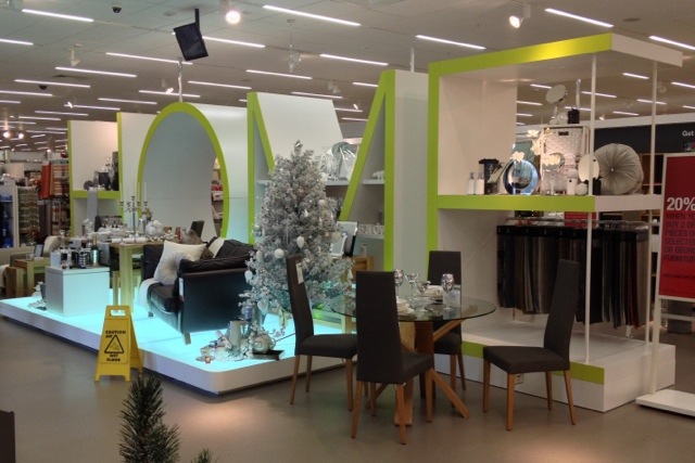
Photo-a-day 332: Massive sign
Sometimes, I think I’m a bit critical of M&S… it’s only because I care. So, today, I thought I’d feature something they’ve done that I really like!
This massive “home” sign is really striking, distinctive, navigationally useful, helps break up the vast store into small attractive areas, displays products well, and is totally on-brand in terms of font and colour scheme. More of this, please!
This post was filed under: Photo-a-day 2012, Retail.
