Weekend read: The brilliant user interface of regular TVs

My recommended read for this weekend is this Wired article by Kyle Vanhemert on what Netflix can learn from the user interface of linear TV. It makes some great points, and it’s great to read someone celebrating older user interfaces instead of another article praising social integration and flat design!
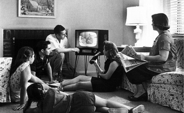
The picture at the top of this post was taken from here, and is used under its Creative Commons licence.
This post was filed under: Weekend Reads, Kyle Vanhemert, Wired.