About me
Bookshop

Get new posts by email.

About me

Temenos

Yesterday, I wrote about a quirky construction in Middlehaven: the only one of an intended set of five which was actually constructed. I visited it back in 2012, and had returned twelve years on to see how it was doing.

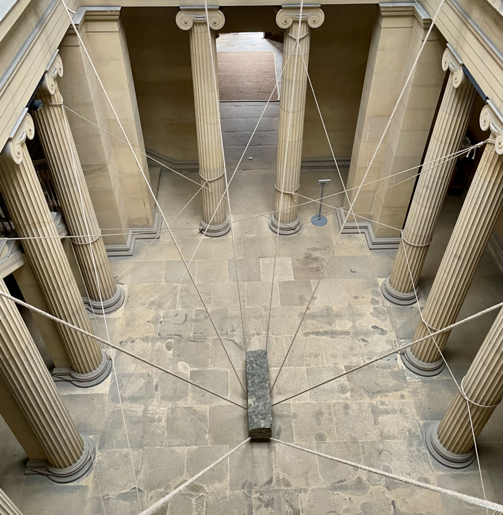
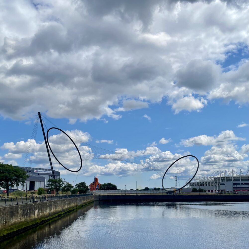
All of the above also apply to today’s post, which is about Anish Kapoor’s Temenos.

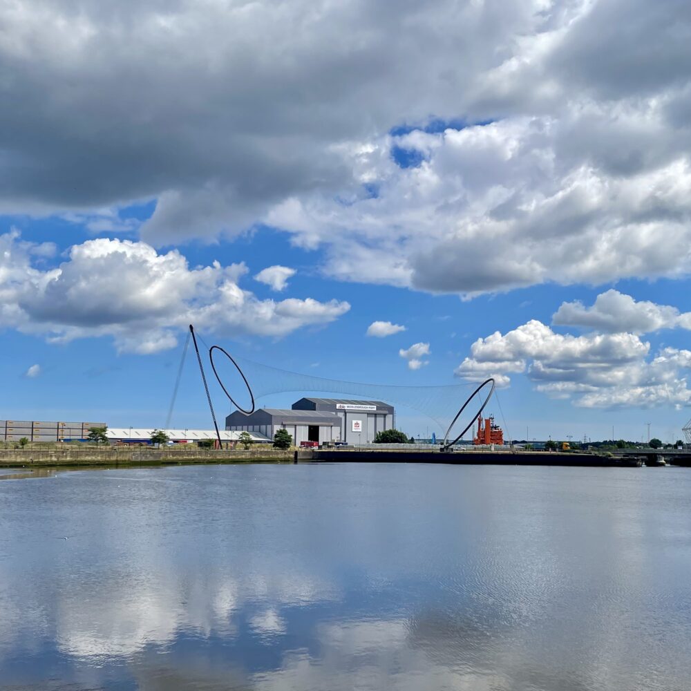
Twelve years ago, I called this massive artwork ‘soulless and bland’—which is very much how it felt on this visit, too. The demolition of the crane which previously stood behind it at least gives Temenos room to breathe, but it doesn’t really say much to me.

It was intended to be the first of five ‘Tees Valley Giants’, humongous sculptures spread between Middlesbrough, Stockton-on-Tees, Hartlepool, Redcar and Darlington. None of the others have been built, and it doesn’t feel like Temenos has become a local landmark in the way that was perhaps anticipated.

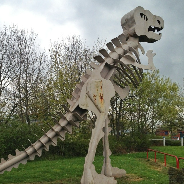
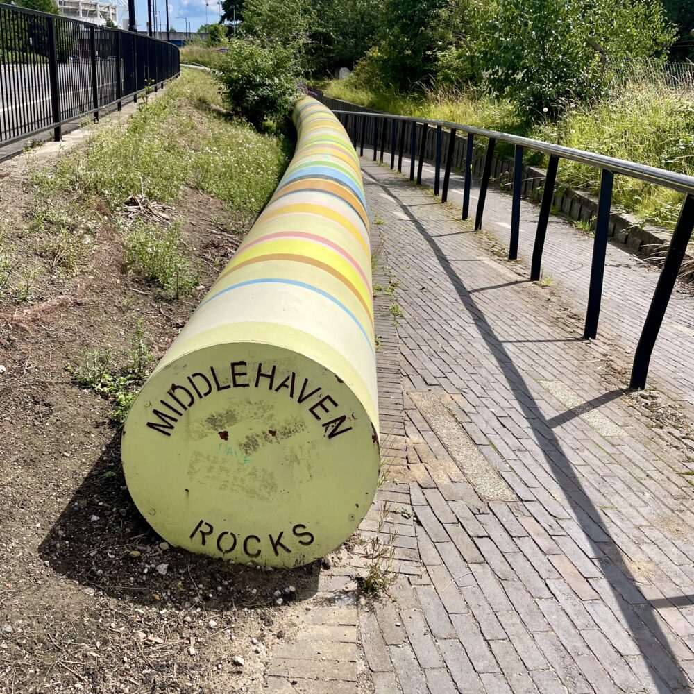
I wrote yesterday about the benefit of whimsy in life, and I think I actually prefer this much cheaper artwork nearby: a giant stick of rock.

This post was filed under: Art, Photos, Travel, , .

Hat chat

There was a story by Vanessa Friedman in The New York Times recently about the dress code in the Royal Enclosure at Royal Ascot, which included the startlingly specific fact that hats:

must include a base that is at least four inches in diameter. That means “fascinators,” those bizarre concoctions of net and sparkle that sit on the edge of a headband like a bird on a twig, are not allowed.

There are few things I’m less likely ever to need to know than this dress code, but it made me wonder quite how specific the requirements could possibly be. The answer is ‘very’.

Friedman quotes a milliner: ‘To err on the side of extravagance as opposed to modesty is a joy for everyone.’

I find within myself a surprising degree of sympathy for that perspective, but it seems a shame that it applies only to women. Men are prohibited any hint of extravagance: my choice is only of a grey or black top hat, about which colour ribbons, feathers or other embellishments are expressly prohibited. Even for ties—the definition of a useless embellishment—‘novelty patterns’ are disallowed. It’s just a sea of boring men in dull grey (or black or navy) suits.

It feels like such a strange choice in the modern world. It doesn’t even feel particularly traditional for a country with quite outlandish masculine fashion traditions—there will be working blokes there wearing scarlet jackets, gold buttons, winged epaulets with bloody great bear skins on their heads for goodness’ sake, with a far longer history than a Moss Bros top hat.

If it were me, I’d go full on ‘suits of armour’, ‘gold-threaded royal tabards’ and ’mandatory codpieces’. The current option just seems terribly boring… but then, it was never my thing to begin with.


The image at the top of this post was generated by DALL·E 3.

This post was filed under: Art, News and Comment, , , , .

More ‘Fragile Beauty’

One of the greatest pleasures of attending an art exhibition with Wendy is her reaction to the more pretentious object labels.

There was a moment in Madrid’s Reina Sofia when, after reading a particularly florid text, she just said ‘I don’t have the bandwidth for that’ and turned on her heel. It’s usually hard to disagree.

Wendy wasn’t able to attend ‘Fragile Beauty’ at the V&A with me, but when I read the label accompanying Richard Caldicott’s untitled triptych, I did wonder what she’d have made of it:

Richard Caldicott’s red, yellow and blue triptych playfully transforms everyday objects – in this case Tupperware food-storage containers – into a sea of colour. The artist’s choice of primary hues references classic colour theory, underpinning hundreds of years of optical experiment. To stand in front of Caldicott’s photographs is to be confronted by a field of light refracted by luminous kitchenware.

I think she may well have furrowed her brow and exclaimed: ‘But why would you want to be confronted by luminous kitchenware?!’


Fragile Beauty continues at the V&A until 5 January next year.

This post was filed under: Art, , , , .

‘Fragile Beauty’

I went to see this overcrowded exhibition of photographs at the V&A. It’s an oddly curated selection of photographs from the Elton John and David Furnish collection.

The blurb claims that the exhibition ‘tells the story of modern and contemporary photography’—I don’t really think it did.

There were a lot of brilliant and arresting images in the collection, but there didn’t seem to be a thread, story or argument to the curation. Perhaps there wasn’t supposed to be—perhaps the point is just to appreciate the photographs. I found it a bit unsatisfying.

But here’s something I took away: four images of the American flag from different time periods. I think this is an interesting series to contemplate: I’d have displayed them together, but the curators had other ideas.

So take the following series of images as some guerrilla curation—and perhaps the series will play on your mind as it has on mine.


Untitled by Larry Clark, 1971.


American Flag by Robert Mapplethorpe, 1977.


Flag by Mitch Epstein, 2000.


Untitled (confetti #8) by Roe Ethridge, 2012.


Fragile Beauty continues at the V&A until 5 January next year.

This post was filed under: Art, , , , , , , .

Piano projection

My sister sometimes tells a story about sitting down to a General Studies exam and facing a question about how pianos work. ‘How am I supposed to know?’, she wondered, despite having had piano lessons.

This was in my mind as I read this fascinating FT article by Rhodri Marsden about a UK-based piano manufacturer. The pianos pictured in the article couldn’t be further from my personal taste, but never before had I thought about issues like the sound projection versus string tension:

Pianos are generally built to project sound rather forcefully (I’ve played a Steinway on the Barbican stage but it’s very different from what you want in a home piano), and that’s an issue Edelweiss has tackled head-on. “Concert grands in particular have high-tension strings and a very stiff, rigid soundboard, so the whole thing roars,” says Norman. “And of course that can give you a buzz when you’re playing, but if you aren’t a die-hard pianist you don’t really want that in your home, with the sound overpowering the room. You want something that’s beautiful to listen to. I don’t know any other manufacturer with this approach.”

The Sonos speakers we have dotted around the house have a function that ‘tunes’ them to the space, and yet I’ve never before considered that different environments might warrant different piano constructions. Marsden’s article shone a light on a world I didn’t know existed.

General Studies was apparently discontinued as an exam subject in 2020, so sadly no more will teenagers be stumped by questions about piano mechanisms… and nor, like me, will they have to bluff their way through essays on the Elgin marbles, Dadaism or the International Monetary Fund. It seems a shame, really: when I try to recall sitting my A-Levels, it’s the General Studies papers that come most prominently to mind, precisely because they were so unpredictable. But I suppose times change.

This post was filed under: Art, Music, , .

‘Racing Ahead’

When I lived in Stockton, this life-sized sculpture by Irene Brown stood outside M&S. The sculpture was removed in 2013, when the High Street was being spruced up. M&S closed in 2018.

The sculpture isn’t really my sort of thing, but it is enormously popular with Stocktonites. There was great fanfare when the refurbished sculpture was repositioned outside the library in 2016, and where I took this photo yesterday.

This post was filed under: Art, Photos, , .

Dinosaurs’ habitat at risk of extinction

Twelve years ago, I told you about Teessaurus Park in Middlesbrough, a pocket of child-friendly green space in a highly industrialised part of the town. I wrote more about it the following day, and still think of it often. The sculptures feel very 1980s, and the whole idea of a park surrounded by heavy industry feels worthy yet dystopian.

It’s in the news this week because the Twentieth Century Society is applying to list the three most important sculptures, which were designed by Geneviève Glatt. This is in response to a local plan to close half of the park.

The C20 Society article about their campaign has much more background and history about the site, much of which was new to me. There are very few major public sculptures from this period by women which adds to the rarity value of the three they are seeking to list. The article also introduced me to the fascinating North East Statues website, which is a rabbit hole I’m now inevitably going to spend quite some time exploring.

This post was filed under: Art, News and Comment, , , .

‘There is light in the fissures’

While we were at Belsay Hall this week, Wendy and I were lucky enough to see this series of installations by Dr Ingrid Pollard MBE. There are twelve installations in the exhibition in all, from the large and arresting piece above—a large sandstone rock suspended on jute ropes—to printed acrylic panels filling in gaps where the original wallpaper has torn away.

Other works include printed voiles over windows, slate tiles carefully arranged in the library, and mirrors placed in the quarry garden.

Wendy and I both reflected on how challenging it must be for an artist to be commissioned to display work that responds to and exists within a Grade I listed building. We both thought that there were some interesting ideas in each of the installations, but none of them particularly connected with us, nor made us reflect differently on the space or our surroundings. Perhaps that was, in part, because this was our first visit, so we have no conception of how the artworks changed our response to the Hall.

We’ll have to visit again.

This post was filed under: Art, , .

Mul’s at the pub

This post was filed under: Art, Photos, , , .

Jolene

Judging by the sheer quantity of ‘think pieces’ that have been written on the subject, it seems that it is now mandatory for every living being to share their opinion on Beyoncé’s cover of Dolly Parton’s Joelene.

Mine is best summarised as: ‘meh’.

Beyoncé’s revised lyrics change the tone of the song from plaintive to combative, and it’s therefore a bit discordant to keep the same plaintive melody. It’s the Wonka / Pure Imagination problem all over again.

But, then again, perhaps the discordance is an intentional commentary on how plaintive feelings often find expression in combative language, particularly among those who are reluctant to admit vulnerability.

I’m willing to give it the benefit of the doubt… but neither version is really up my musical street and I have no immediate plans to listen to either version again.

This post was filed under: Art, Music, .


The content of this site is copyright protected by a Creative Commons License, with some rights reserved. All trademarks, images and logos remain the property of their respective owners. The accuracy of information on this site is in no way guaranteed. Opinions expressed are solely those of the author. No responsibility can be accepted for any loss or damage caused by reliance on the information provided by this site. Information about cookies and the handling of emails submitted for the 'new posts by email' service can be found in the privacy policy. This site uses affiliate links: if you buy something via a link on this site, I might get a small percentage in commission. Here's hoping.