About me
Bookshop

Get new posts by email.

About me

Spam attack

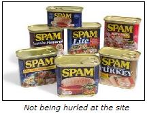
SpamI’m sorry to report that the site is currently receiving huge amounts of comment and trackback spam, and despite the filter managing to zap (literally) thousands of messages, a few are getting through, and are having to be deleted manually. This takes a silly amount of time, so apologies if posts are sporadic at the moment. As the filter updates over the coming days, I’m hoping the problem will resolve somewhat, though if it continues, I may have to consider other options like bringing back the captcha, which I’m not keen on doing, as it makes life difficult for large swathes of the population.

Is it worth making commenting more difficult for the sake of stopping this becoming a haven for the impotent and debt-ridden? It’s hard to tell. Let me know what you think.

It’s interesting to note that the number of spam emails making it through to my inbox has increased dramatically in the last few weeks, too. Presumably, the spammers have become wise to the latest attempts to stop them, and the next generation of spam-killers is required.

And then (yes, I know it’s a tenuous link) there’s the unwanted intrusion onto our TV programmes, with the confused Fathers 4 Justice invading last night’s National Lottery draw…

[flashvideo filename=”http://sjhoward.co.uk/video/jetset.flv” /]

If this site and blogging in general represents the supposed new media, and I’m posting videos of the supposed old media world of TV, does that mean I’ve just discovered a whole new medium, somewhere between old and new? 😉

This post was filed under: Site Updates, Video.

Three years of blogging

I’ve now been blogging for a total of three years. That is pretty incredible – it doesn’t seem a week since I first posted on The LBSC, let alone since I first went independent. It’s always difficult to know what to post for these parochial, ever so slightly meaningless anniversaries.

My first anniversary of posting was met with this post, and the announcement that those first hundred posts were to be released in a very limited-edition book, Tilly Talks, which has long since sold out. On this third anniversary, I can (in a somewhat bemused way) announce that the book is currently in the process of being extensively re-edited, and will be out on general release later this year (though hopefully not too much later!) as The Tilly O’Shea Thing. The idea of me having a book out in the shops is so bizarre that I’m not saying much more about it until it’s released – and then, readers here will be the first to know.

My second anniversary was marked with a revisit of my 99-point list of ambitions. Given that most have them have changed, and that reading the list is rather tedious, I’ve decided not to do that.

Instead, I’m just going to post a few facts and figures. Over three years, I’ve made 871 posts – a bit less than one a day – consisting of almost 200,000 words – about 175 per day, or about a novel a year. Over the last year, the site’s popularity has astounded me. In the year May 2004 to April 2005, the site received 378,630 hits – at the time, I thought that was phenomenal, showing as it does over 1,000 hits per day. From May 2005 to April 2006, the site received 1,573,243 hits. One and a half million! That’s well over 4,000 per day! Where are all of these people coming from, and what do they want with my random ramblings?

Anyway, I’d like to take this opportunity to thank all of my readers for their ongoing support. If you’re still here in three years’ time, hopefully I will be too!

This post was filed under: Site Updates.

Tweaking the site design… again

Regular readers will have noticed a bit of a change to the site. Essentially, the sidebar has gone, and been replaced by dynamic boxes, which appear and disappear according to which particular page you are on. These boxes have shifted to the right-hand-side. This changes very little functionally about the site, except for some tidying up of the Permalink pages – the ‘More about this post’ and ‘Related Posts’ sections are now in dynamic boxes, allowing comments to flow more freely from the bottom of the text. A menu has also magically appeared below the banner-head, replacing some of the sidebar’s functionality.

The aim of the change was to put more immediate emphasis on the latest content, that being what people visit to read. To aid this, the size of the headlines has increased by about 15%, and long titles now (rather cutely) shrink-to-fit, as best as possible (particularly in the ‘My Work’ section, there are still some two-liners). Also, external links have sprouted their own page as well, instead of being forever stuck in the sidebar. This allows more links to be added, which is a clear improvement. The site background has changed a little bit, too, and new posts no longer turn red for an hour after posting, as I felt this played against the unified blue design. The site guide has been updated to reflect the changes.

It’s almost six months since the last design tweak, so I don’t think I can be accused of changing too much too often! Overall, I hope you’ll agree that the freshened-up design gives the site a cleaner, clearer look. If you have any comments or suggestions, feel free to add them to this post. You know what to do!

This post was filed under: Site Updates.

Now part of the Google Family

I am deligted to announce that, as of today (1st April), this blog has become part of the Google Family.

Following on from our awards and recognition earlier in the year as one of the most comprehensive, amusing, and authoratative blogs on the web, a multi-million pound deal has been agreed with Google. The deal will see me continuing to work on the site, though now full time from a new base in New York.

I will be taking a short break from posting – Olaf Priol, the former Guardian columnist who leaves the newspaper on a high after today’s front page exclusive, will be filling in for the next fortnight, before joining the site permanently after the summer.

Thank you for all your support over the years – it’s great to see that the site’s true worth has finally been recognised. I hope that the support will continue into this new, incredible era for the site.

For more information on the deal, please see this new section of the site.

Hoax posted for April Fools’ Day 2006

This post was filed under: Site Updates.

Up-to-date again

I’ve just finished the WordPress 2.0.1 to 2.0.2 upgrade, meaning the site is (once again) bang up to date. For others wanting to do the same, information about it is here, the download is here, and the instructions are here.

This post was filed under: Site Updates.

An amazing couple of weeks

Bloggy AwardThe last couple of weeks have been really, really amazing for the site. The last two weeks have brought more hits to the site than the first three months of last year (more than 150,000 in all), mainly due to the somewhat surprising spread of this post, which certainly wasn’t hindered by the fact that it became one of the top results on Google for the search term “Denmark cartoons”. Quite how that happened, I have really no idea. The post was inevitably controversial – it generated (and is still generating) more comments than any other item ever posted on the site – over 70 in total.

And then today, I find out that I’ve won the above award, with a perfect ’10’ score. That’s just incredible. I have to say that I find the idea of winning award like this mildly embarrassing, because the site was never intended to be a huge thing, it’s just a place where I kind of vent my spleen, and make almost mental notes for myself for the future. I really have no idea who my audience is, because the stuff on the site is so ecclectic, I can’t see anyone liking it all. Yet clearly some people do. Some choice quotes from the Bloggy Award review:

Hilarious, absolutely hilarious, but refreshingly intelligent as well. This blog, run by a British medical student, runs the gamut from political commentary to a E! Hollywood-esque article on the romance of Barbie and Ken. One of the best ways to start the day.

It’s intelligent without being academic, opinionated without being arrogant, well-written without lapsing into the arrogant self-obsession that can often occur when you fall in love with your own wit. A fantastic read.

I love that they used the word ‘gamut’. I really love that. It’s just a lovely word. And I love even more that they feel I haven’t lapsed into arrogant self-obsession. Personally, I would’ve thought that registering a (or several, actually) domain name in your own name, then posting a load of personal thoughts with the presumption that someone will want to read them is a definition of arrogant self-obsession, but clearly that doesn’t come across in my writing. Which, I guess, is a Good ThingTM.

So thanks to the Bloggy Award people for their very kind comments, and their shiny little award. If I had a virtual trophy cabinet, it would have pride of place in it. But I don’t, so the sidebar will have to do.

Now, in an effort to be fair and balanced, let me include the comments of someone who isn’t such a fan of the site:

Sjhoward, bulshit bullshit, bullshit, bullshit

Sometimes, I love the bad comments more than the good. The official tagline of this site has been, for a long time, “The thinking man’s blog (provided you don’t think too much)”. Which is frankly terrible, which explains why it appears nowhere except for on the RSS feed. I’m beginning to think though, that “Sjhoward, bulshit bullshit, bullshit, bullshit”, complete with spelling errors, would be a fantastic alternative.

Whadya fink?

This post was filed under: Site Updates.

Bang up-to-date!

Just a very quick techie note to say the site’s now on WordPress 2.0.1, up from 2.0 (via). The upgrade was pretty quick and painless, which is always good 🙂

This post was filed under: Site Updates.

Goodbye 2005 – This Blogging Year

Given that 2005 is now all but wrapped up, I thought it would be good to go back and look at why it is that 2005 has been the most amazing year yet for sjhoward.co.uk. 

In 2004, the site generated 238,122 hits.  That’s quite a lot for a little site like mine.  In 2005, I’ve been blown away by 1,200,000 hits – the exact figures aren’t yet in at the time of writing, but that’s very nearly one million more hits than last year.  That is truly incredible.  Since January, the average daily number of hits has more than tripled. 

Of course, this popularity boom comes with inherent difficulties.  In the early part of the year, the site was plagued by Internal Server Errors as my host struggled to keep up with the sudden explosion in site traffic.  Over the course of the year, however, B-One have become used to the traffic level, and so Internal Server Errors have almost become a thing of the past.

This year has also been an incredibly prolific one, with 640 posts filed, and special sections set up for coverage of the devastating tsunami of 2004, and the political excitement of this year’s General Election, not to mention being asked to write for Channel 4 News.  The amount written, though, only reflects the amount that’s happened this year – it’s been incredibly busy, with news events covering the broadest possible spectrum of emotion.

On another subject entirely, I’ve conducted several experiments with advertising on the site this year, one of which is still ongoing.  I’m happy to report that, for the first time, the site has generated enough money to cover costs during 2005, and that’s something about which we can all be glad, as it will continue to allow me to innovate and introduce new features to the site.

On the subject of new features… at the beginning of 2005, there was only one way to access the site – visiting it at sjhoward.co.uk using a standard web browser.  Now, there are many more ways of getting your fix:  You can get us on your mobile, on your mp3 player, and in your email inbox to name just three, in addition to the traditional browsing method.

On the technical side, I started the year with Blogger and finished it with WordPress, following the ‘big move’ in January.  And some exciting news:  As of today, the site is running on the all-new WordPress 2.0. This should make the site faster and more reliable, and certainly does give me more to play with, in a more intuitive way, backstage.

Finally, I’d like to take this opportunity to thank all of my visitors, readers, advertisers, and others, for your support during 2005.  With you, it’s been a great year for the site, but without you, the site is nothing.  Thank you so much for your continuing support.

This post was filed under: Miscellaneous, Site Updates.

The great advertising argument

Regular visitors will have noticed the re-appearance of ads on the site. There is one ad per page, up at the top.

The site has been ad-free for a number of months now, but sites cost money to run, and as traffic continues to grow, so do costs. So ads are back, at least for a trial period, but the site remains, of course, completely free of commercial interference in the decisions taken as to what is posted. If that makes sense. Frankly, it probably doesn’t, so just read the legal bumpf found at the bottom of the sidebar if you’re especially worried. Which, frankly, you’re not.

Since I haven’t done a ‘This Blogging Month’ type post for a while, I might as well give you a quick update on site performance: The site’s millionth hit this year was reached last month, and the site is continuing to attract over 4,000 hits per day, or over 120,000 per month. Most visitors to the site are from the States (nearly a third, in fact).

So there’s a very brief update for you, and I hope you don’t find the advertising too intrusive.

This post was filed under: Site Updates.

Tidying things up

Over the last week or so, you may have noticed a few changes on the site. First off, and perhaps most noticeably, the site’s ‘masthead’ has changed. The main aim of this exercise was to get rid of the old ‘design’, which was only ever really intended as a placeholder until I converted the original sjhoward.co.uk logo into something a little more respectable. What I’ve now ended up with is an amalgamation of features of both designs, which I think works quite well. As ever, your thoughts are also appreciated.

I’ve also tidied up the post title and information thingy, so that they’re now connected, and made some subtle positional changes with the sidebar and paragraph lines to make the posts stand out a bit more, and look clearer and less cluttered. Blockquotes have become rather lighter in every sense of the word, too.

The way comments are displayed has been tweaked, to make things a little clearer, and the sidebar has been lengthened with a few more things added, and archives fully expanded instead of hidden in a drop-down.

The changes are pretty small, but I think they generally improve the appearance of the site. If you think otherwise, then feel free to get in touch through commenting or email, and I’ll try my best to respond to your concerns.

Update
In other good news, thanks to more advanced spam filtering, you now don’t need to enter any graphically displayed security code to post a comment on the site. This provides a major improvement for our visually impaired readers who use screenreaders, which makes commenting rather tricky since they can’t read the graphic. Hurrah!

This post was filed under: Site Updates.


The content of this site is copyright protected by a Creative Commons License, with some rights reserved. All trademarks, images and logos remain the property of their respective owners. The accuracy of information on this site is in no way guaranteed. Opinions expressed are solely those of the author. No responsibility can be accepted for any loss or damage caused by reliance on the information provided by this site. Information about cookies and the handling of emails submitted for the 'new posts by email' service can be found in the privacy policy. This site uses affiliate links: if you buy something via a link on this site, I might get a small percentage in commission. Here's hoping.