I’ve been to Battersea Power Station
I am the sort of heretic who, if asked, would have supported the recent transformation of (part of) Battersea Power Station into a shopping centre. The same part of me that has been whinging recently about the stasis of cathedrals would have praised it as an interesting bit of repurposing, celebrating heritage by making something new of it.
I’ve been down to the Power Station a couple of times in recent years, before the main building opened, so the surrounding ‘distinctive’ (ugly) flats and mildly preposterous ‘community’ shops weren’t a surprise. But this time, I was able to venture inside, and I was surprised at what I found.
It is utterly soulless. It has the feeling of a shopping centre in a second-rate European railway station, the sort that behooves one to grip one’s backpack straps a little more tightly and quicken one’s pace.
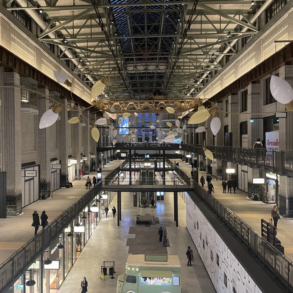
This isn’t helped by the lighting scheme. It seems to have been designed to with ‘traditional’ warm white lighting set against mostly matte black fixtures and fittings throughout. I suspect this was designed to be sympathetic to the building, but instead it clashes at every turn with bright white retail lighting and flashy screens—while leaving corridors feeling threateningly dark. There are more narrow, dark, low-ceilinged corridors than one would imagine in a newly opened premise, which I guess is a side-effect of the conversion. This atmosphere might improve as the centre’s occupancy rate rises and injects some life into the place, but many of the warm-white LED fixtures have already acquired a flicker that suggests the LED controller is faulty. Low-level flickering lighting in a dark space gives an oddly rundown feeling to a venue that isn’t even yet fully open.
The grey-ish terrazzo flooring—somehow already looking dirty—only adds to the rundown railway vibe. Incongruous touches of brass and wood here and there, as though someone felt that the scheme needed warming up a bit, look more like non-matching “patched” bits than a design scheme.
For reasons surpassing understanding, the architecture is left to fade into the background. Look at the picture at the top: beautiful columns virtually unlit, while shop names, flashy screens and two incongruous food trucks are brighter than the sun. Why would anyone do that?
Maybe I’m judging it too soon. Perhaps it will seem better when more units are occupied, and the whole thing feels a little more lived in. I don’t think I’ll hurry back, but potentially in a couple of years this will seem like another “he clearly didn’t know what he was talking about” post.
This post was filed under: Post-a-day 2023, Travel, Battersea Power Station, London.