178 words posted by Simon on 14 April 2012

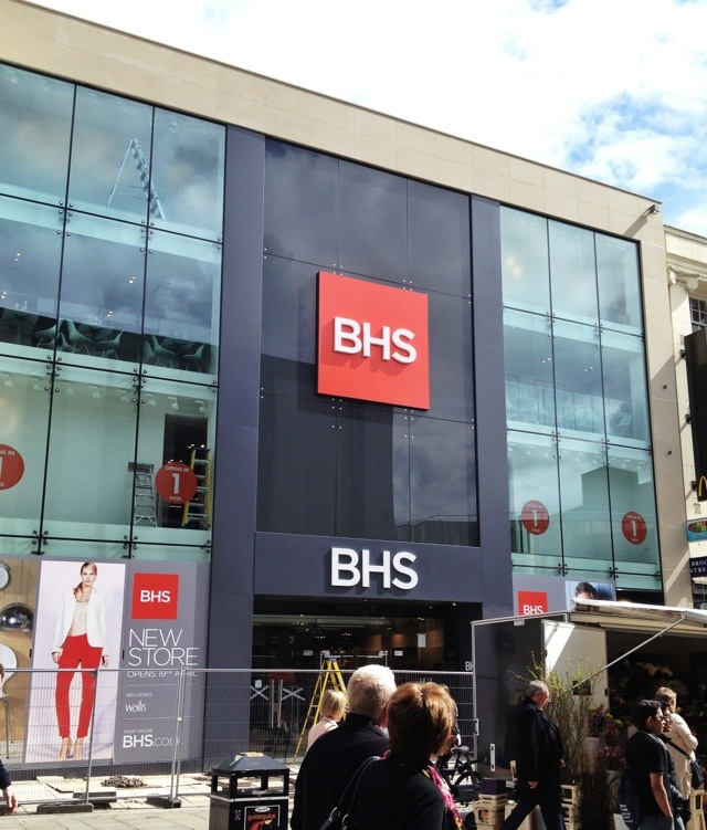
I’ve spied the new BHS on Newcastle’s Northumberland Street this afternoon. It’s in the building vacated by Next after they shuffled off into Eldon Square, and is a few doors up from its previous home, which has been subsumed into the expanding Primark.
Graham Soult has some great before-and-after comparison shots to see the impressive scale of the building’s transformation.
On my visit, my eye was drawn to the cafe on the second floor with floor-to-ceiling windows, which strikes me as a little vertiginous. I’m also not entirely keen on having two BHS signs above one another – I understand the logic (the higher one isn’t terribly visible from the doorway), but couldn’t they just have put a logo on the doors? There were six big visible logos on the frontage on my visit (four on posters), and it really cheapens the brand.
Anyway, I’m being picky. It’s a nice looking shop from the outside – certainly moreso than the old, unloved Next – and it’s a relief to get rid of some of Northumberland Street’s scaffolding!


