About me
Bookshop

Get new posts by email.

About me

Photo-a-day 290: South Marine Park

20121016-201525.jpg

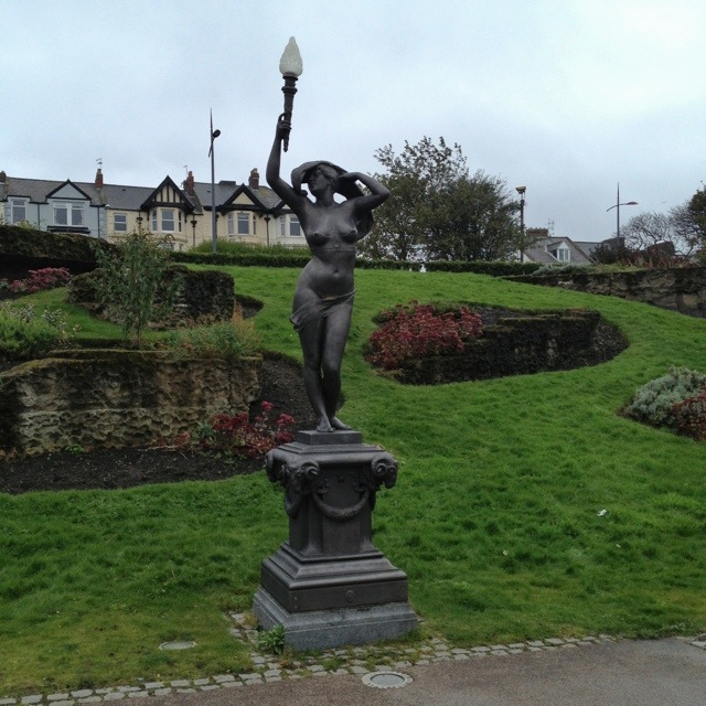
South Marine Park in South Shields opened in 1890, designed by John Peebles. It underwent an extraordinary renovation in 2008, returning many of the lost Victorian features to the park, and restoring those that remained.

The overall effect is quite remarkable, even on a dull grey day like today.

20121016-201928.jpg

These statues have been a source of some disquiet since their first installation, with many campaigning for them to be removed, even up to the recent restoration!

But all-in-all, this small park seems a lovely place to take a stroll. Today was my first visit, but I’m quite sure I’ll be back!

20121016-202130.jpg

This post was filed under: Photo-a-day 2012, , .

Photo-a-day 289: Strawberry lemonade

20121015-205933.jpg

I tweeted about discovering Costa’s strawberry lemonade a few weeks ago, but it probably bears repeating… When I worked in Calgary (and when I holidayed in Toronto) I really enjoyed Second Cup’s strawberry lemonade, and was quite disappointed to find that no coffee shops sold it in the UK on my return. But five years on, Costa has started selling it, and whilst it isn’t quite as lemony as Second Cup’s, it is pretty good!

This post was filed under: Photo-a-day 2012, , , .

Photo-a-day 288: Millennium rainbow

20121014-220332.jpg

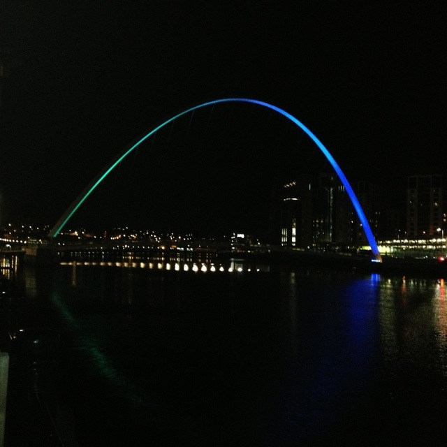
This is a picture I took earlier in the week of the Millennium Bridge lit up, as it is every night, in its rainbow-like colour scheme. The current lighting system was installed in 2009, and is LED based for super energy efficiency.

It’s the (first, second, third, fourth) fifth time I’ve featured the bridge this year, so you may be bored of seeing it by now…! In my own defence, this is the first night-time shot of it!

This post was filed under: Photo-a-day 2012, , , , .

Photo-a-day 287: Bus stop

20121013-165210.jpg

Here’s something you don’t see everyday: a bus stop being delivered and installed! Even the giant red kite in the background looks a little surprised at the sight!

This post was filed under: Photo-a-day 2012, .

Photo-a-day 286: Glass escalator

20121012-153227.jpg

This is a bit of the pretty escalators in Newcastle’s Monument Mall, whose workings are shown as a result of tge sides of them being glass. I guess these escalators are not long for this world as the mall is being in-filled to provide a series of bigger restaurant and shopping units accessed from the street. It seems a shame, because they’re certainly attractive and unusual!

20121012-153429.jpg

This post was filed under: Photo-a-day 2012, , .

Weekend read: How Britain fell in love with Krispy Kreme

I’m featuring another of the Guardian’s retail analyses this week, and once again it’s by Emine Saner. This one is all about the rise and rise of Krispy Kreme in the UK. I just wish public health could emulate the marketing success built by some of these hugely successful brands in a very short space of time!

This post was filed under: Weekend Reads.

Photo-a-day 285: Autumn

20121010-161302.jpg

With so many leaves underfoot, and so many central heating systems being turned on, there’s no denying that autumn is here.

This post was filed under: Photo-a-day 2012, .

Photo-a-day 284: Map

20121010-160433.jpg

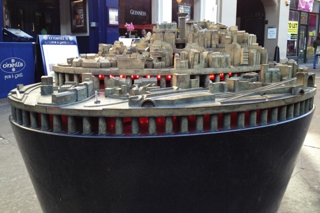
This plan, the Grainger Town Sculptural Map, can be found just across the road from Newcastle Station. It was designed by Tod Hanson and Simon Watkinson, and put in place in 2003.

The idea is that the buildings have been reduced to their “essential forms” – no Earl Grey atop the Monument, for example – to provide an enjoyable spotting challenge to locals and tourists alike. When I first saw it, though, I didn’t realise it was meant to be a representation of the local area, so it didn’t really challenge me at all. Whether that’s a comment on the artwork or my own dimness, I’m not sure.

Here’s another angle that shows the pretty lights within:

20121010-161044.jpg

This post was filed under: Photo-a-day 2012, , .

Review: Religion for Atheists by Alain de Botton

I really like Alain de Botton and his accessible, absorbing approach to philosophy. When I read the press coverage surrounding the book launch, which included de Botton’s arresting announcement that he wanted to build a secular temple, I was intrigued. But, in the end, I really didn’t enjoy this book, I’m afraid.

The structure of each chapter is very formulaic:

  1. Identify a positive aspect of religion
  2. Cite a singular example of where this is lacking in modern society
  3. Propose a secular solution

The majority of his arguments collapse at stage 2. For example:

  1. Churches get strangers talking to one another
  2. Restaurants don’t
  3. Set up new restaurants

The problem, of course, is that the assignment of this quality to restaurants is arbitrary. There are plenty of secular places and events, from knitting circles to Skeptics in the Pub, where strangers are encouraged to talk and interact. I simply don’t accept the premise that this is a function of religious society that is absent from secular society.

Similarly:

  1. The church guides us on practical life skills
  2. Universities teach fact-based courses like history, with little regard for life skills
  3. Change university curricula

I studied at a university with an Institute for Health and Society and a Campus for Ageing and Vitality: I don’t accept the premise that universities only offer impractical courses.

And so it goes on. Almost every chapter is built upon one of these illogical leaps – and, not only that, but the structure of the book gives little expression to the downsides of the prescribed form of living encouraged by religion, and its secular reversioning encouraged by de Botton.

Overall, this was a disappointing and frustrating read from one of my favourite authors. It feels a little like a cynical attempt to cash-in on the growing popularity of secularism. I sorely hope de Botton returns to form with his next work!

Religion for Atheists is available now from amazon.co.uk in hardback and on Kindle.

This post was filed under: Book Reviews, , , .

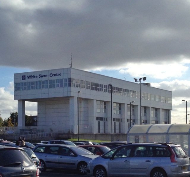
Photo-a-day 283: White swans

20121009-153333.jpg

After telling you about one interesting Killingworth building earlier, here’s another: the White Swan Centre.

This building too originally dates back to Killingworth Township’s day. It was originally a mammoth 1960s office building, but – like most of the Township buildings – was disused by the 1990s. By the late 1990s, plans were afoot to reduce it in height, give it a makeover, and move into this building all of the services – like the GP surgery and library – that were previously housed in the Township’s high-level shopping precinct.

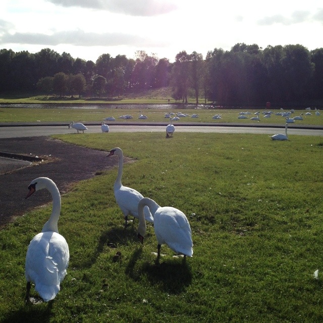
Local schoolchildren were given the task of naming the new improved building, and took inspiration from the hundreds of residents of Killingworth Lake:

20121009-154236.jpg

This post was filed under: Photo-a-day 2012, , .


The content of this site is copyright protected by a Creative Commons License, with some rights reserved. All trademarks, images and logos remain the property of their respective owners. The accuracy of information on this site is in no way guaranteed. Opinions expressed are solely those of the author. No responsibility can be accepted for any loss or damage caused by reliance on the information provided by this site. Information about cookies and the handling of emails submitted for the 'new posts by email' service can be found in the privacy policy. This site uses affiliate links: if you buy something via a link on this site, I might get a small percentage in commission. Here's hoping.