About me
Bookshop

Get new posts by email.

About me

I’ve been to see Glass World

The National Glass Centre has curated an exhibition to show the influence of international studio glass styles and techniques on the British studio glass scene. It features work representing the practice in thirty different countries.

Here are three objects that stood out.

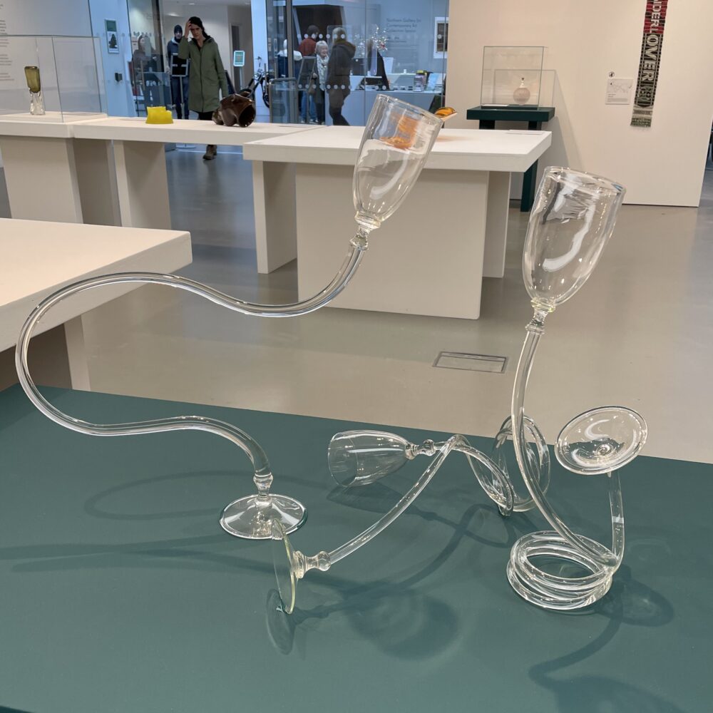
This is Dancing Goblets, a 2021 work by Sacha Delabre. Delabre grew up in France and studied for a BA in Glass on the internationally renowned programme at Sunderland University. He now works at the Glass Hub down in Wiltshire.

I’ve previously seen the left-most of the three goblets exhibited on its own. I was taken by its surrealist form. Seeing these three pieces together brings out the dynamism of the dancing. They are wonderful.

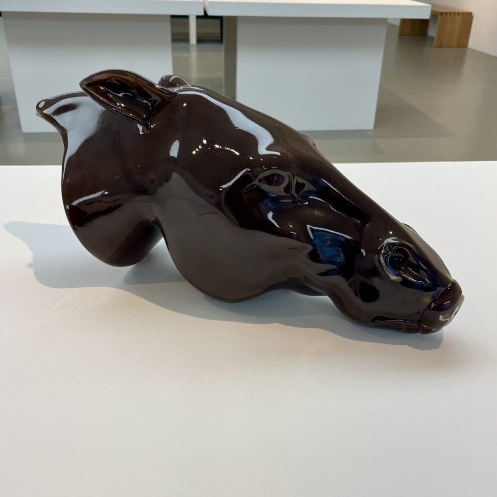
I didn’t react as emotionally to this 2016 untitled work by Czechia’s Martin Janecký, but I was amazed. The detail and complexity of the large form seemed incredible.

My visit to the exhibition of work by Neil Wilkin and Rachael Woodman earlier this year taught me something about the challenge of working with glass. It is hard to comprehend how Janecký made such a detailed, lifelike form from such an uncompromising material.

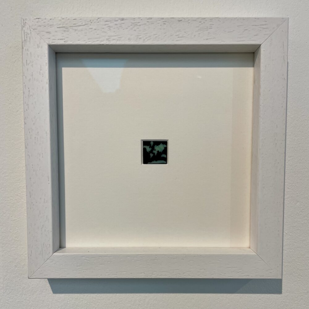
Map of the World, diminished by Inge Panneels is a tiny 2023 work, perhaps only a couple of centimetres square. Slightly cheekily, this work apparently represented Belgium, Scotland and England on the basis that Panneels is from Belgium, taught in Sunderland and works in Scotland.

This stood out to me, combining the aspects I liked in the previous two works. It is surrealist: the practical map is rendered impractical through its tiny size. It’s also an astoundingly detailed representation of a familiar form rendered in an uncompromising material. It’s brilliant.


Glass World continues at the National Glass Centre until 10 March.

This post was filed under: Art, Post-a-day 2023, , , , , .

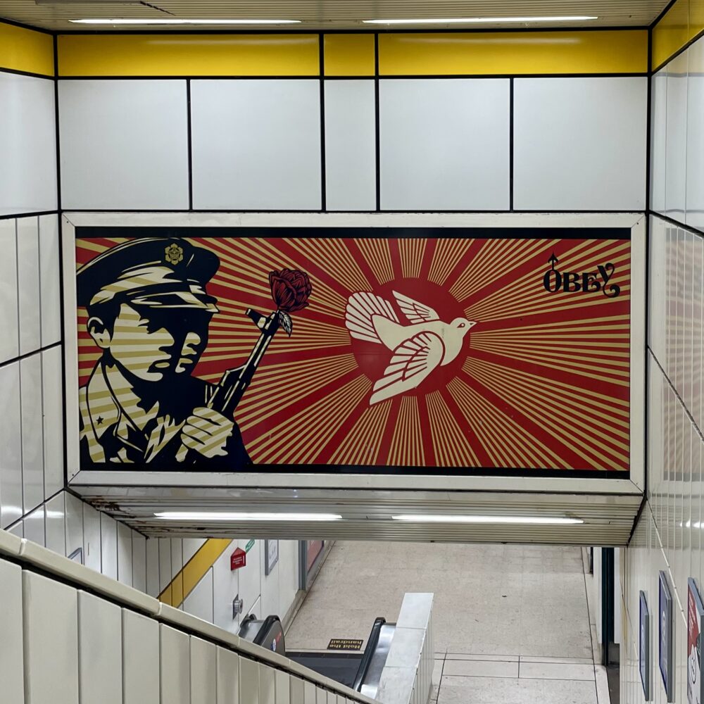
Obey

This post was filed under: Art, Post-a-day 2023, , , .

I’ve been to see ‘Longing for Nature’

Whenever I’m at Schiphol, provided I’m in the non-Schengen zone, I try to make time to pop into the tiny branch of the Rijksmuseum. The current exhibition is ‘Longing for Nature’, and I thought it made quite a nice partner to the ‘Essence of Nature’ exhibition I saw at The Laing earlier this summer.

Whereas ‘Essence of Nature’ was about the changing artistic representations of nature, ‘Longing for Nature’ is about the shifting relationship between humankind and the natural world. The exhibition focuses on the 19th century, which was a period of immense change in this relationship. The exhibition posits that, in the early 19th century, nature was considered indestructible and immutable. The Industrial Revolution clearly challenged that perception.

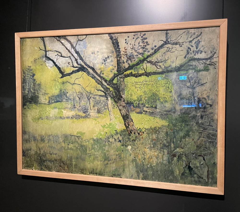
I think that’s a hard case to demonstrate with such a small exhibition. Yet, I was struck by this painting: Orchard at Eemnes by Richard Roland Holst. From ‘Essence of Nature’ I’d learned about how art moved from aiming to be photorealistic in the pre-Raphaelite era to being more about character and atmosphere later on. Seeing this in the context of ‘Longing for Nature’ made me realise that the latter is filtering the scene through the human experience.

Just as popular perception shifts from nature being immutable to humans having an impact, we also started to consider nature in art through the human experience, rather than appreciating its essential quality. That surely can’t be coincidental.


‘Longing for Nature’ doesn’t have a publicly advertised end date but is on now at Rijksmuseum Schiphol.

‘Essence of Nature’ continues at The Laing until 14 October.

This post was filed under: Art, Post-a-day 2023, Travel, , , , , .

I’ve visited ‘Confluence’

What happens when you take three artists who are used to working in ceramics and give them a ten-day residency at the National Glass Centre? They try to explore ideas in a new material, resulting in an exhibition that—for me, at least—didn’t really work.

The three artists involved were Bouke de Vries, Andrea Walsh and Andrew Livingstone.

Andrea Walsh experimented with the fluidity of glass and ceramic, seeing how each could be made to fold or flex, almost like fabric. Her pieces were mostly tiny and intricate. They felt a bit like the artists’ artist’s response to the challenge, in that they explored the material, but didn’t offer an awful lot to a casual observer like me. I don’t really know how fluid ceramics can be, so a comparison with glass was a bit lost on me.

Bouke de Vries’s work seemed to mostly involve putting ceramic pots in glass boxes, marked with words like ‘fragile’ and ‘handle with care’. I appreciated the whimsy of doing that in glass, but I didn’t get much beyond that. According to the labels, the artist was intending to draw some connection with Vermeer’s Milkmaid, which appeared as four tapestries, but I didn’t really understand how the whole thing was supposed to fit together.

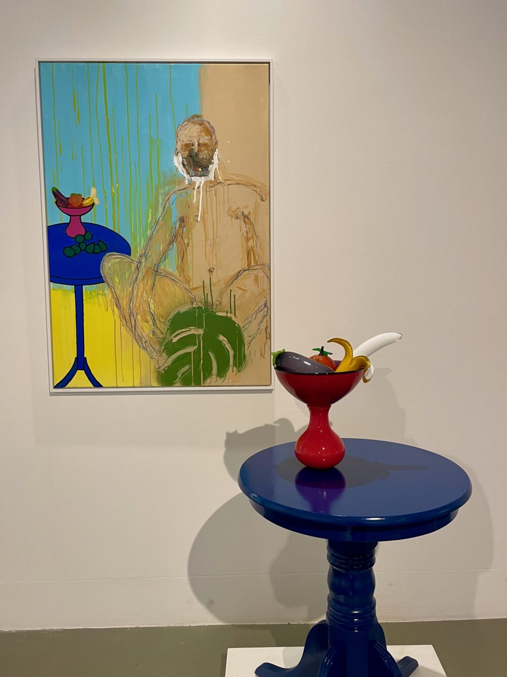
Andrew Livingstone exhibited a bowl of glass emoji-like fruit which I enjoyed, and which was displayed alongside the artist’s earlier painting which featured the fruit. I thought this was an amusing commentary on his style and the artistic process, upending the usual way in which still life art works. Until I read the label, I didn’t realise that there was another sexual layer of meaning in that the fruits are all used in ‘sexting’ and also reference ‘fruit’ as a homophobic slur.

Livingstone also exhibited a glass model of a house in its own section of the gallery, surrounded on the floor by what3words grid references. I had no idea what this was all about: according to the label, it aimed to “explore ceramic and glass as queer politically charged materials.” I didn’t get it, not least as there wasn’t even any ceramic in the piece, as far as I could make out.

All things considered, I suspect this exhibition would be of more interest to those with some background knowledge or experience of working artistically with ceramic or glass than it was to me.


Confluence continues at the National Glass Centre until 10 September.

This post was filed under: Art, Post-a-day 2023, , , , , .

I’ve visited ‘Fiona Crisp: Weighting Time’

Weighting Time is an exhibition of Fiona Crisp’s work spread over two different locations on two different sets of dates. I’ve been to see the portion exhibited at the Northern Gallery for Contemporary Art: the portion at Sunderland Museum has already closed.

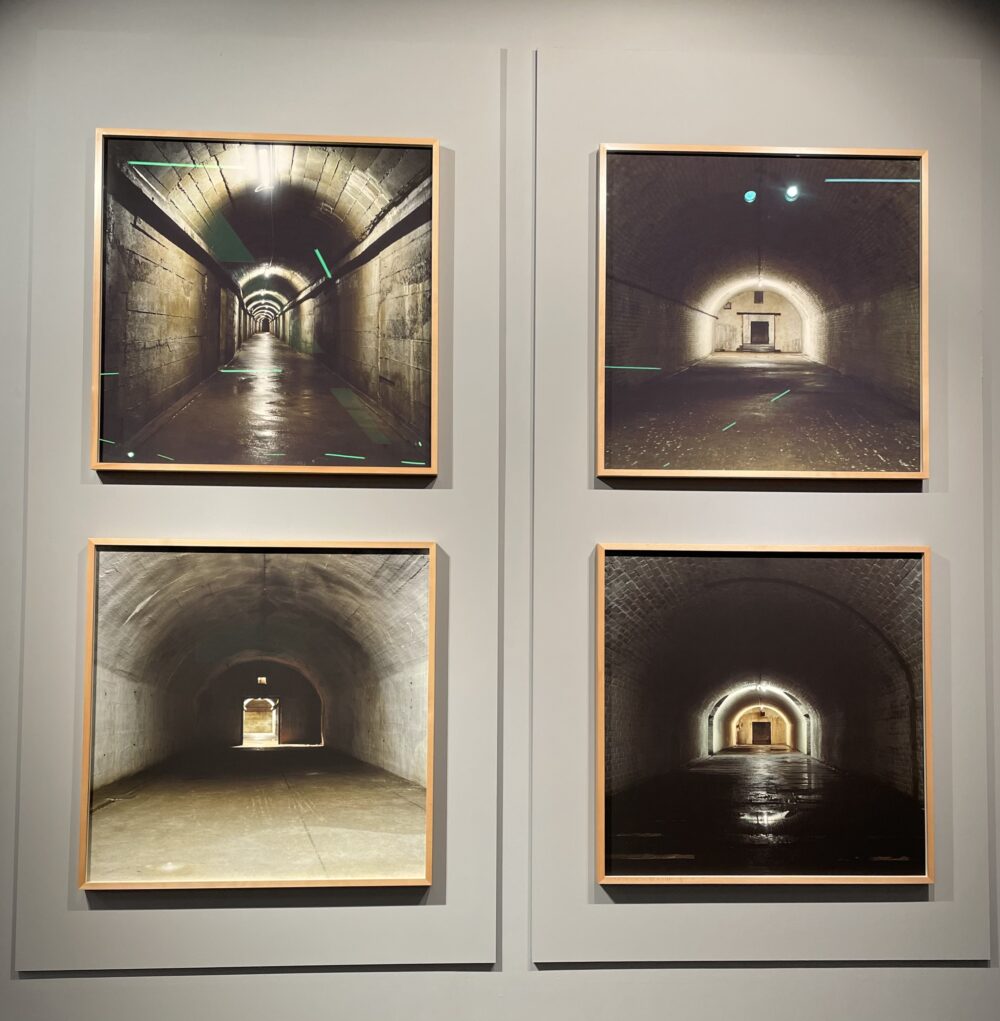
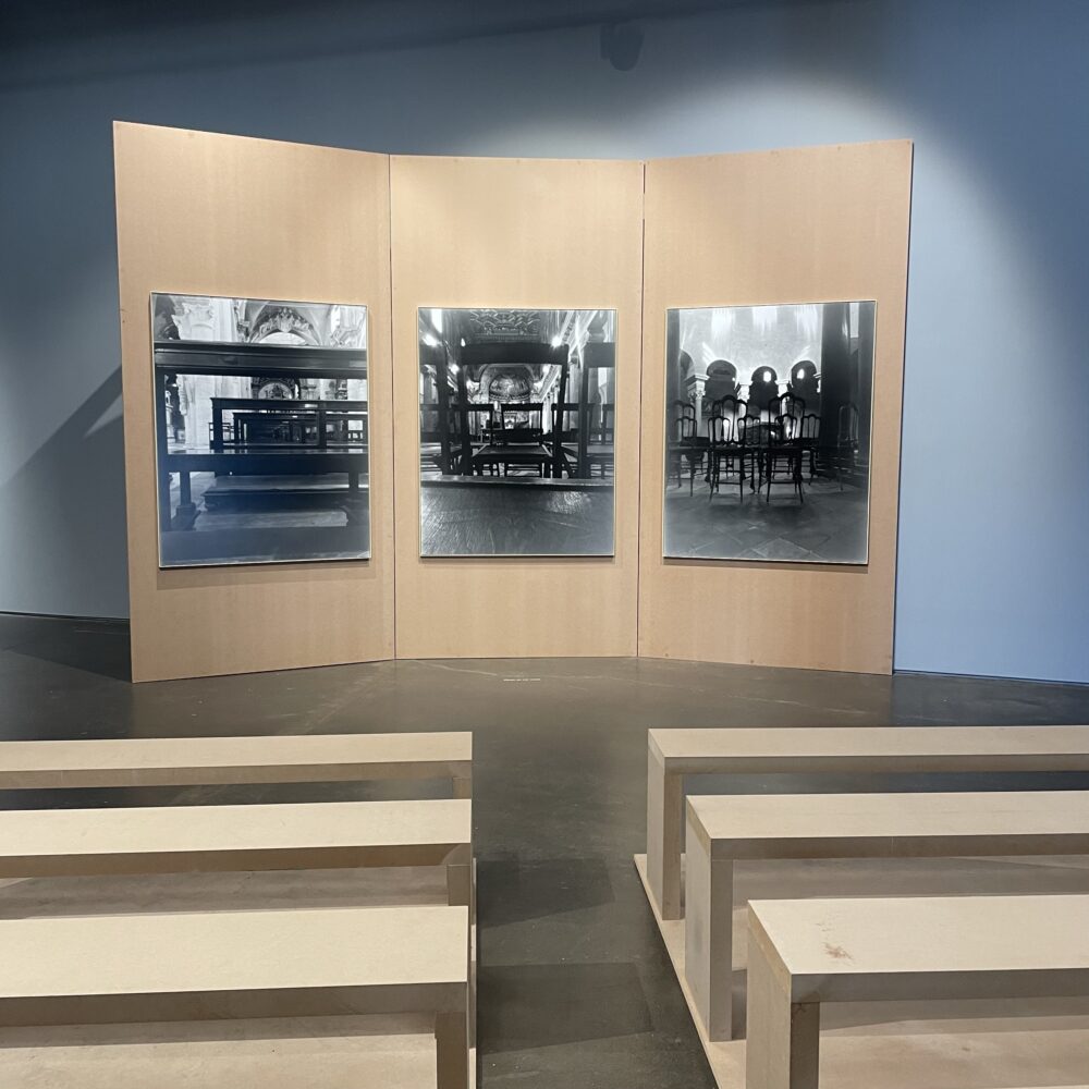
This was a small exhibition of photography and film drawn from across Crisp’s thirty-year career. Included were representations of large, deep underground industrial spaces, which contrasted with images of similarly structured above-ground buildings, such as theatres and cathedrals. Both seem like otherworldly spaces.

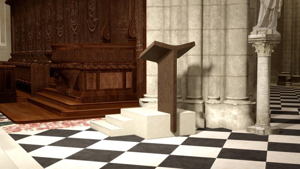
A film installation took us driving through the Boulby Mine which stretches out under the North Sea, to space imagery travelling through time itself. The industrial aesthetic of the Northern Gallery for Contemporary Art complemented the work which also includes structures and seating designed by the artist to help viewers to contemplate the work.

I found this intriguing and enjoyable, though perhaps too small to be fully immersed or to completely appreciate all the ideas Crisp had in mind. Though, that feels like unfair criticism when I have effectively only seen half of the exhibition.


Fiona Crisp: Weighting Time continues at the Northern Gallery for Contemporary Art until 3 September. A virtual version is also available online, if you’re into that sort of thing.

This post was filed under: Art, Post-a-day 2023, , , .

The last suppers

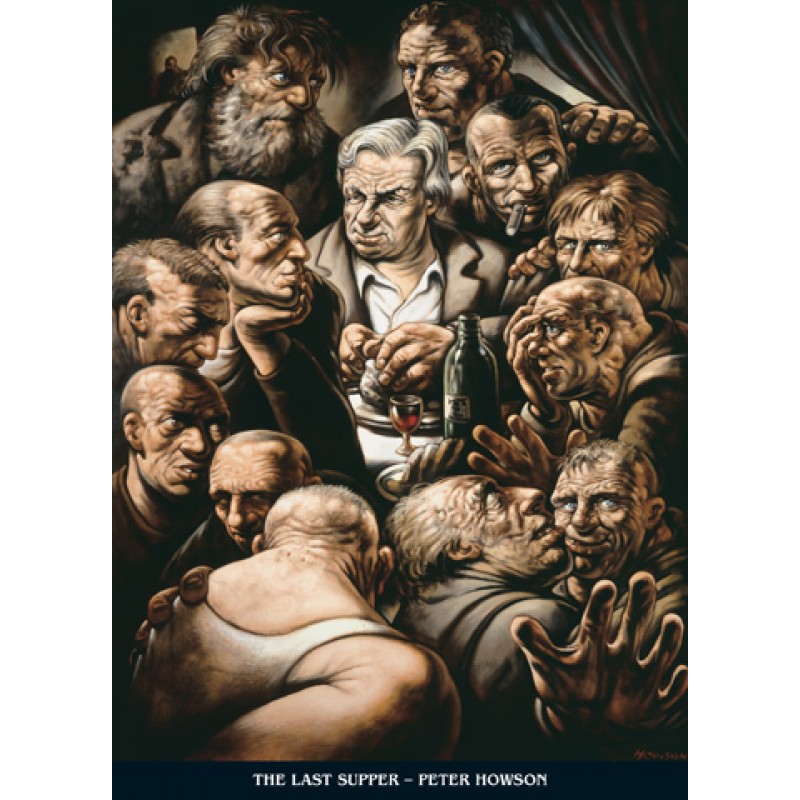
I told you a few days ago about going to visit a Peter Howson retrospective. While I was there, I saw his 2006 painting of The Last Supper.

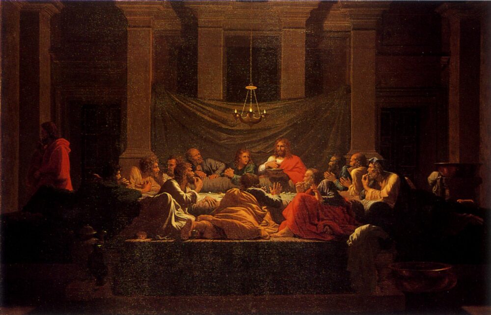
While waiting for my train home, I popped into the National Gallery and happened upon Nicolas Poussin’s 1694 painting of (essentially) the same scene, The Sacrament of the Holy Eucharist.

Generally, I prefer more abstract paintings to ones with photo-like realism, but this pairing disproves that rule.

The Howson painting is clearly more abstract, yet I prefer the Poussin. I particularly like Poussin’s use of symbolic light. I also think the composition is clever: unlike most representations of the Last Supper, Poussin has shown the disciples seated around a table. Poussin’s disciples all seem to me to have their own personalities, whereas Howson’s seem more like an indistinct group.

I’ve probably seen more exhibitions this year than in the rest of my life combined, so it’s perhaps not surprising that some of my preconceptions are being challenged—but it nevertheless feels arresting to me!

This post was filed under: Art, Post-a-day 2023, , , .

I’ve been to see ‘When the Apple Ripens’

I don’t proclaim to be an art expert, or even a knowledgable amateur. Prior to visiting this major retrospective exhibition, despite his fame and acclamation, I couldn’t say I knew who Peter Howson was.

Born in London, Howson spent his formative years in Ayrshire before venturing off to study at the Glasgow School of Art. Today, he is a highly celebrated figurative artist.

During the early 1990s, he took on the role of the official ‘British war artist’ for the conflict in Bosnia, an experience that left a profound imprint on his mental and emotional wellbeing. A decade later, he found comfort in Christianity, a shift that brought a religious focus to his work. In recent years, he has crafted artistic responses to Brexit, the pandemic, and various other contemporary events.

Admittedly, Howson’s figurative and almost cartoonish style doesn’t particularly resonate with me. However, in a three-floor mega-exhibition, there are bound to be a few stand-out pieces. Below, I’ve highlighted three artworks that captivated me more than the rest.


This is My Tale Shall Be Told, a 1995 work which is apparently based on William Hogarth’s 1730s series A Rake’s Progress. I’m not familiar enough with art history to appreciate that.

I liked this because of the surrealism and the bold colours. I liked that the girl in the background had a Munch-like scream at the scene of the bearded lady inexplicably attempting to ride a dog. I like the way that the child in the foreground is contorted in a way which looks natural at first glance, but impossible on a closer inspection. The recognisable inclusion of the ‘fat controller’ gave this a grounding in the real world.

I especially enjoyed the way that the paintbrushes were left colourless in such a colourful scene.


This is a 1994 piece from Bosnia, called Serb with Child. I was struck by the abstract nature of this piece, which isn’t typical for Howson. I thought it said something about the way that the anger and violence were more prominent for him than the specifics of the awful situation.


From the same period, this is House Warming. Here, the contrast between the horrific, violent events in the foreground and the everyday scene in the top-left of the canvas is striking.

This helped to bring home to me the reality of living in a war zone. The contrast between everyday life and the battle surrounding it has been much-observed in the current conflict in Ukraine. But, as only art can, I think this representation made me ponder the reality of living through a situation like that.

I also thought that the juxtaposition said something about how close we all are to violent conflict: it seemed like it was commenting on the fragility of society, and how easily any society can tip over into unrecognisable violence.


When the Apple Ripens: Peter Howson at 65 continues at the City Art Centre until 1 October.

This post was filed under: Art, Post-a-day 2023, , .

I’ve been to see ‘Shifting Vistas’

This small exhibition covers 250 years of artistic representations of Scottish landscapes… although in a slightly odd curatorial decision, some paintings are of landscapes in other parts of the world.

This is a small exhibition, but there were a few pictures which were new to me, and which I particularly enjoyed. I didn’t take any of the pictures in this post, as photography was forbidden.


This is one of Joan Eardley’s seascapes. I think it is the one I saw in the gallery, showing Catterline near Stonehaven, but I may be mistaken. My memory isn’t photographic, and there’s no published catalogue to compare against.

I like the dynamism and emotion that this painting captures: it’s recognisably a seascape, but it strikes me that there’s much more in it to explore. I particularly like the contrast between the chaotic sea and coastline compared to the calmness of the sky. It drew me in.


This is William MacTaggart’s 1974 work, Autumn Leaves. Regular readers will know that my colour vision isn’t great, but I love the warmth of the oranges and reds of this painting. I was drawn to the inspired combination of the autumn scene with sunset, given that autumn feels a bit like the sunset of the year. There’s something peaceful and reflective about this painting.

I also like the prominence of the blue and purple elements which wouldn’t necessarily be expected, and the recognisable building in the back of the picture. It was another picture that I found absorbing.


This is The Valley of the Shadow, Loch Coruisk by Robert Burns. Represented as it is above, this painting doesn’t really move me. In the gallery, it seemed considerably more abstract, the forms of the mountains and the loch being much less clearly discernible. It turns out that it’s actually disappointingly literal.

This is, I think, attributable to something that irritated me throughout this exhibition: the lighting. The gallery seems to have positioned spotlights on each painting—so far, so normal—but they seem to be undiffused. This means that the glare and reflections on canvases makes some works really quite difficult to see: I had to duck and weave to get an impression. I’m not sure if the space has been recently refitted or something, but it’s really not working as well as it could.


Shifting Vistas: 250 Years of Scottish Landscape continues at the City Art Centre until June next year.

This post was filed under: Art, Post-a-day 2023, , , , .

I’ve visited the Chris Killip retrospective

Before I visited this exhibition, I had no idea who Chris Killip was: perhaps that makes me too ignorant to have an opinion on this major retrospective of his work.

If you are as clueless as me, then I should explain that he was one of the most celebrated and important post-war documentary photographers of the UK. He was especially known for his 1980s photography of Tyneside, published in a landmark book called In Flagrante in 1988. His work intended to show, as he put it, ‘not those who made history, but those who had history done to them.’ He was born on the Isle of Man in 1946 and died from lung cancer in 2020.

Killip was a co-founder at the original creator of the Side Gallery in Newcastle, which—with unbelievable timing—closed due to a lack of funding in April 2023, while this major retrospective exhibition was running just a stone’s throw away.

When I visited last week, a couple of months into the run, the exhibition was heaving. It was like something at the British Museum. The place was packed.

I’m waffling. And I’m waffling because I’m trying to minimise the fact that this sort of photography does very little for me. I don’t feel any emotional connection to it, and I don’t feel drawn to it. It just isn’t my kind of thing. I much preferred the personality and humour on display in Mark Pinder’s retrospective earlier this year. I also wasn’t keen on the decision to display the photos in glass frames in a brightly lit environment, which meant that reflections made them—in a very practical sense—quite hard to actually see.

I’m trying to minimise that because I don’t want to put you off. Even The Telegraph—the newspaper least likely to enjoy photographs of poor people from the North—gave it four stars. The interest and joy that the photographs in this exhibition inspired in other visitors was greater than anything else I’ve seen this year, bar Vermeer. I don’t to hold back anyone from having that kind of experience… even if it didn’t have that effect on me.


The Chris Killip retrospective continues at the Baltic until 3 September.


The picture at the top is my photograph of Killip’s photograph called Bus Stop I. I chose this entirely because the name reminded me of Diamond Geezer’s detailed coverage of Bus Stop M. This probably says something about my level of engagement with the work.

This post was filed under: Art, Post-a-day 2023, , , .

I’ve been ogling ‘Apollo Remastered’ by Andy Saunders

This book is a collection of photographs of the Apollo missions to the moon. I managed to pick it up for £10 in a sale, while Waterstones are still listing it at £60.

The photographs taken during the missions were obviously taken on film. The film has been stored in a secure freezer ever since, the better to stop it degrading. The films were recently defrosted, cleaned, and scanned at extremely high resolution. Despite this, the quality of the images themselves remains relatively poor: for example, as they were designed to be back-lit, they tend to be underexposed.

Andy Saunders took those detailed scans and manipulated them to produce authentic yet extremely clear versions. He talks in detail in the book about how he went about this, and how he chose to judge the line between accurate representation and artistic manipulation.

I found this fascinating to flick through. I had expected to be drawn mostly to the detailed photography of the technology of the era, but in fact, that didn’t affect me much at all.

There were three things that stood out.

Firstly, the wonderful photographs of the astronauts. Many of these look like beautifully shot and lit portraits. They bring out the humanity of the endeavour, and it helped me to understand the personal risk each of them took by participating in this programme. Every human being who has ever walked on the moon is included in this book. It is also impossible not to be struck by the fact that all twelve are white American men.

Secondly, the astonishing pictures of the earth. I’ve seen many of these pictures countless times over the years, but seeing them presented in this book, in stunning clarity, gives something of a new perspective.

Thirdly, the focus on the USA. It has never really struck me before how absurd it is to have a spacecraft floating in magnificent isolation with the letters ‘USA’ painted on it. I’ve never truly considered the madness of planting an American flag on the moon. But there is something about contemplating the astonishing photographs in this book which made me think about how narrow one’s view of the world must be to ‘brand’ the mission as the product of a country.

A couple of months ago, I watched and recommended the film Apollo 11, composed entirely of archive footage of that mission. My reaction to the film was to be awed; my reaction to these photographs was more contemplative. I think both are worth seeking out.

This post was filed under: Art, Post-a-day 2023, , .


The content of this site is copyright protected by a Creative Commons License, with some rights reserved. All trademarks, images and logos remain the property of their respective owners. The accuracy of information on this site is in no way guaranteed. Opinions expressed are solely those of the author. No responsibility can be accepted for any loss or damage caused by reliance on the information provided by this site. Information about cookies and the handling of emails submitted for the 'new posts by email' service can be found in the privacy policy. This site uses affiliate links: if you buy something via a link on this site, I might get a small percentage in commission. Here's hoping.