Fact-checking artwork
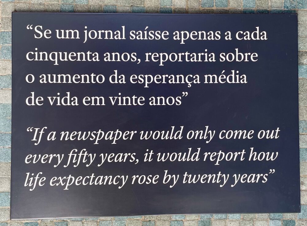
In a subway in Lisbon, there’s a 2024 cork artwork by Sagmeister & Walsh that spells out a sentence, repeated on a nearby plaque for much easier reading:

If a newspaper would only come out every fifty years, it would report how life expectancy rose by twenty years.
I scoffed to Wendy that this couldn’t possibly be true. In the UK, life expectancy has increased by about a decade since the 1970s and is now in decline. Surely Portugal couldn’t be so different?
With her usual sagacious wisdom, Wendy suggested that it was probably not meant to be taken literally. We were probably supposed to contemplate the negativity bias in the news and note how poorly it reflects the long-term improvements that I talk about regularly in a professional context.
But I couldn’t let it drop, so I did the research. Astonishingly, the artwork is reasonably accurate.
In the fifty-year period between 1970—when, of course, Portugal had yet to return to democracy—and 2020, life expectancy grew from 63 years for men and 71 years for women to 78 years and 83 years, respectively. It’s not quite a twenty-year increase, but it’s in the ballpark.
In 1920, the average life expectancy in Portugal was about 40 years, so the increase from there to the 1970s exceeded the artwork’s claim.
In 1870, the average life expectancy was around 29 years. The fifty-year span to 1920, therefore, delivers less than a twenty-year increase, but again, it’s in the right ballpark—and proportionately, it is astonishing. An extension of the average lifespan by a third in fifty years.
Exactly as the artwork (and Wendy) tried to tell me, it’s easy to underestimate gradual changes.
This post was filed under: Art, Health, Travel, Lisbon, Sagmeister & Walsh.