I’ve visited ‘Wilhelmina Barns-Graham: Paths to Abstraction’
I am nowhere near well-read enough of art to be aware of the (apparently very famous) mid-20th century Scottish artist Wilhelmina Burns-Graham. I therefore didn’t really know what to expect of this exhibition. From the title, I assumed the work would be abstract, which, as I’ve previously mentioned, is right up my street.
It turned out that this large-scale exhibition of seventy chronologically presented paintings and drawings was quite fascinating in the way it showed the development of Wilhelmina Barns-Graham’s style.
Barns-Graham’s early work was almost entirely representative: there were a lot of ‘nice’ but plain depictions of ‘nice’ by plain scenes, such as the Cornish landscape. Some of these had a rather idiosyncratic style with some bold brushstrokes, but there was nothing in this work that especially stood out to me.
Later, Burns-Graham painted and drew pictures of Swiss glaciers, which naturally have quite abstract and complex forms. Whether it was due to the hanging of the exhibition or a true reflection of reality, I could feel Burns-Graham becoming increasingly taken with abstract forms over this period. The pictures became much less representative, and much more reflective of feeling and response… much more my kind of thing.
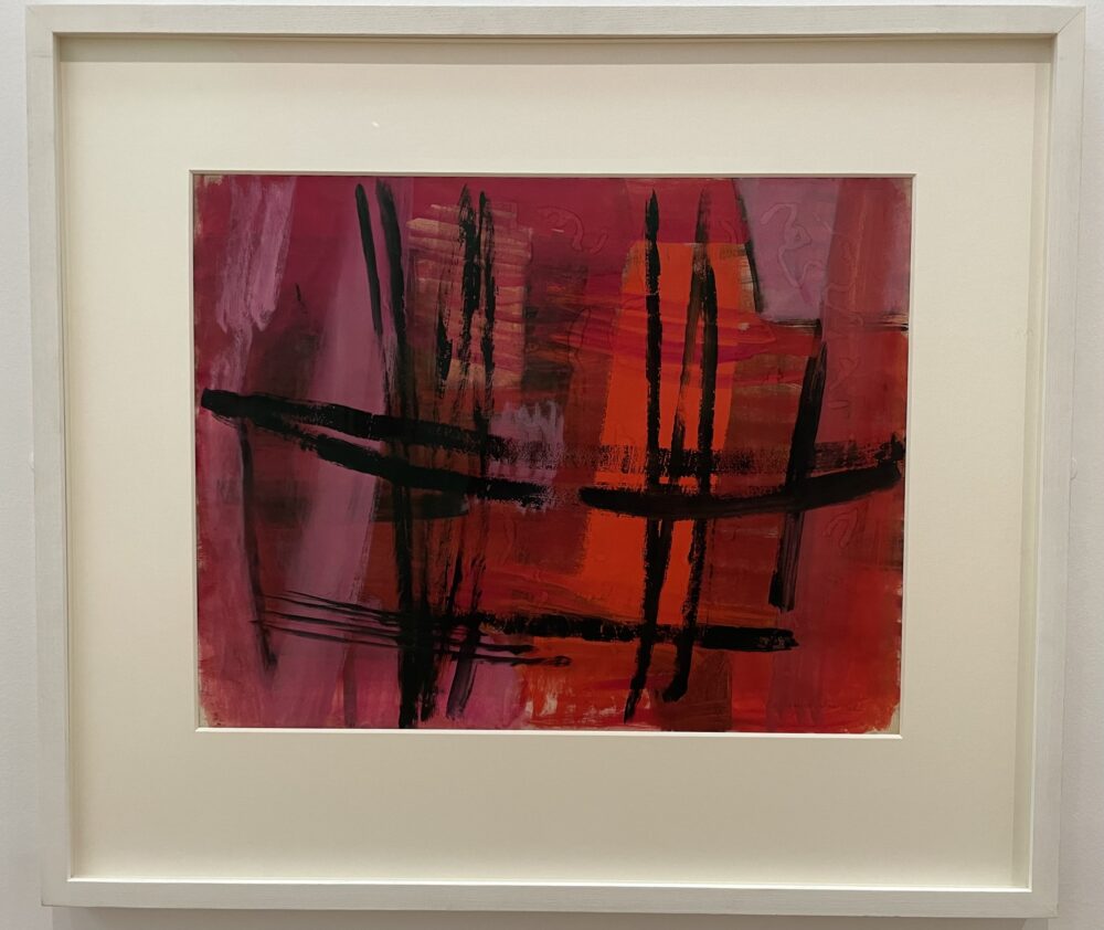
I was very taken in by this 1958 painting, Pink and Flame, which suggested so many things to me, but most especially the warmth of a fireplace in a living room (or perhaps a kitchen?)
From here, Barns-Graham started to experiment with even greater abstraction, teaching me that regular geometric forms can, in fact, be even more abstract than works without clear form.
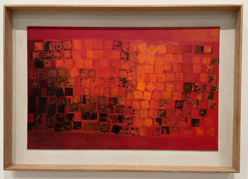
This is 1964’s Cinders, which stood out to me as a good comparison with the 1958 painting, for depicting a broadly similar thing in a much more abstracted–but more geometric–form. This slightly blew my mind, as I’ve always associated abstraction with a lack of form.
So, what I really liked about this exhibition was the way it flowed, and the way I could follow through the development of this singular artist’s work over decades. I at least had the impression that I was following her thought patterns, which made for a very successful and absorbing show.
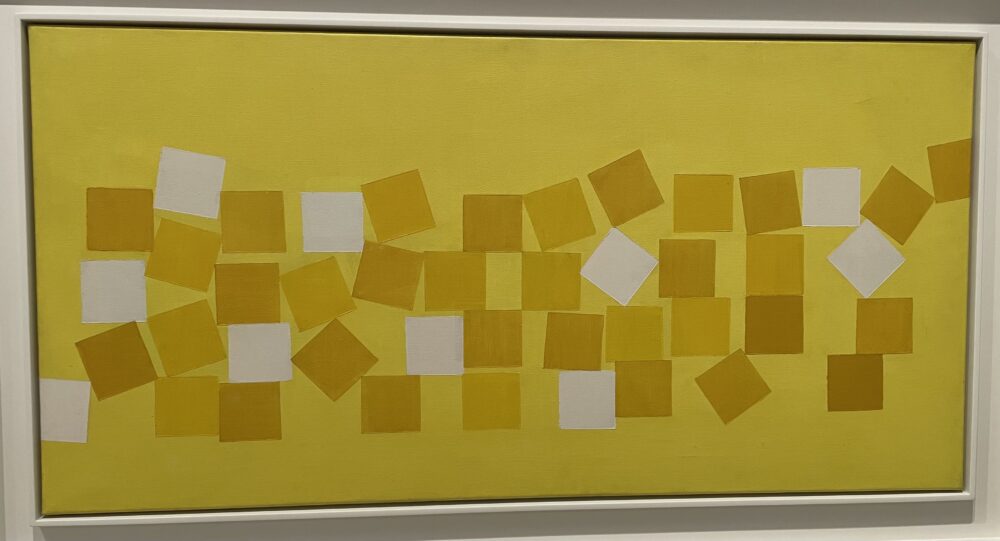
This last work, 1966’s Bird Song, stood out to me for quite personal reasons. I find the colours in it, combined with the synaesthesic abstraction, fascinating. Looked at one way, the yellows and oranges are a celebration of spring, of everything that is positive in nature. Looked at another way, they are colours of warning, of danger, of distress.
This struck a chord with me: it’s a weird thing to admit, but I’m not a fan of birdsong. ‘How,’ you might wonder, ‘can anyone dislike birdsong?’
I just find so much of it irritating. It’s the alarm-like aesthetic of repeating sounds, often not even repeated in a rhythm that I can try to tune out. I often want the birds to shut up. It’s the bursts of birdsong that made me stop listening to Scala Radio’s In the Park each morning.
Anyway… I was just delighted that Barns-Graham captured a bit of that element in her painting, intentionally or otherwise.
Wilhelmina Barns-Graham: Paths to Abstraction continues at the Hatton Gallery until 20 May.
This post was filed under: Art, Post-a-day 2023, Hatton Gallery, Newcastle upon Tyne, Wilhelmina Barns-Graham.