La Sagrada Família
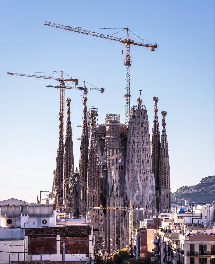
Earlier this week, I was in Barcelona for one of my occasional solo weekends in Europe. Normally, I like to spend these brief breaks doing absolutely nothing: I like simply to wander around with no particular destination in mind, taking in the sights and sounds of somewhere new and occasionally stopping on a bench or in a coffee shop to read for a little while. I enjoy spending time with my own thoughts.
This time, however, I made an exception to my rule. When I told people I was going to Barcelona, several people exhorted me not to miss the Sagrada Família.
Construction began on the Catholic ‘Church of the Holy Family’ in 1882, and from 1883 Antonio Gaudí became its chief architect. Much of his life was dedicated to design and construction of the church, and indeed he lived on site for quite a number of years. Following his death in 1926, construction has continued—often slowly, and often with considerable controversy—and it is currently estimated that the building will be finished in 2026, give or take a few years for the final bits of decoration to be finished.
Prior to visiting, I wasn’t particularly familiar with Gaudí’s work. I’ve never previously visited Barcelona, where his influence is pretty much unavoidable, and I can’t claim to be well-read in architecture, so it’s probably no surprise that I don’t think I’d ever really come across Gaudí before. Nevertheless, I couldn’t ignore the exhortations of friends, and so bought myself a ticket to visit.
In fact, due to the illogical position that “entry only” tickets had sold out, I ended up buying an extra-expensive ticket which included an “audio guide”, as if to add an extra layer of interruption to my planned day of wandering and contemplation.
The reason I’ve felt compelled to write about this visit is that I’ve never before felt so profoundly conflicted about a building. Several friends who encouraged me to visit have since asked what I thought of it, and I’ve struggled to string together a semi-coherent response, because I have such strongly logically inconsistent opinions. And so I thought I would try and set down here the answer to the question of what I thought of the Sagrada Familía. But, as with some of my other recent posts, I’m only publishing it twelve months later, so you may have been waiting quite a while for an answer.
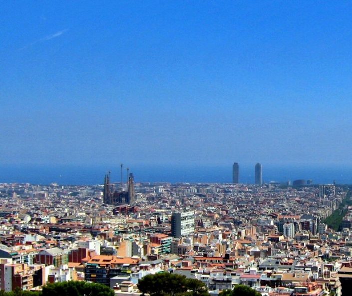
La Sagrada Família is a building of awesome scale: it dominates the landscape in a way which seems almost out of place in a city. The basilica covers an entire city block and, even in its incomplete form, has an imposing height to figure alongside its great mass. I was staying in a hotel three miles away, and could still clearly see the building from my hotel’s window, across the city’s rooftops. From this distance, there is something oddly other-worldy and inhuman about it. Seeing its mass within Barcelona’s grid system, conforming to a city block’s size yet still being utterly disproportionate in scale, reminded me of nothing quite so much as one of those occasionally odd buildings that would spring up in Sim City 2000.
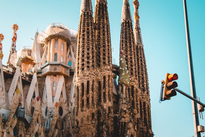
I approached from the east, walking along Avinguda Diagonal, meaning that the basilica came in and out of view according to the gaps between the buildings. The closer I got, the more spectacularly ugly the spires appeared, covered in horizontal openings. These opening serve to let the wind blow the tubular bells yet to be installed within, and also to lend a ‘natural’ appearance to the architecture: something repeated throughout Gaudí’s work.
I have no doubt that to create huge spires which are open structures from stone requires true architectural genius. How could it not? They are clearly both intricately constructed with an eye toward delicacy, and yet strong enough to withstand enormous forces acting upon them. Delicacy and strength rarely go together.
And yet, to my eye, they look like nothing quite so much as insect nests that I’d call Rentokill about. They strike me as thoroughly aesthetically unpleasant. This impression was only reinforced when I got close enough to see that they have occasional fragments of text carved into them at huge sizes visible from the ground. They really are arrestingly ugly.
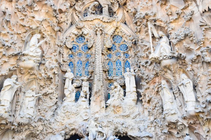
The Basilica will eventually have three facades, capturing different points in the Holy Family’s life as described in the Bible. The first I came to, and indeed the only one constructed in Gaudí’s lifetime, was the Nativity facade. This astounding structure makes stone look as malleable as clay. The entire facade is covered in leaves, plants and statues which are so detailed and intricate as to be quite astonishing. Gaudi’s original plans for this facade was for the stonework to be painted to make it even more lifelike, which hasn’t happened and (for reasons I didn’t quite pick up) no longer seems to be part of the plan. Many of the features are no longer original, having been damaged in protests over the years, but none stands out as inauthentic.
Yet, for all the obvious skill and talent which has gone into the construction of the facade, it looks like the dictionary definition of religious kitsch. The interpretation of the Nativity is, even to an unbeliever like me, almost offensively literal. The facade looks as though the intention was to jam-pack it with decoration, and anything and everything that could be literally represented in stone has been stuck on, with no particular thought to any religious or spiritual significance. Hence, “Joseph was a carpenter” becomes a sculpture of a carpenter with a young boy looking on.
The skill and detail is astounding – but the overall effect is that of a desperately tacky and overwrought Christmas decoration that might be erected each December outside one of the US Bible Belt’s megachurches. Or perhaps, if a little more gold were added, like something Donald Trump would construct at one of his homes. It struck me as being in the most awful taste.
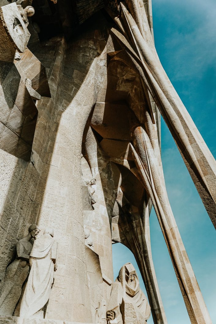
On the opposite side of the Sagrada Família, directly across the transept from the Nativity Facade, one finds the Passion Facade. This provides an extreme contrast to the exuberance of the Nativity Facade: it is relatively sparsely decorated, angular and severe. There is a clear intention to provoke a contrasting emotion among viewers of this facade as compared to the Nativity Facade: indeed, Gaudí’s intention was to provoke fear among viewers.
On the Passion Facade, the architecture is more exposed as as result of the reduced decoration, and it struck me as all the more impressive for this. The visual trick of making thin ‘ribs’ of concrete appear to support the (still ugly) massive spires above is neat, inspired, and clearly related to the ecclesiastical meaning of the events the facade represents, which gave me a much greater sense of overall coherence than the literal presentation of the Nativity Facade.
And yet, the literal interpretation is still very much in evidence, particularly in the angular sculptures by Josep Maria Subirachs. These sculptures are so angular that the figures portrayed all appear to have cubic heads. This provides an echo of the surrounding angular architecture, but has the unfortunate side-effect of rendering the figures pretty emotionless. This was particularly striking for me in the figures of Jesus—who looks mildly fed up—and the figure of St Peter—who looks a bit sad.
The most interesting consideration in the Passion story, at least for me (but I would also have thought it pretty fundamental in Catholicism) is the emotional toll on the primary characters. The scale and complexity of their emotional states is mind-boggling, and this complexity well-represented in enigmatic portraits through the centuries. Rendering them as figures out of Minecraft provides a neat continuity with the architectural style, but man it sucks all of that emotion out of the scenes, and leaves them once again being little more than a story-telling diorama.
There’s also the confounding inclusion of a magic square stuck on this facade. I can’t fathom why this grid, not obviously associated with Catholicism or Christianity, is incongruously included in a prominent position on this facade. The solution to the magic square is the age at which Jesus died, but why represent this using a technique associated with both paganism and mathematics, rather than something more obviously religious? It is particularly out of place given the generally sparse decoration.
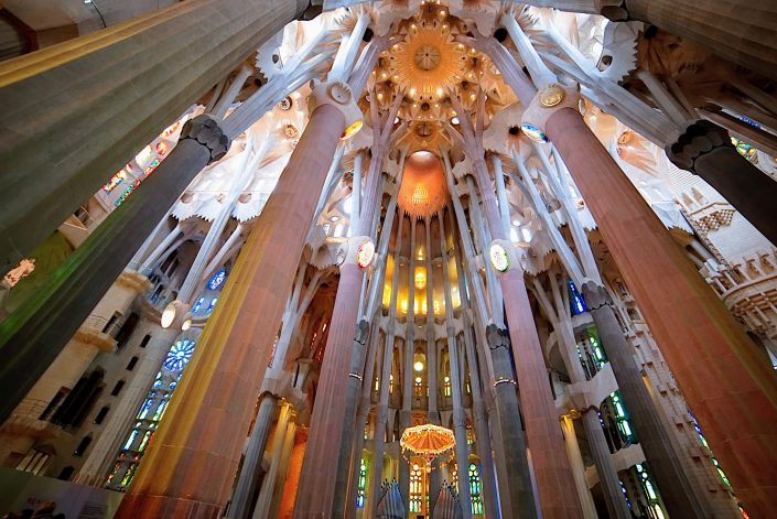
Entering the basilica, I found the interior to be utterly breathtaking. The scale of the space is hard to comprehend, and it seems almost implausible that the narrow branching columns within can support the load of the ornate roof which seems to be hovering at something like sky-height. And then one remembers the massive spires towering even above that, supported by those self-same columns. It is genius.
The basilica is flooded with light from the stained glass windows, brightened by the more delicate leadwork than is commonly seen in older church buildings. The dominant colours of the windows on each side of the Basilica are carefully chosen to bathe the inside in particular hues of light, giving it a strangely ethereal feeling. It is an awesome space, arresting and moving all at once.
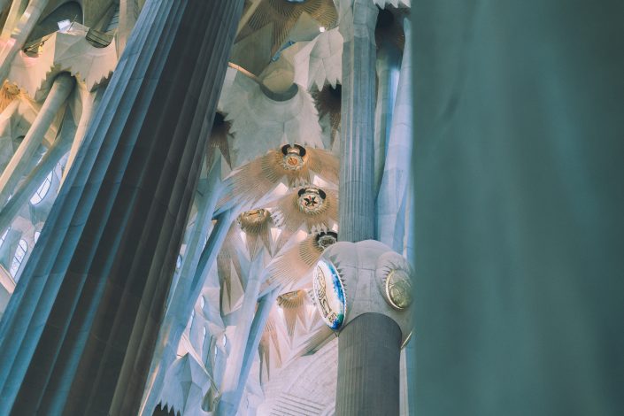
Unfortunately, the decor of the interior continues the profoundly kitsch theme, mostly notably with four huge back-lit medallions representing four saints situated high up on the four largest columns. These wouldn’t look out of place on a fruit machine.
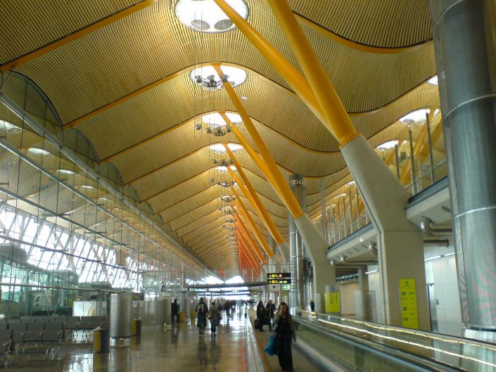
The comparison may be unflattering, but the construction of the interior reminded me of Richard Rogers’s Terminal 4 at Madrid Barajas airport. Of course, it is all the more impressive to see this sort of structure built from stone, and on a much greater vertical scale, than it is to see the steel equivalent. But it is interesting to contemplate the way in which Terminal 4 was lauded for it’s shockingly open and modern design, and yet note how similar it is to something designed almost two centuries ago.
Underneath the basilica, there is a museum which explains much of the architectural significance of the building, which is well worth a visit (particularly if, like me, you know nothing about architecture). I was particularly taken by a series of scale models which demonstrate how the structure was derived from the classical Gothic architecture originally proposed for the Sagrada Família, before Gaudí got involved.
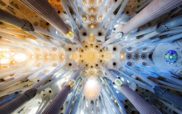
As I wandered round the basilica, I kept trying to reconcile my mixed feelings. How could I be awed and appalled at the same time? Exactly what was it about the decor of the building that made me feel so uneasy? Why couldn’t I just appreciate the undeniable beauty that was before me? I kept thinking back to something I read in Alain de Botton’s uncharacteristically disappointing book, Religion for Atheists:
The most boring and unproductive question one can ask of any religion is whether or not it is true.
The kitsch literal descriptions of Biblical events that flow throughout the Sagrada Família seem to invite no more contemplation than wondering whether or not the tales were true. They did not inspire, in me at least, any deeper reflection on their meaning, and nor was the imagery arresting and memorable. I found myself thinking that if Disney made cathedrals, they’d be much like this basilica.
Safe to say, then, that the exterior decoration was not at all to my taste. Not at all.
And yet, for all that, there was a style and theme that carried throughout the building. There was a vision of how it should look, and despite over a century’s worth of opportunity to dilute that vision, it is clearly being maintained. There is something deeply admirable and impressive about this scale of implementation of a vision, even if that vision seems as tacky as hell. It may not be inspirational to me, but it must clearly be inspirational to many people to have persisted for so long. It is hard not to be awed.
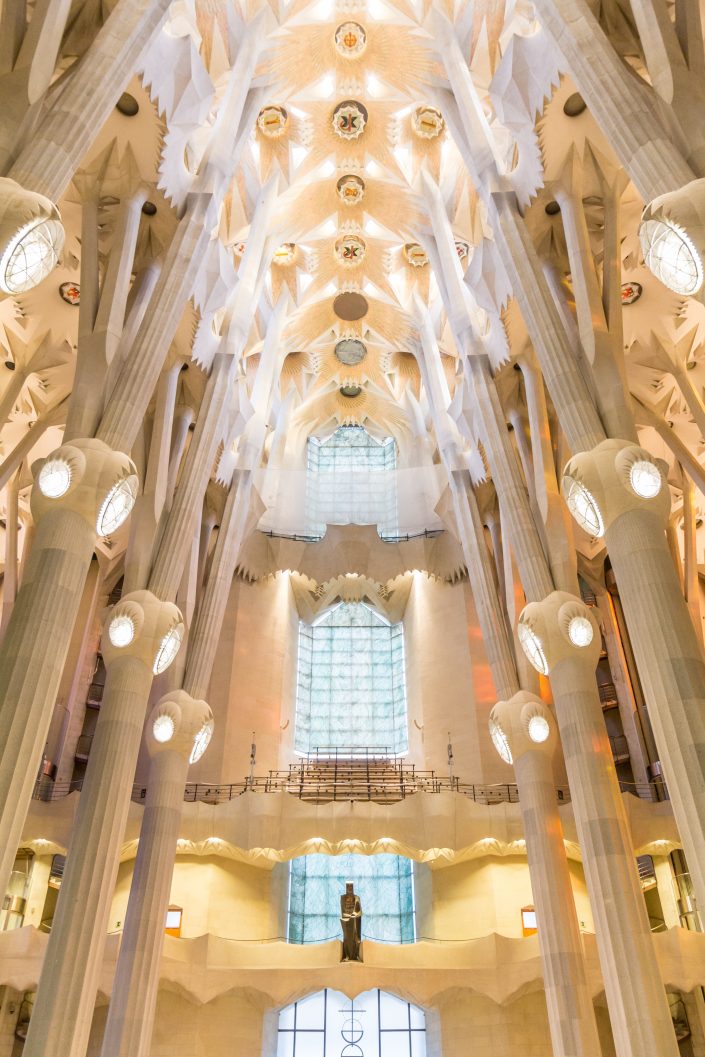
As for the architecture and the space it creates: it is incredible. The scale and ingenuity of the project is inspiring, and the interior is breathtaking. It is almost unbelievable that something so firmly modern could have been designed so long ago. There is no doubt in my mind that Gaudí was a genius.
There is a lot of debate about whether the basilica should ever have been finished. It is said that Gaudí always refined his ideas as he built, and that the plans would have changed considerably after his death as he continued to refine them during building. So, the argument goes, this is not truly Guadí’s work any more, even though the plans and design were his. I mention this because it strikes me as an interestingly prospective Ship of Thesus question. But whether or not it is Gaudí’s work, it is clearly the fulfillment of a cohesive vision, underpinned by architectural foresight, understanding and masterwork that may well have been unrivaled. The basilica cannot fail to impress.
So, what did I think of Barcelona’s Sagrada Família? My utterly contradictory conclusion is that the basilica is a masterpiece, an incredible and breathtaking work of profoundly kitsch bad taste that is both truly beautiful and as ugly as sin.
None of the photos in this post are my own: mine were crap. They are all pictures taken by people with much better photography skills than me, and used here under Creative Commons licences. The first (the wide shot of the Sagrada Família) is an edited version of a photo by Angela Compagnone. The second (the city skyline) is a cropped version of a photo by Joe Lin. The third (the spires) is by Danil Sorokin. The fourth (the Nativity facade) is a photo by Greg Nunes. The fifth (a brilliantly framed detail of the Passion Facade) is by Jessica To’oto’o. The sixth (showing part of the interior) is by Eleonora Albasi. The seventh (another interior shot) is by Paulo Nicolello. The eighth (the shot of Madrid Barajas) is by Ángel Riesgo Martínez. The ninth (the ceiling detail) is by Claudio Testa. The final photo (the interior of the Glory Facade) is by Won Young Park.
This post was filed under: Posts delayed by 12 months, Travel, Antonio Gaudí, Barcelona, Christianity, Churches, Religion, Sagrada Família, Spain, Travel.