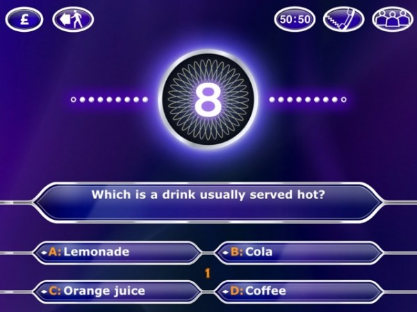
iPad App Review: WWTBA Millionaire HD

I’ve chosen to write about this App not because it’s good, but because it’s not.
That isn’t out of some kind of sadistic wish to be mean, but because I want to demonstrate how it’s hard to get an iPad App just right. But first, a little background.
When Millionaire first burst onto our screens in 1998, I was hooked. The very idea of giving away a million pounds seemed incredible to my teenage brain, and I couldn’t get enough of it.
Soon, the magic faded. I still watched, but mainly with the sound down unless someone got to the £32,000 “safe haven”. And, gradually, my interest waned still further, not bolstered by any revamps, clocks, or anything else that was thrown at it.
But one thing continued to preoccupy my mind – I badly wanted to play the game myself. I used to “play” the game with the quiz books and the CD soundtrack, but I desperately wanted a PC version of the game. Somehow, despite taking some time for the format to cross the Atlantic, they got their PC version out more quickly, and I was insanely jealous.
When eventually Celador got round to cashing in on the format, the resulting PC game seemed incredible to me. And when Version 2 turned up, and Chris Tarrant asked me the questions personally (after the first five), I loved it.
I also loved various Playstation versions of the game, and several phone versions – including the two I have on my iPhone at the moment. I even joined Virgin Mobile at one point because they had an SMS version of the game.
So I’m a bit of a Millionaire format fan, even if I don’t particularly watch the TV show anymore.
 Naturally, when I got my iPad, I got the “Millionaire HD” app, which, like it’s iPhone cousin, bizarrely titles itself “2011” below the icon. And what did I get for my money? Essentially, a blown up version of the iPhone title. There really is no discernible difference between the two.
Now, by pure logic alone, that should be a good thing. I really like the latest iPhone version, and find it one of the most addictive editions I’ve ever owned. But it’s not an iPad App.
A screen the size of the iPad’s does not lend itself to blown-up display of a screen the size of the iPhone’s. It doesn’t work. It feels like a jumbo toy. And the great aspect of the iPhone App, which I’d guess you could call it’s “passiveness” in a loose sense, doesn’t work on the iPad. On the iPad, I want an immersive experience, not a passive one.
Now that’s really difficult to pin down. The difference isn’t obvious or clear-cut. Is it CGI video that’s missing, or would that just be deeply irritating? Is it the relatively poor use of music doing that’s stopping this being immersive? Is it the “clock” rushing me towards an answer? Well, no, it’s not the clock, because you can turn that off and it doesn’t improve things.
All the important things are there. The questions seem of the right level, the lifelines offer just the right degree ofdoubt, and even the graphics are slick if oversized.
But there’s an unknowable “something” that turns the iPad edition, in my eyes at least, from a “hit” to a “miss”. I just can’t bring myself to recommend it.
This is the fourth in a series of posts reviewing iPad Apps. Yesterday’s review was of the Sky News App. Check back tomorrow for my review of Flipboard.
This post was filed under: iPad App Reviews, Reviews, Technology, Apple, Gaming, iPad, Who Wants to be a Millionaire.
