About me
Bookshop

Get new posts by email.

About me

I’ve been to see ‘Vermeer’

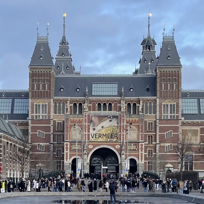
There are 37 paintings by Johannes Vermeer in this world, and the Rijksmuseum—for the first, and very possibly last, time in history—has gathered 28 of them in a single exhibition.1 I was lucky enough to go for a gander. And I mean lucky, because with over 200,000 tickets sold, this exhibition is sold out for months.

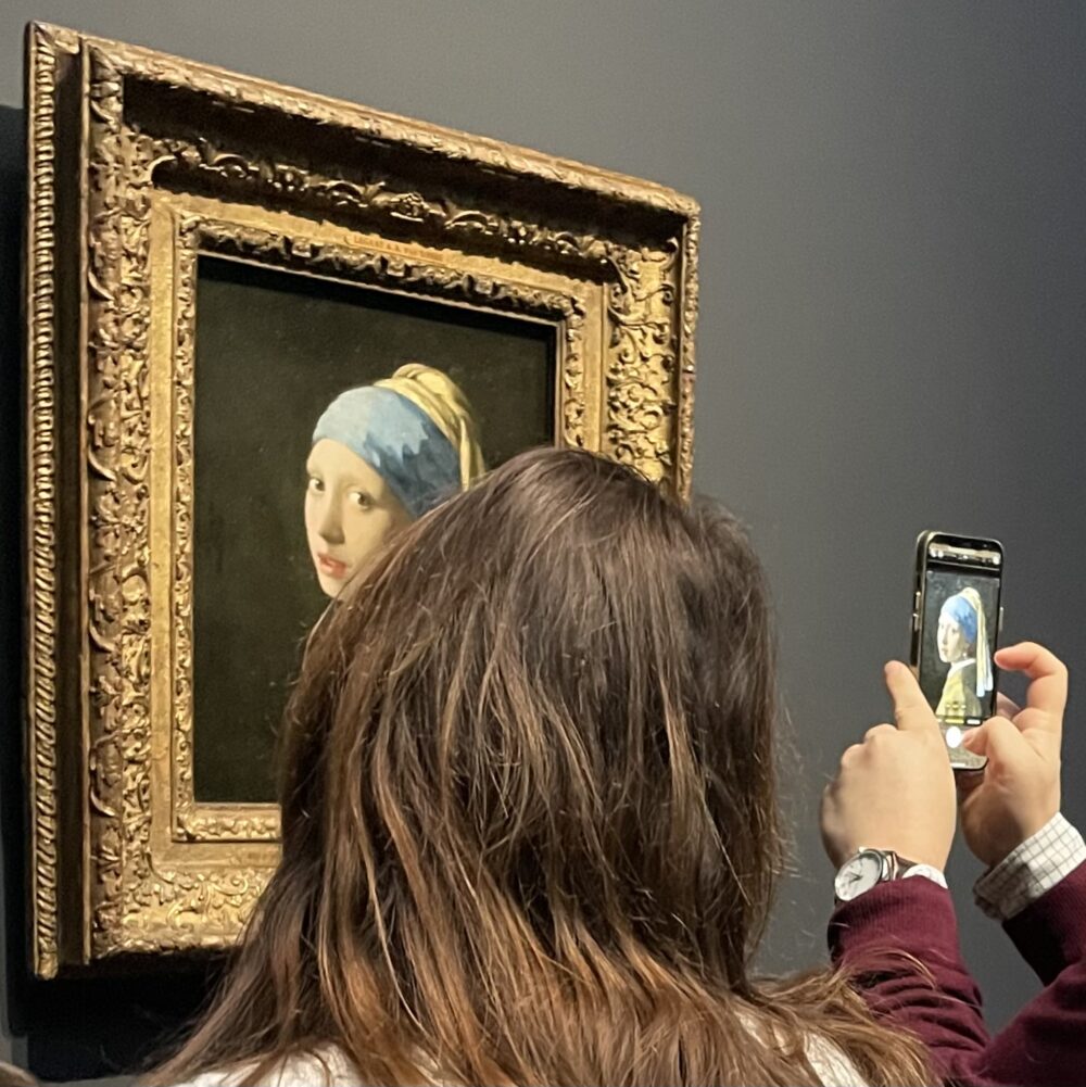
You’ll probably gather from the photos that I went into this exhibition with a slight sneer: here was an opportunity to see some pictures that are already familiar while peering over people’s shoulders and through their mobile phone screens. I’m not a fan of the sort of literal representative art that makes up Vermeer’s oeuvre. I was going as much to say I’d been as to actually see anything.

I’ve been lucky enough in my life to see any number of fantastically famous artworks, from the Mona Lisa to the Sistine Chapel. And every single time, it has looked just about exactly as I already knew it looked, and I felt no different for having seen it than I did beforehand. I wondered why I bothered.2

Vermeer was different. I don’t have the knowledge or language to properly explain why, but the experience of seeing these paintings in real life is remarkably different to seeing pictures of them. I think it’s something to do with their vibrancy: there isn’t a hint of dullness in the way there is in many historical paintings. They look, in some ineffable way, as though they are alive, or as though the paint is barely dry.

The exhibition was exceptionally well put together. The curators have avoided any muddying of the experience: there are no paintings by contemporaries for comparison, no works inspired by Vermeer to show his continued legacy, no blown-up reproductions to demonstrate his techniques. This is just the 28 Vermeers, spread across no fewer than ten galleries, giving each room to breathe.

Some paintings are on their own. It is objectively absurd to give The Milkmaid, a painting probably smaller than A3 size, an entire gallery to itself. And yet, it commands the space far more than Rembrandt’s huge Night Watch upstairs.

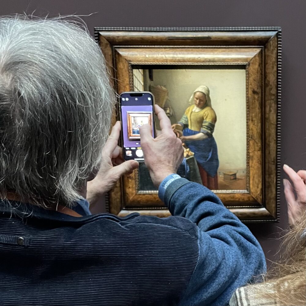
And nowhere in this exhibition does the visitor need to be hindered by bullet-proof glass, ‘which really gives the impression of being very close to the painting.’ Instead, a simple balustrade prevents crowding, but allows leaning over to get a closer look.

But obviously, it’s the paintings that are the star here. That unexpected, indescribable presence, the astounding attention to detail, the lifelike quality. They really are utterly unbelievable, completely astonishing.

I was so unexpectedly bowled over by the exhibition that I did something I’ve never done before with any exhibition: I went back the next day. I was so surprised by the strength of my own reaction that I couldn’t quite believe it, and wondered if I’d just been tired or overawed at being back at the beautiful Rijksmuseum. But no: the paintings really are spectacular, unlike anything I’ve ever seen before.

On my second viewing, I decided that the effect was a combination of the fine detail and the light: a lot of Vermeer’s paintings have a clear light source, often a window, and most of the light falls exactly as it would in reality. But there are exceptions: figures within the paintings seem to be lit more brightly than they probably should be. I think it’s this that gives the paintings such an arresting quality, and it most likely works best ‘in person’ because the light sources probably ‘read’ most correctly when the painting is on a wall. I know virtually nothing about painting, so this may well be a load of rubbish–but the fact that I’m spouting it demonstrates how much the Vermeers got inside my head.

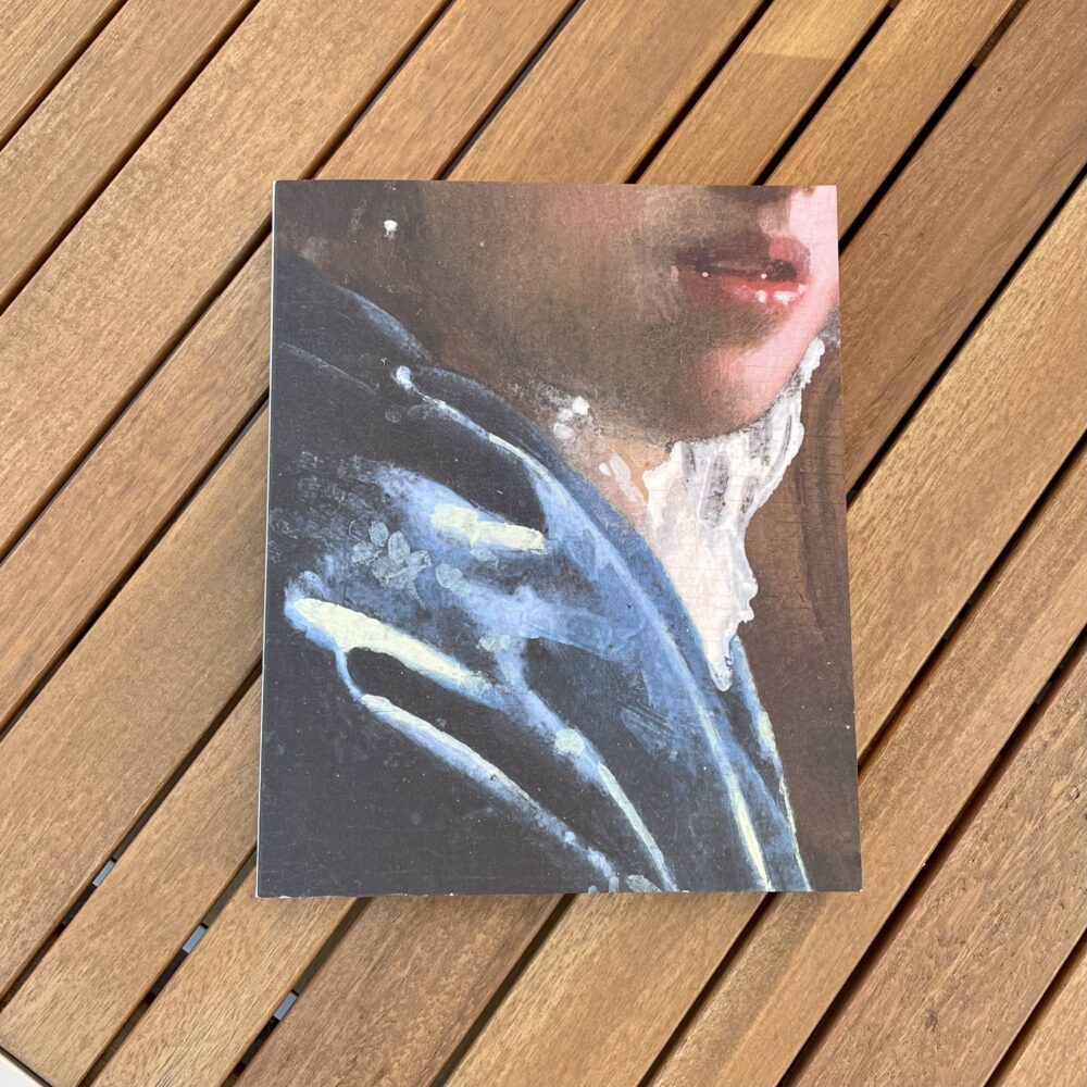
Another illustration of how much the paintings struck me is that on my second visit, I bought the catalogue (I never buy the catalogue). And I know this is reaching a whole new standard of weirdness even for me, but the catalogue smells divine–a very intense new book scent. Oh, and the close-ups in it helped to deepen still further my appreciation of Vermeer’s eye for detail.

This exhibition wasn’t at all what I expected when I followed the blue line through the Rijksmuseum to find it: I’m very glad I went to it.


Vermeer continues at the Rijksmuseum until 4 June.


  1. It is a little bit embarrassing to visit as a Brit, and know that one of the Vermeers missing from this exhibiton is squirreled away in the Royal Collection, not just hidden from visitors to this exhibition, but from everyone.
  2. My only mention on this blog of seeing the Mona Lisa is a reflection on how many people took selfies with it rather than looking at it, which I think probably underlines my point.

This post was filed under: Art, Post-a-day 2023, Travel, , , .

I’ve been to visit ‘The Horror Show!’

This exhibition at Somerset House aims to demonstrate how artistic rebellion in Britain in the past fifty years has been rooted in horror. It groups a range of works into three stereotypical horror genres: monsters, witches and ghosts.

I wasn’t convinced. It felt a bit forced, and bringing the objects together didn’t really help me to interpret them in any new or different way.

In a way, it reminded me of my recent experience of watching The Menu, a film sometimes classified as ‘horror’ but which contains so much more. Had I seen the horror label, it would have put me off the film, as I would have thought it was an entirely different sort of film.

Anyway, the exhibition had four objects that particularly stood out to me—in addition to the inclusion of wonderful examples from Scarfolk Council, which I’ve seen and enjoyed many times before.


Bloody Haemorrhaging Narcissus by Fim Nobel and Sue Webster is a 2009 sculpture which appears under direct view to be an amorphous blob of bloodied penises and fingers. It casts a shadow which appears to be of two male statuesque faces. It seemed to me to be a critique of the societal values that result in the sort of statues captured by the shadow, and to foreground the toxic masculinity and patriarchal violence that often essentially put them there.


I could have stared at Post Viral Fatigue, Noel Fielding’s recent painting, all day long and still had more to see in it. The mood of the piece captures that feeling of, well, post viral fatigue. I’m not convinced that there’s much horror here; it’s felt more like commentary on the human condition.

This was displayed next to Bloody Haemorrhaging Narcissus, and I’m not certain that the juxtaposition added anything at all.


Kerry Stewart’s deceptively simple 1993 piece, The Boy From The Chemist Is Here To See You, is a life-sized charity collection box in the shape of a young boy (I realised I never see these in ’real life’ any more) placed behind a door with pebbled glass.

This is horror: every day and yet strange and threatening, like something out of a film. I loved the ingenuity of it.


I like most of David Shrigley’s work, but I’d never seen his 2007 piece I’m Dead before: a taxidermy kitten holding a sign. I like the combination of whimsy and provocation. It made me think about the obvious nature of death, and the fine line between life and death.

This was displayed next to Stewart’s piece, and—again—I’m really not sure that the two have a meaningful connection, or that the juxtaposition adds anything.


The Horror Show!’ continues at Somerset House until 19 February.

This post was filed under: Art, Post-a-day 2023, Travel, , , , , , , .

I’ve been to visit ‘Hieroglyphs’

Visiting the British Museum feels a bit uncomfortable these days. A venue that shows off treasures stolen from other countries, refuses to give them back and exhibits them with interpretation from a primarily British perspective gives me “the ick,” as people younger than me might say.

Visiting an exhibition sponsored by an oil company, with a cloying “have a great time” message from the company beside the entrance, is also discomforting.

The fact that the guard searching my bag in the security theatre had to check with a colleague whether my toothbrush constituted a “potential weapon” did not feel especially welcoming. For clarity, I hadn’t (yet) fashioned it into a shiv.

But it’s often said that no-one does exhibitions quite as well as the British Museum, so I thought I’d dive in any way.


I visited the British Museum’s latest temporary number on Hieroglyphs—not something you’d ordinarily associate with Bloomsbury.

It wasn’t really worth it. My view is probably coloured by the fact that the exhibition was overcrowded. I don’t know how that’s allowed to happen with timed ticketing, but it was a struggle to see much of anything.

I didn’t really know much about hieroglyphs before attending: I knew that their meaning was lost, and then essentially rediscovered when the Rosetta Stone was found. I didn’t feel that I left the exhibition with really any more understanding than I arrived with, though perhaps I had more appreciation of the amount of (weirdly competitive) work that was undertaken to use the stone to decode hieroglyphs.

I don’t think I’ve seen the Rosetta Stone before (though maybe I did as a child): it’s a remarkable object, but it’s hard not to look at it and wonder why on Earth it is in a glass case in London, shorn of all natural context. It’s an Egyptian artefact with Greek text pilfered by the French—and Egypt has wanted back it for decades. It seems cruel and absurd for it to be held in a British museum, a relic of the attitudes of an age which we might hope to have consigned to the past.

It also felt to me like many of the cultural interpretations of objects were over-reaching, or at least did not explain how the conclusions did not overreach. I spent some time looking at an object described as a calendar of “lucky days”, and wondering how on Earth that conclusion could be drawn. It made me think that millennia from now, someone will dig up a calendar of lottery draws and talk about how there were European-wide “lucky days” when the population would collectively place money on the drawing of random balls. It’s a valid interpretation, but unrecognisable as a description of the motivations and experiences of most people.

But this exhibition has been praised by people who know what they’re talking about, so don’t let the fact that I found it more depressing than enlightening put you off: you still have a couple of weeks left to go and see it.


Hieroglyphs’ continues at the British Museum until 19 February.

This post was filed under: Museums, Post-a-day 2023, Travel, , .

I’ve travelled with Lumo

I recently had occasion for a return trip from Newcastle to London. This is a trip which I’d preferentially take by train, but have previously ended up flying as a result of the comparative cost.

In the time since I used to do this journey frequently, a new locally based operator—Lumo—has begun serving the East Coast Mainline, with the express intention of getting people onto electric trains instead of flying. It’s been running for a little over a year. I thought I’d give it a go.

On the day I booked my tickets, the Lumo return journey cost £64.80.

The LNER fare for similar departure times was £155.40. The British Airways economy fare for similar times was £271.44, but I would never have paid (or compared with) that figure. I would, unfairly, have compared the prices to the £85 + some Avios price of a BA return in business class… I’m a delicate flower. At those LNER and BA prices, I would probably have opted for BA, rather than paying nearly ‘twice as much’ for LNER standard class.

The Lumo fare substantially undercuts both options. Having whinged a decade ago about the variability of ticket prices, it’s worth noting that Lumo has far fewer price points in its ticketing structure than LNER—though Lumo can’t match the £8.10 single fare I once paid with the old operator, East Coast.


To a certain extent, a train is a train: there isn’t always much to pick between them. Lumo’s are all-electric, which is environmentally advantageous.

The seats are in a standard 2-2 layout, almost all airline-style, with tray tables. The trains are near-identical to LNER Azuma ones, with the same colourblind unfriendly traffic-light seat reservation indicators. It’s a single-class service, and my train had five coaches.

Lumo has gone to town on making their interior an on-brand blue, supplemented by light grey. It felt a bit cold and austere to me, and the plain blue moquette really showed the dirt, but I’m no interior designer. The lighting is unpleasantly bright white, almost clinical, and not at all conducive to relaxation. The luggage rack is glazed with a bluish glass, which looks mirrored and bronze-tinted when packed with bags. It’s a weird choice, but how much time does anyone spend looking at the underside of luggage racks?

The seats have airline-like flappy headrests for snoozing, and individual reading lights above the tray table. The tray table is extendable, which means that you can actually work on a laptop on it. There’s one three-pin socket and two USB-A sockets shared between each pair of seats. The seats are firm: I miss the padding on the older, non-Azuma LNER trains. The arm rests are the narrowest I’ve ever seen, no more than a couple of centimetres in width, but I suppose that’s probably a compromise to keep the seats themselves as wide as practically possible. The legroom was fine.

The service was almost non-stop, save for an alight-only stop at Stevenage on my southbound trip. There is something luxurious and relaxing about non-stop services: it’s nice to settle in and know that the train isn’t about to become suddenly crowded at the next stop.

Food is available to pre-order if boarding at King’s Cross or Edinburgh. This is delivered to your reserved seat, and perhaps as a consequence of this, the conductor was militant about people sitting in their reserved seat and nowhere else. A cashless trolley paraded through the train for impulse purchases. Lumo didn’t ply me with endless mini bottles of complementary champagne like BA Club Europe, but my pre-ordered food was delivered almost immediately after leaving King’s Cross, homeward-bound.

While my southbound journey was perfectly to time, my return was delayed by a little under an hour, so I automatically received half my fare back.


All things considered, and based mainly on the price and reduced ecological impact, Lumo will be my first choice next time.

This post was filed under: Post-a-day 2023, Travel, , .

I’ve been to Battersea Power Station

I am the sort of heretic who, if asked, would have supported the recent transformation of (part of) Battersea Power Station into a shopping centre. The same part of me that has been whinging recently about the stasis of cathedrals would have praised it as an interesting bit of repurposing, celebrating heritage by making something new of it.

I’ve been down to the Power Station a couple of times in recent years, before the main building opened, so the surrounding ‘distinctive’ (ugly) flats and mildly preposterous ‘community’ shops weren’t a surprise. But this time, I was able to venture inside, and I was surprised at what I found.

It is utterly soulless. It has the feeling of a shopping centre in a second-rate European railway station, the sort that behooves one to grip one’s backpack straps a little more tightly and quicken one’s pace.

This isn’t helped by the lighting scheme. It seems to have been designed to with ‘traditional’ warm white lighting set against mostly matte black fixtures and fittings throughout. I suspect this was designed to be sympathetic to the building, but instead it clashes at every turn with bright white retail lighting and flashy screens—while leaving corridors feeling threateningly dark. There are more narrow, dark, low-ceilinged corridors than one would imagine in a newly opened premise, which I guess is a side-effect of the conversion. This atmosphere might improve as the centre’s occupancy rate rises and injects some life into the place, but many of the warm-white LED fixtures have already acquired a flicker that suggests the LED controller is faulty. Low-level flickering lighting in a dark space gives an oddly rundown feeling to a venue that isn’t even yet fully open.

The grey-ish terrazzo flooring—somehow already looking dirty—only adds to the rundown railway vibe. Incongruous touches of brass and wood here and there, as though someone felt that the scheme needed warming up a bit, look more like non-matching “patched” bits than a design scheme.

For reasons surpassing understanding, the architecture is left to fade into the background. Look at the picture at the top: beautiful columns virtually unlit, while shop names, flashy screens and two incongruous food trucks are brighter than the sun. Why would anyone do that?

Maybe I’m judging it too soon. Perhaps it will seem better when more units are occupied, and the whole thing feels a little more lived in. I don’t think I’ll hurry back, but potentially in a couple of years this will seem like another “he clearly didn’t know what he was talking about” post.

This post was filed under: Post-a-day 2023, Travel, , .

I’ve been to visit ‘Objects of Desire’

Surrealist art tends to be the sort of thing I like, the sort of art that I wish I could take home. There’s something about its playfulness and inventiveness always makes me think a little differently, provoking reflection and contemplation in a way that other art sometimes doesn’t.

I don’t know very much about art or the history of art. I never studied it, and it’s not something that has cropped up in much of my reading. Nor is it something I’ve really sought to read about. But I do enjoy a good exhibition. And to my mind, this collection of surrealist art at London’s Design Museum constituted an excellent exhibition.

There were five objects that especially stood out to me: none of the pictures of these are my own, they are all outrageously stolen from various museum websites.


This is Salvador Dalí’s Lobster Telephone, the archetypical surrealist object and the hero image used in most of the advertising for this exhibition. In the exhibition, it is presented alongside examples of Dalí’s Mae West Lips Sofa and Champagne Standard Lamp in a mock living room.

The telephone stood out to me as an object I’d previously seen and which raised a smile, but whose meaning I hadn’t grasped (or really considered) until it was presented in this exhibition. I hadn’t appreciated that Dalí considered both the lobster and the telephone to be inherently sexual, nor that he positioned the sexual organs of the lobster directly over the mouthpiece.

The absurdity, intrigue, and humour of those details made me appreciate the object anew.


I’ve been to see some of Gaudí’s work before, most notably La Sagrada Família, and while I’ve been awed by the way his work reflects the natural word, I’ve not always been wild about the aesthetic of the end result.

An example of Gaudí’s Calvert Chair is featured in the exhibition as part of a commentary on how his work influenced surrealist art. This is a connection I would never have made without it being pointed out to me. This was a bit of art education encapsulated in a single object, which gave me new understanding. Isn’t that the real power of exhibitions?

They make a bigger deal in the exhibition guide about the connection between Dadaism and surrealism, and feature some work by DuChamp, but to me, the Gaudí connection was less obvious and more interesting.


Conquest by Nina Saunders was, of all the objects I’d love to pilfer, the most obviously impractical option.

This is a 2017 piece with so much to say about the forces which impact the illusion of domestic norms and, depending on how you look at it, either destroy the perception, or force the perception to warp around them. This would certainly make an impact in my living room, and I think you could probably work out some comfortable unorthodox positions to sit on it too (though I’m not certain how Saunders would feel about that).


Wolfgang Paalen’s Le Génie de l’espèce felt like an object of the moment, inseparably representing both guns and death. It actually dates from 1939, very shortly before the outbreak of the Second World War.

This made me think a lot about how humanity never seems to learn the lessons of the past.


I enjoyed the fact that the Campana Brothers’ chair made of plush Disney toys provoked a sense of immediate repulsion, despite being made of soft, friendly characters. If Wendy had been with me, I know she’d have said: “too much.”


Objects of Desire’ continues at the Design Museum until 19 February.

This post was filed under: Art, Post-a-day 2023, Travel, , , , , , , , .

I’ve been to visit ‘Pyrex100’

Pyrex, the thermally resistant glass, used to be made in Sunderland. In fact, between 1922 and 2007, all Pyrex sold across the commonwealth—excepting Canada—was made in Sunderland. You’ve probably got a bit of Sunderland in your home right now.

The city is proud of this heritage, and so Sunderland Museum has created Pyrex100—an exhibition to celebrate a century since the start of manufacture in the city.

When I think of Pyrex, I think of glass measuring jugs. I was therefore unsurprised to see that the earliest Pyrex manufactured in Sunderland was a range of clear glassware. I had no idea, though, that glass teapots were a thing in the 1920s and 1930s.

Around this time, Pyrex was also a pioneer in marketing products directly to householders—mostly housewives at that time—rather than to their household staff. It’s sometimes startling to be reminded of the pace of societal change over the last century.

Though the designs of these pieces look suspiciously familiar, I was also unaware of Opalware. These were products made of Pyrex, and therefore strong and heat-resistant, but designed to look like china. They don’t look like they’d fool anyone, but I’m not convinced that I’d immediately pick them out as glass.

The crockery we use in our house is made of reclaimed offcuts of glass products: I thought this was a really novel idea when we bought them, but clearly I’m 70 years behind the times.

Commemorative Pyrex was a thing, too: here’s a 1966 World Cup commemorative glass. I would perhaps have expected to see this sort of thing in crystal, but seeing it in Pyrex maybe illustrates that Pyrex was once desirable in a similar way.

And this is the last bit of Pyrex ever made in the UK, which rolled off the production line as the factory closed in 2007. As this was the last commercial glassware factory in Sunderland, this also brought to an end something like 1,500 years of glassmaking history in the city.


You might, like me, have assumed that the word Pyrex shares the Greek root pyr (fire) with pyrexia and, indeed, funeral pyre, given that its main property is heat resistance, and it is glass forged in a fire. But this exhibition made me wonder about the ‘ex’, and so I came home and looked it up.

And prepare to clutch your pearls because—amazingly—the brand has nothing to do with pyr and everything to do with pies.

The Oxford English Dictionary quotes the original company’s assistant secretary as saying:

The word ‘pyrex’ is a purely arbitrary word which was devised in 1915 as a trade-mark for products manufactured and sold by Corning Glass Works… We had a number of prior trade-marks ending in the letters ‘ex’. One of the first commercial products to be sold under the new mark was a pie plate and in the interests of euphonism the letter ‘r’ was inserted between ‘pie’ and ‘ex’ and the whole thing condensed to ‘pyrex’.

It just goes to show that you can never rely on etymological assumptions.


Pyrex100 continues at Sunderland Museum… but it ends on Saturday, so you need to get there quick if you want to see it.

This post was filed under: Art, Museums, Post-a-day 2023, Travel, , , .

I’ve been to see James Graham’s ‘Best of Enemies’

A stage play inspired by a documentary film about some political television debates from 1960s America doesn’t feel intuitively like it would have much to offer. One could reasonably assume that the effect would have been dulled and flattened by the distance in time and multiple re-interpretations from the source material.

Yet, this was exhilarating. Graham’s script dramatises the US debates between Gore Vidal and William F Buckley Jr on the ABC network, programmed around the Republican and Democratic national conventions. It explores the behind-the-scenes drive within ABC to stage these debates—it’s about ratings, as ever it is—as well as the personalities and motivations of Vidal and Buckley.

Zachary Quinto and David Harewood were excellent in this production at London’s Noël Coward theatre: both are famous for other roles, but fairly unknown to me. The staging was inspired, using live projections to make relevant scenes at once theatrical and televisual.

Graham presents this series of debates as the source of all personality and opinion-led discussion of politics on television. Clever scripting—much of it seemingly based on well-chosen verbatim quotes—draws parallels with current politics. The whole play felt immediately relevant to modern politics and media… though the time-jump at the end felt a bit like it rammed that message home harder than was necessary.

Yet, the script as a whole was definitely the biggest star here, cleverly combining direct quotations and zingy, catty one-liners with urgent questions about society’s approach to politics.

I really enjoyed this.


Best of Enemies’ continues at the Noël Coward theatre until 18 February.

This post was filed under: Post-a-day 2023, Theatre, Travel, , , , , , , .

I’ve been to Sycamore Gap

Wendy and I have been for a wonderful winter wander alongside a short section of Hadrian’s Wall. We started at Housesteads Fort and walked a couple of miles to Sycamore Gap, before about-turning and wending our way back.

We feel so lucky to live so close to such spectacular and historic landscape. When we got up in the morning, we had no particular plans, but fancied a bit of a walk—and within 40 minutes or so, we were strolling a World Heritage Site.

The walk was five fairly easy miles, though with lots of undulations and on quite muddy and slippery ground.

Just as we were finishing our walk and trying to dredge up our Key Stage 3 history to remember when Hadrian’s Wall was built, we spotted the AD122 bus, which solved that mystery for us.

This post was filed under: Post-a-day 2023, Travel, , , .

Misperceiving ticket prices

Wendy and I recently had occasion to buy two Merseyrail Day Savers, which set us back a total of £11.20.

“Blimey,” we thought, “that’s so much cheaper than the Metro!”

But it’s not. The equivalent Tyne & Wear Metro Day Tickets would have cost us £11.40, and—unlike the Merseyrail ticket—our fare would have additionally covered up to six children. It would have also allowed travel during the morning peak, which the Merseyrail ticket did not. And it would have permitted travel not just on the Metro, but also on local rail services and the Shields Ferry.

It’s funny how perceptions of fares don’t always match reality. Deals can be better (or worse) than they seem.

This post was filed under: Post-a-day 2023, Travel, , .


The content of this site is copyright protected by a Creative Commons License, with some rights reserved. All trademarks, images and logos remain the property of their respective owners. The accuracy of information on this site is in no way guaranteed. Opinions expressed are solely those of the author. No responsibility can be accepted for any loss or damage caused by reliance on the information provided by this site. Information about cookies and the handling of emails submitted for the 'new posts by email' service can be found in the privacy policy. This site uses affiliate links: if you buy something via a link on this site, I might get a small percentage in commission. Here's hoping.