I’ve been to see ‘Irma Boom: Art + Books’

I can’t claim to have a deep or long-standing appreciation for the work of Irma Boom, but I think like most of us, I had a vague familiarity with the name and was aware that she was a designer. Having visited this exhibition, I’m much more familiar with her work designing books, and also her work in designing the visual identify of the Rijksmuseum following its 2013 refurbishment.1
Having said that, I don’t think this exhibition was massively successful. Boom’s entire philosophy, as described in the exhibition, is that books can be turned into powerful works of art because they involve a necessary order and narrative. This is not well demonstrated by sticking the book in a glass case, where the viewer can see only one part of it.2
It also wasn’t massively clear where Boom’s exhibition started and ended. We were told that she had selected some works by others to theme with her own. However, Boom’s works were together in a corner of a gallery, and I’m not certain how much of the other stuff in the room was Boom’s doing, and how much was just permanent collection stuff.
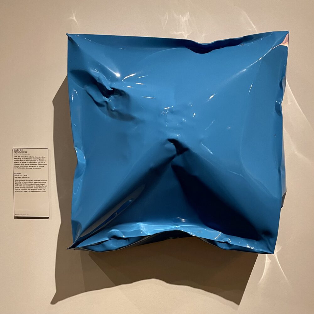
For example, I was particularly taken with Han Schull’s untitled work pictured at the top of this post: a bit of aluminium spray-painted in a single colour and then duffed up, meaning that it looks like there are many colours (or shades) to it, even though in another sense there is only one. I can see the obvious connection between that and bookmaking… but did Boom see that connection, or has the Schull work lived long on that wall?
I was particularly intrigued by two of Boom’s books.
Her book for Chanel No5 which was ‘printed’ without ink was inspired. The texts and images are embossed rather than printed, meaning that the whole book remains plain white. This was a commentary by Boom on the way that the perfume, too, is experienced through senses besides the visual.
Her SHV Think Book was also striking, less for the object itself than for part of the story behind it. SHV had wanted the ‘book’ to be a permanent record, and so had considered creating a CD-ROM—the then-latest technology—rather than a book. Boom advised otherwise, suggesting that a book was likely to be a more timeless option than any modern digital format, and she won out. In retrospect, Boom was obviously correct: in 2023, a book is clearly much more accessible than a CD-ROM. This struck me because I’ve had this same conversation several times, especially with web developers. I once had to explain in terms that one of the major functions of something I was writing was for it to sit on a shelf alongside 100+ older versions—this wasn’t an optional extra.
Finally, there was a bit of what might reasonably be called surrealism to tickle my fancy. As part of Boom’s design work for the Rijksmuseum, she designed the object labels, one of which became an object in this exhibition as a result. And, as if that weren’t enough, from the ceiling hung a Benno Wissing and Jan Hoogervorst design for a directional sign to a toilet, as used in Schiphol Airport. There was no toilet in the indicated direction, of course, for this sign had been re-designated as art. Sublime.
Irma Boom: Art + Books continues at the Rijksmuseum until 7 May.
- Including, as it happens, that expensive Vermeer catalogue I mentioned. ↩
- It’s not long since I got frustrated at the same thing in the British Library exhibition of Alexander the Great, so forgive me if you think you’ve heard this rant before. ↩
This post was filed under: Art, Post-a-day 2023, Travel, Amsterdam, Irma Boom, Rijksmuseum.