About me
Bookshop

Get new posts by email.

About me

Do it like this

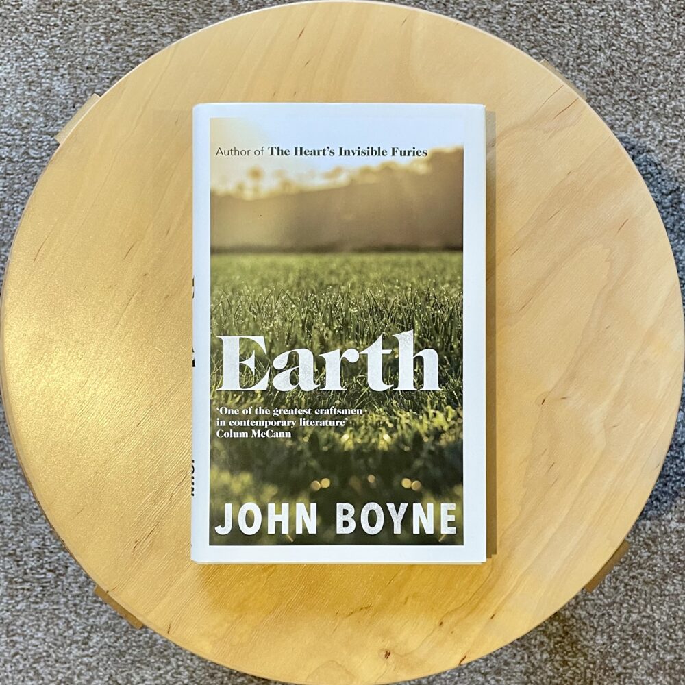
I’m currently reading Everything I Know about Life I Learned from PowerPoint by Russell Davies. More on that when I’ve finished it—but these facing pages summed up so much that I couldn’t help but share them early:

This post was filed under: Notes, .

You put your whole self in, your whole self out

Last year, I reflected a little on Civil Servants being encouraged to bring their ‘whole self’ to work. I wouldn’t have guessed that the very next year, under the same political leadership, the same workforce would be told to ensure that ‘your beliefs remain at the front door’ (because heaven forfend that someone should wear a non-standard lanyard).

Yesterday, I was interested to read Zoë Schiffer’s piece on Platformer about a similar—but altogether more thoughtful—change in the culture of technology firms.

It’s intriguing to watch the pendulum swing.

This post was filed under: Politics, Technology.

Penrith

This post was filed under: Travel, .

Sunset

This post was filed under: Photos, Travel.

‘Racing Ahead’

When I lived in Stockton, this life-sized sculpture by Irene Brown stood outside M&S. The sculpture was removed in 2013, when the High Street was being spruced up. M&S closed in 2018.

The sculpture isn’t really my sort of thing, but it is enormously popular with Stocktonites. There was great fanfare when the refurbished sculpture was repositioned outside the library in 2016, and where I took this photo yesterday.

This post was filed under: Art, Photos, , .

‘User-friendly front door’

I recently read a corporate document that promised the creation of ‘a user-friendly front door.’

I’m part of the intended audience, but I can’t explain what the sentence was trying to communicate. I don’t know whether the ‘front door’ is a website, a phone line, a physical location, a team of people, some combination of the above, or something different altogether. It is, apparently, to be an automatic door: it will be ‘using automation to make processes more efficient’.

I enjoyed the delicious irony of the authors failing to communicate while, at the same time, promising to be ‘user-friendly.’ I enjoyed the mixed metaphor of ‘automation’ making ‘a door’ ‘more efficient’. And, most of all, I enjoyed the fundamental absurdity of a ‘user-friendly’ ‘door’.

I was reminded—as I often am—of this from Jeanette Winterson’s 12 Bytes:

When institutional content tries to be more user-friendly, we get marketing-speak clichés like: stakeholders, bad actors, road maps, blue-sky thinking, low-hanging fruit, facilitators, roll-out … Conferences are the worst. I have been to some of them. By the afternoon I am sweating under the mental pressure of translating non-language. We need writers involved – and we need language that speaks to people. This isn’t about dumbing down, it’s about doing what writers do well – finding a clear, precise, everyday language that goes beyond utility, without jargon, with beauty.


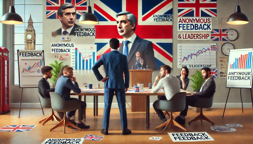
The image at the top of this post was generated by DALL·E 3. I note with wry amusement that the AI conception of a ‘user-friendly front door’ has a knob on the left and a handle on the right, making it entirely unclear as to which way the door opens.

This post was filed under: Technology, .

Which plan? What’s working?

In The Times last week, Matt Chorley wrote about a focus group’s reaction to the Government’s oft-repeated plea:

In the meantime, Sunak presses on, vowing to listen to voters while refusing to change. “Stick with the plan that’s working.” On our most recent Times Radio focus group of swing voters, we asked about that slogan. “Which plan’s that?” scoffed one. “And what’s working?” said another, before they all descended into guffaws.

This was still ratting around my mind when I saw this laminated sign above a hospital bed—not in deepest mid-winter, but on a glorious spring afternoon:

This isn’t a one-off: it has become the norm in many NHS hospitals these days. It’s this graph of the relative collapse capital spending in the NHS made photographic:

‘Which plan? What’s working?’ might be the most apposite piece of political commentary in years.

This post was filed under: Health, Politics, , .

A crushing realisation

Apple recently released an advert for a new iPad, and it seems it’s like a Rorschach test for our times.

The first I heard of this advert was when I saw this article in the FT, reporting that Apple had apologised for it. And so I sought out the advert. The message I got from it? Apple has managed to fit a load of different tools and functions into an extremely thin device. I wasn’t offended by it, but thought I could see why others would be: wanton destruction of perfectly good instruments, tools etc. In a world of limited resources, and from a company that preaches about sustainability, it’s not a good look, even if it’s all just visual effects.

But it turns out that I was wrong. The controversy was related to a different metaphorical interpretation of the advert. As Tedium explained:

Apple’s infamous “Crush” ad deeply misunderstands the role of the hydraulic press in meme culture.

I’m completely ignorant of the role of hydraulic press in meme culture. It turns out that there’s a whole industry around videos showing hydraulic presses crushing things. I did not know this existed. I’ve heard of Will It Blend—but I’m clearly behind the times when it comes to online video culture.

The ad doesn’t connect because the message it’s trying to promote is essentially completely at odds with our understanding of the hydraulic press, which we only understand as a device that breaks things in the most brutal way possible. There’s no intelligence at all, artficial or otherwise. It just crushes things.

Clearly, many people had viscerally negative reactions. TechCrunch called the advert ‘disgusting’. Where I saw a neat metaphor for packing functions into a device, others saw an enforced digital transformation:

Does your child like music? They don’t need a harp; throw it in the dump. An iPad is good enough. Do they like to paint? Here, Apple Pencil, just as good as pens, watercolors, oils! Books? Don’t make us laugh! Destroy them. Paper is worthless. Use another screen. In fact, why not read in Apple Vision Pro, with even faker paper?

Our social context can completely change the way we interpret the same piece of footage… and perhaps I’m getting old.

This post was filed under: News and Comment, Technology, , , , .

Dinosaurs’ habitat at risk of extinction

Twelve years ago, I told you about Teessaurus Park in Middlesbrough, a pocket of child-friendly green space in a highly industrialised part of the town. I wrote more about it the following day, and still think of it often. The sculptures feel very 1980s, and the whole idea of a park surrounded by heavy industry feels worthy yet dystopian.

It’s in the news this week because the Twentieth Century Society is applying to list the three most important sculptures, which were designed by Geneviève Glatt. This is in response to a local plan to close half of the park.

The C20 Society article about their campaign has much more background and history about the site, much of which was new to me. There are very few major public sculptures from this period by women which adds to the rarity value of the three they are seeking to list. The article also introduced me to the fascinating North East Statues website, which is a rabbit hole I’m now inevitably going to spend quite some time exploring.

This post was filed under: Art, News and Comment, , , .

What becomes of the banks departed?

Two years ago, I reflected on the post-lockdown closures of my local high street branches of Barclays, Santander, NatWest and Nationwide.

Since then, Gosforth High Street has also lost branches of HSBC, Halifax and Virgin Money. The last branches standing are those of Lloyds and the Newcastle Building Society.

And so, you might wonder: what becomes of the banks departed? Let’s work our way northwards.

At number 59, Barclays remains empty, still with its previously-hidden Martin’s Bank sign on show. The premises have recently been sold:

At 117, Nationwide—whose adverts tell us that face-to-face banking matters—is now an upmarket cafe and soft play venue:

At 129-131, Santander is now banking on flame grilled chicken:

At 149-151, NatWest have left their exterior in a right state:

Within Gosforth Shopping Centre, Virgin Money is now mostly advertising an ‘urban park market’, which sounds like something you’d come across at CenterParcs:

At 178-180, Halifax is yet to find another function:

At 189-191, HSBC remains vacant:

Shall we check again in another couple of years?

This post was filed under: Photos, , .


The content of this site is copyright protected by a Creative Commons License, with some rights reserved. All trademarks, images and logos remain the property of their respective owners. The accuracy of information on this site is in no way guaranteed. Opinions expressed are solely those of the author. No responsibility can be accepted for any loss or damage caused by reliance on the information provided by this site. Information about cookies and the handling of emails submitted for the 'new posts by email' service can be found in the privacy policy. This site uses affiliate links: if you buy something via a link on this site, I might get a small percentage in commission. Here's hoping.