A burglar is today behind bars after picking the wrong house to burgle. His crime was caught in full by a webcam, which the hapless thief stole along with the computer, but not before it had sent pictures of him to a website.
A couple of decades on, it’s remarkable how twee this story seems. These days, there’s nothing remarkable about burglars being caught on webcams: Ring, Blink, Arlo and more have made it their entire business model. There are many millions of webcams set up for this exact purpose.
People often mention the pace of the change of technology, but the pace of change in how we use technology is equally astounding.
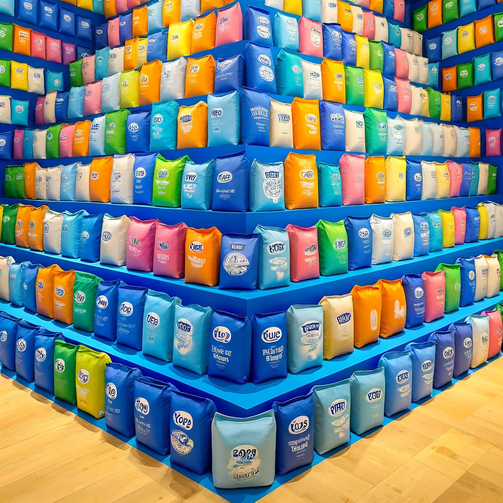
The image at the top of this post was generated by DALL·E 3.
Sometimes, it takes distance to understand the culture that surrounds us.
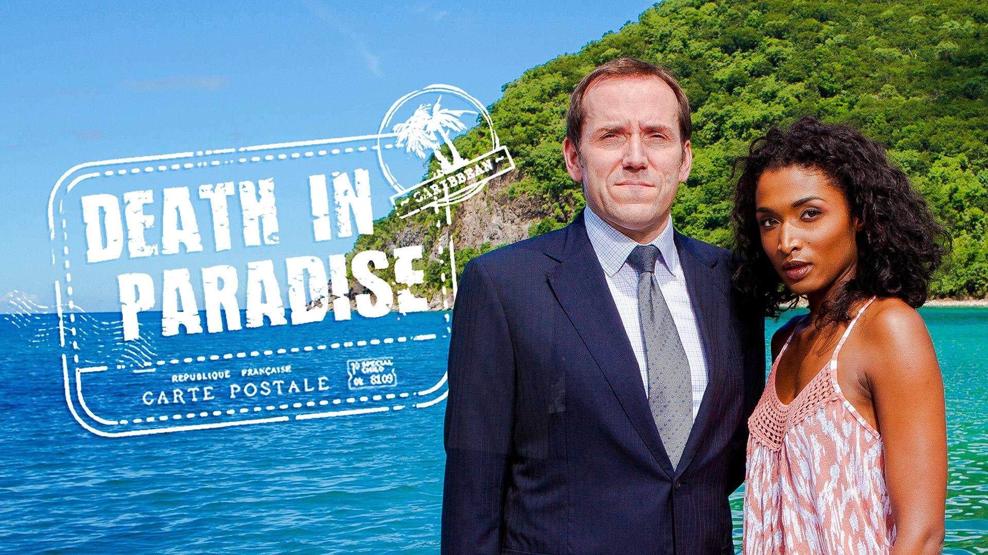
I’m vaguely aware of the popularity of Mrs Hinch, who posts cleaning tips on social media. For many months, I assumed the lady in the Fariy Non-Bio advert was Mrs Hinch, but that turns out to be Vogue Williams, whose claim to fame has passed me by.
I didn’t know that Mrs Hinch posts exclusively on Instagram, nor that she now works for Procter & Gamble, nor that her early social media posts had transformed the fortunes of a cleaning product called ‘The Pink Stuff’. I had heard people casually mention ‘The Pink Stuff’ and assumed it was a reference to a Vanish product: ‘trust pink, forget stains’ and all that. I buy all the cleaning products for our house, and I’ve never seen a tub of it in real life.
On Friday night, Wendy and I returned to the Glasshouse International Centre for Music to hear the Royal Northern Sinfonia play works by Beethoven and Schumann, plus a Clara Schumann piano concerto featuring Isata Kanneh-Mason. We saw Isata’s cellist brother several times last year, including in this very hall. The talent in the Kanneh-Mason family is astonishing.
The RNS now stream most of their home performances on YouTube, as they did with this one. It’s both fascinating and discombobulating to see the same concert I’ve witnessed in person streamed online, with all of the televisual close-ups and changes of angles that medium provides. I guess it’s a uniquely twenty-first-century experience.
I almost booked the seats behind the stage, and given how prominent they are in the streamed production, I’m glad I didn’t!
I recently dined at a restaurant in Leeds. It was part of a chain described by its owners as ‘sophisticated’, ‘elegant’ and ‘flawless’. The food was, indeed, delicious—much better than I expected. Regrettably, the bill was also larger than I expected.
I was surprised that the maître d’ handed me six menus as he seated me: the main menu, a prix fixe menu, a specials menu, a wine list, a cocktail list, and a mocktail list. In situations like this, my mum is wont to request a filing cabinet, though in her absence, I just muttered something like ‘goodness’.
In the years since the pandemic, I haven’t been anywhere where I’ve experienced a similar surfeit of menus, and it struck me as a little strange. It wouldn’t have seemed unusual a few years ago; the range might have been a plus, the keenness to fill so many pages indicative of a desire to wax lyrical about the virtues of the dishes.
These days, it reads as a lack of confidence in food quality. The menu served not as a brief collection of equally excellent options but an endless list of things one might fancy.
It’s interesting to note how my perception of an approach has changed without me noticing.
The image at the top of this post was generated by DALL·E 3.
What is there to write about a film that has already had so much written about it? Emerald Fennell’s comedy / psychological thriller has seemed to divide viewers, some thinking it’s just a bit silly, and others thinking it’s a masterpiece. I thought it was both, and therefore neither.
If you’re unfamiliar, the plot concerns a young lad from Prescott, Oliver, taking up a place at Oxford University. He is marginalised by the wealthy, entitled majority of toffs. After he confides that his social background is especially challenged, and that his father has suddenly died, a popular wealthy student, Felix, invites him to spend the summer with his family at their ancestral country mansion, Saltburn. Weirdly obsessive and comically macabre events ensue.
After the film was repeatedly recommended to me by friends, I streamed it at home. I suspect this isn’t the best way of experiencing it: the cinematography was the biggest star of this film. Aside from the odd misfire (there were a few too many ‘reflecting’ shots for me), it was aesthetically remarkable.
There were also some brilliant acting performances. Rosamund Pike entirely inhabited the character of Lady Elspeth, effortlessly treading the line between comedy and psychodrama. I also loved Archie Madekwe as Farleigh, a part that offered much more depth than his character in Gran Turismo. And Alison Oliver brought a beautifully unhinged quality to Venetia, which rescued some desperately uneven writing for that character.
I wasn’t sold on either of the two lead actors, though. Jacob Elordi’s performance was a bit flat, which was a problem when playing a ‘magnetic’ character. Barry Keoghan is a 31-year-old actor who didn’t read as an 18-year-old character. The less said about his ‘Scouse’ accent, which intermittently became his native Irish, the better.
But the main issue with the film was the writing: the plot was indecisive, the dialogue was startlingly stodgy, and the film as a whole seemed uncertain about its message. I’m not sure what I was supposed to take away from it.
There were several scenes which were clearly intended to shock, as though to lift the writing. These fell flat: the resolution of the plot undermined them, and the casting of a far-too-mature Keoghan considerably undercut the weirdness factor.
The comedy also falls flat. Fennell misunderstands what the rest of us find funny about people with inherited wealth. Fennell thinks it’s funny that, despite their wealth, the family live in closeted chaos. They don’t appreciate their wealth: despite a library, they all read Harry Potter. They care only for their own: they don’t know the names of their footmen. Their knowledge is limited by their experience: they don’t know where Liverpool is.
But none of that is funny, it’s just irritating. Fennell even seems to expect us to find the idea of fancy dress among the wealth amusing, as though ‘normal people’ imagine the fabulously wealthy to be clad in nothing but the latest designer clobber at every given moment.
At the risk of being a boorish man explaining a joke, the comedy lies in the absurdity of the assumption of entitlement. It is amusing that the owners of stately homes fail to appreciate the weird myopia of their ancestral claims: ‘it’s ours because it’s been in the family for generations’, without recognising that it’s also been in the community for generations, and the wealth only exists because of historic abuse of that community and its less fortunate inhabitants. The assumption that only their family, or only their class, are of worthy of consideration is ripe for ridicule, and is such a jarring contrast to the way most people live their lives as to be intrinsically funny.
To labour the point, there is no humour in Pike’s character not knowing the location of Liverpool. The humour ought to flow from the underlying assumption that she will never need to know where that is: an arched eyebrow, a dismissive ‘very well’, a look of profound disinterest; all would have served the script better than a brief discussion of whether Liverpool is by the sea. And hence, the comedy doesn’t land.
In Saltburn, Richard E Grant plays the same ‘unhinged wealthy father’ role that seems to be his stock-in-trade now: you could slot in one of his scenes from The Lesson and no-one would notice. Indeed, the thriller-ish elements of the plot are strikingly similar: they’re both about outsiders spending time in wealthy people’s country houses, where dark things happen. Heck, both have a rich kid called Felix as a central character. It’s remarkable that they were released only a few weeks apart.
For my money, The Lesson was the better film overall, though it received only a fraction of the media coverage of Saltburn. The Lesson may not have had the shock factor of Saltburn’s more unhinged scenes, but it had far more to say, and it said it more assertively. And the soundtrack of The Lesson blows the overdone, clichéd score of Saltburn out of the water.
So: Saltburn. It’s difficult to forgive a film that lacks both a coherent plot and meaningful insights, no matter how beautiful it looks. It ends up feeling just a bit disappointingly run-of-the-mill, a bit scripting-by-focus-group, a bit mass-market, a bit average. I’d hoped for better.
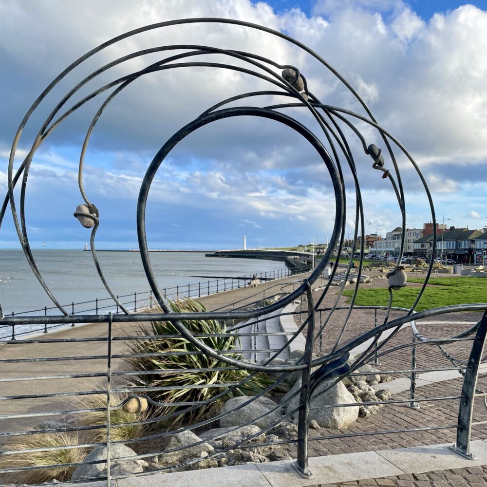
Brighton’s i360 is sometimes described as the world’s first ‘vertical pier’, but Redcar’s similarly-described construction was completed three years earlier. Neither are up my street.
This is another V&A exhibition for which you can chalk my attendance up to having complimentary access. I’ve no particular interest in Chanel, and certainly wouldn’t have paid twenty-odd quid to wander round it. Could it pull off the trick of Diva and reel in even this sceptical visitor? In a word: no.
If you covet Chanel clothing, this is the exhibition for you: hundreds of dresses, suits and more are assembled for you to gawp at. And gawp people did: it’s clear that this is why the vast majority of the crowd had come. The gender balance in the crowd was, shall we say, uneven.
However, if you’re more interested in Coco Chanel as a person, the influences behind her designs, or her creative and professional journey through significant social changes, you’ll likely be disappointed.
I might have felt differently if this were an art gallery exhibition, and I was being invited to contemplate the pieces and draw my own interpretations and conclusions. I’m not that into fashion, so I still doubt it would have moved me, but the lack of analysis would have ranked less than it did in a museum exhibition promising a named designer’s manifesto.
There’s a room in this exhibition with a gracefully curved, back-lit, two-storey display case filled with dozens of Chanel suits. I witnessed people enter this space and gasp, their eyes dazzling. If you’d gasp, you’d probably enjoy this show. If, like me, you’re vaguely baffled that the interpretation panels for so many suits amount to perhaps 100 words in total, leaving you to wonder what the hell you’re supposed to take away from this bit of curation, you probably won’t like it.
I learned that from early in her career, Chanel preferred simple garments that were comfortable to wear, generally featuring white, cream and black—the latter formerly shunned as appropriate only for mourning. And, it seemed to me, she stayed that course for the remainder. She was a visionary genius, we’re constantly told, but we never quite explore why, or where anything besides her core ideas propagated outside her fashion house.
Chanel experimented with different materials now and again, but I didn’t get a sense of progression. She leant her brand to a perfume line, but as this was hived off into its own space in the exhibition, I didn’t really get an appreciation of whether (or how) the progression of that line influenced her fashion, and vice versa. There was a nice hand-written letter from the late Queen in the perfume section, displayed much more prominently than any description of Chanel’s unsuccessful attempt to seize control of the perfume business from its Jewish owner during the mid-century rise in antisemitism. This is surprising, as one might imagine that the latter gives greater insight into Chanel’s character and ‘manifesto’ than the latter.
During the war, Chanel temporarily closed her fashion house, and possibly became a spy, possibly for one side, possibly for the other, possibly for both. ‘We can’t be sure,’ says the exhibition, ‘as she never finished her autobiography.’
It’s hard not to see that sort of thing as a cop-out. Surely, we couldn’t be sure even if she had written an autobiography? Interrogation of secondary sources would be essential, but here we just brush over the whole episode, but ooh, here are some more dresses.
It feels like the exhibition promotes Chanel, the brand. It tells us repeatedly how wonderful Chanel is, inviting us to stand and stare, while minimising the bits of the story that might seem, at best, a bit awkward to modern eyes. It seems to lack critical analysis, offering little dissection of the brand’s projected image versus the reality.
Walking past a large ‘exhibition supported by Chanel’ logo on exiting gave me a sinking feeling. Was the support contingent on the lack of criticism? Is this actually just an advert, rather than merely feeling like one?
And mostly: does something which lacks criticism, lacks analysis, and lacks proper context really belong in a museum?
I was a little put-off reading Lessons because I’d seen it described as a novel which featured a life story, also reflecting events in society from the late 1950s to the present day. This sort of novel is rarely well-written.
The central character of Lessons is Roland. We meet him aged 14 entering a sexual relationship with his piano teacher, in her mid-20s. From there, we follow him through the rest of his life: through love, marriage, single fatherhood, loneliness, and more. It’s tremendously ambitious and pulls off the trick of feeling genuinely biographical.
Roland is a drifter, someone who reacts to events around him rather than recognising his agency. This is frustrating on two levels. It’s sort of ‘good frustrating’ in terms of providing some narrative bite, but also ‘bad frustrating’, in the total lack of recognition of the background of privilege required to live in that way. If I wasn’t so predisposed by previous work to like McEwan, I’d say this was evidence of a desperate lack of awareness… but having read his previous works, I’m chalking it up to being a satirical choice he’s made with the narrative voice.
I have other nits to pick too. This isn’t a book where every word counts: it’s a baggy novel that felt like it could have been tightened up. In particular, I was frustrated by McEwan’s attempt to make this a sort of ‘state of the nation’ novel by frequently referencing contemporary news events. This could have been mostly excised without loss.
Yet, overall, this was excellent. I thoroughly enjoyed reading it.
When I think of orchids, I think of my grandparents, who used to take great pride—and occasionally some frustration—in cultivating them on their windowsill.
Yet, they took on a slightly different meaning when I worked at the Department of Health in London. Much as fevered talk of Glyndebourne took over later in the year, February was dedicated to chatting about whether people ‘had seen the orchids yet’. The reference was to the annual orchid festival at Kew Gardens.
Until the other day, I’d never visited the orchid festival before. As a visit to London happened to coincide with the festival, and since I’m a member of a scheme which gives me free access to Kew Gardens, I thought I’d pop in.
I expected a sort of exhibition: some plants, perhaps with little interpretation boards explaining what was so remarkable about them. I expected to come away with at least a vague appreciation of what makes an orchid an orchid, perhaps having learned a thing or two.
The first thing I learned is that one does not simply ‘pop in’ to the orchid festival. This is a ‘book a time slot’, ‘stand in queue’, ‘bags searched on entry’ experience. If you’re not up for crowds, this isn’t for you: it’s a slow-moving snake of people, mostly looking at flowers through their phone cameras. Don’t expect to stand and admire or stop and contemplate: unless, of course, you temporarily detour off the route into a designated ‘quiet space’, the existence of which is a clue to the atmosphere in the main conservatories: expect piped-in music from Madagascar and plenty of crowd noise.
The second thing I learned is that this isn’t primarily an educational experience: it’s a gawp-at-that, take-a-photo-for-instagram experience. Don’t expect interpretation boards explaining the life cycle of the orchid; do expect orchids arranged to look like giant chameleons, birds, lemurs and the occasional turtle. Kew’s preferred description is ‘horticultural spectacle’, which is a bit like describing the Blackpool illuminations as a ‘photometric panorama’.
As I wandered around, I kept thinking that it felt a little like parading around a ‘plant zoo’: this was an environment created for the visitors’ entertainment, not to demonstrate the plants in their natural habitat nor really to educate to any meaningful degree. The concentration on Madagascar specifically felt a bit culturally off, too: I kept wondering what would be in the ‘UK’ greenhouses in the Botanical Gardens of Antananarivo.
But none of this takes away from the astonishing achievement of putting on some impressive orchid-based dioramas: it just isn’t at all what I expected it to be, and nor is it up my street. I won’t be rushing back next year, but don’t let that put you off visiting this year.
Thirteen years ago, Apple launched the iPad—the device that seemingly every technology journalist in the world was certain would be called the iSlate. This is handy, as it provides a ready-made search term for anyone interested in transporting themselves back to those days of fevered speculation of quite what such a device would do.
Even after its launch, I was certain that the iPad wasn’t for me. I wasn’t alone in thinking that the market for an oversized iPhone that didn’t even function as a phone would be minuscule. I was wrong. I’m typing this very post on one of the two iPads I used regularly, the third and fourth that I’ve owned.
Partly because of that experience, and partly because I’m older, I’ve reserved judgement as I’ve read the coverage of the launch of Apple’s Vision Pro. There’s another element, too: I can actually see a potential benefit in sitting at home and working with lots of different large computer screens without having to clutter up the house with hardware. It’s not worth the financial cost or the practical tradeoffs at this stage, but I can see a future for this kind of device that would work for me.
As so often, though, Benedict Evans’s writing on the subject widened my perspective. He makes the point that simply projecting 2D screens into 3D space is not really the point of ’spatial computing’—‘That’s cool, but it seems like using a desktop service on an iPhone. It’s not native to the experience. I can use an iPad for that.’
Evans says that the device is really for 3D work. I was—and still am, to a degree—sceptical that 3D is the future of everyday work. As he asks, ‘is our work 3D? Is your data 3D?’ I have strabismus and sometimes think that I barely see in three-dimensions to begin with, so my scepticism is, maybe, unsurprising.
But, ‘is that like looking at a colour monitor in the 80s and saying that your spreadsheets don’t need colour? Putting maps or messaging onto your phone changed where you used it and how it could be useful: what’s the equivalent for 3D?’
It was the ’spreadsheets’ line that got me. I remember being taught, in the 1990s rather than the 1980s, that one really ought not to use colour in spreadsheets. I’d forgotten all about that. These days, it’s entirely normal to see spreadsheets filled with colours: does a risk register even exist if it isn’t pasted into a spreadsheet with colour-filled RAG ratings, which the colourblind among us struggle to interpret?
I think, too, of PowerPoint presentations. These seem, in many cases, to hand supplanted Word documents as the preferred way to share lengthy text-based narratives. They’re not the logical nor most accessible option, but perhaps people find uses for the tools they’re given.
Perhaps in fifteen years’ time, the Vision Pro 15 will be as every day as iPads are today. Perhaps it will be de rigeur to present things in 3D, regardless of whether it’s actually the best approach for any given task. Or maybe the idea will fade away, like Google’s vision for Glass.
‘Of course, most people didn’t realise how big the iPhone would become, and conversely, some people thought that everyone would have a 3D printer. Predicting tech is hard, and predicting human behaviour is harder: we all do things every day that “no-one would ever do”.’
The content of this site is copyright protected by a Creative Commons License, with some rights reserved. All trademarks, images and logos remain the property of their respective owners. The accuracy of information on this site is in no way guaranteed. Opinions expressed are solely those of the author. No responsibility can be accepted for any loss or damage caused by reliance on the information provided by this site. Information about cookies and the handling of emails submitted for the 'new posts by email' service can be found in the privacy policy. This site uses affiliate links: if you buy something via a link on this site, I might get a small percentage in commission. Here's hoping.