About me
Bookshop

Get new posts by email.

About me

‘Landed’ by Les Johnson

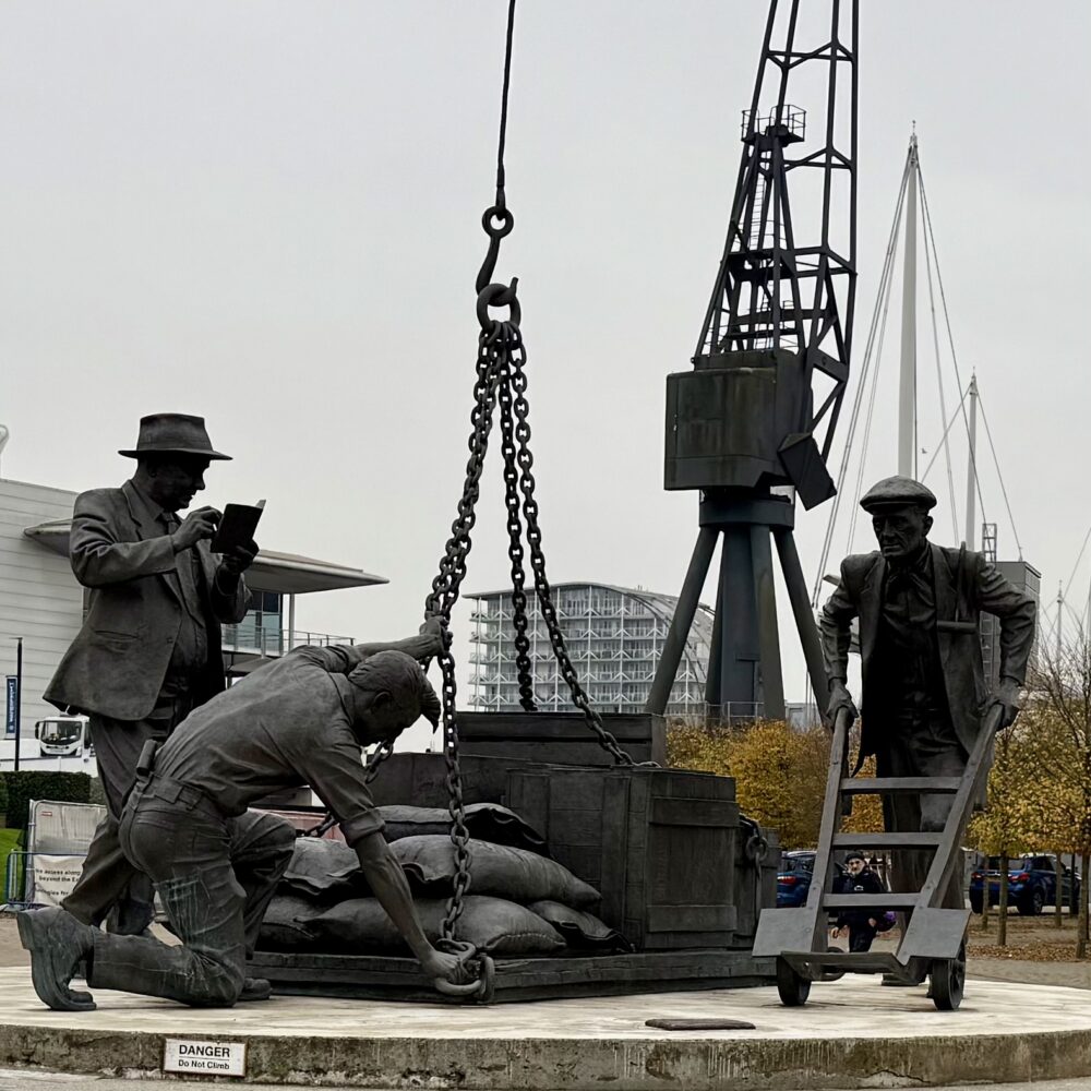
I recently walked past this sculpture next to London’s ExCel exhibiton centre and thought, “that’s new!”

It’s not, though. It’s been there since 2009. I evidently walk round with my eyes closed.

The sculpture shows three dock workers, and was the result of a long campaign supported by the Queen Mother, among others, to commemorate the people who worked at the docks between 1855 and 1983. The figures are based on the likenesses of real dock workers, including Johnny Ringwood who helped raise money for it. Now aged 89, he re-visited the statue earlier this year.

The bloke with the hat and the book is Patrick Holland, depitcted as a tally clerk but in reality a stevedore, a word I last thought about in April 2021.

The scene is loosely copied in Mychael Barratt’s Mile End Mural.

This post was filed under: Art, Photos, Travel, , , , , .

‘Types of Happiness’

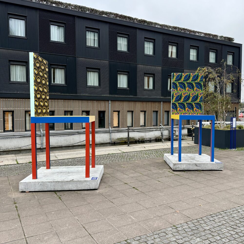
These two giant chairs, by Yinka Ilori, are currently on display next to the Royal Victoria Dock. One represents happiness and the other pride, though the fact that I can’t tell which is which is perhaps a marker of their limited success.

This post was filed under: Art, Photos, Travel, , .

Redriff

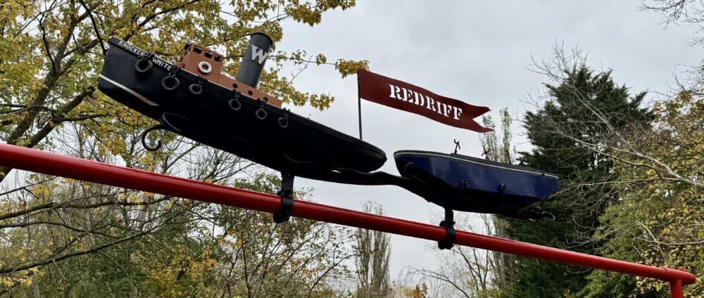
While we’re on refreshed artworks in Rotherhithe—and there’s a sentence I never imagined writing—this pair of boats made by Kevin Boys was recently unveiled on the refurbished Redriff Footbridge, replacing a previous artwork that had been stolen.

I would never have come across this spot had I not serendipitously wandered into the Russia Dock Woodland on an ‘I wonder where that path goes?’ whim.

After the closure of the Surrey Commercial Docks in the 1970s, Russia Dock was filled in—except for a little trickle of a stream. The surrounding area was planted to create a little woodland. Forty-odd years after it was completed, it’s become a 34-acre haven of nature in a formerly industrial area.

The filled-in dock sits at a lower level than the surrounding pathways, with the capstones still visible. This provides a nice link to its industrial past, but it did strike me that safety considerations might have prevented that design approach if the woodland were created today.

I’ve previously written about the many country parks in North East England, which stand as the beautiful legacy of our mining past, and I suppose this is a sort of industrial dock equivalent.

This post was filed under: Photos, Travel, , , .

Deal porters

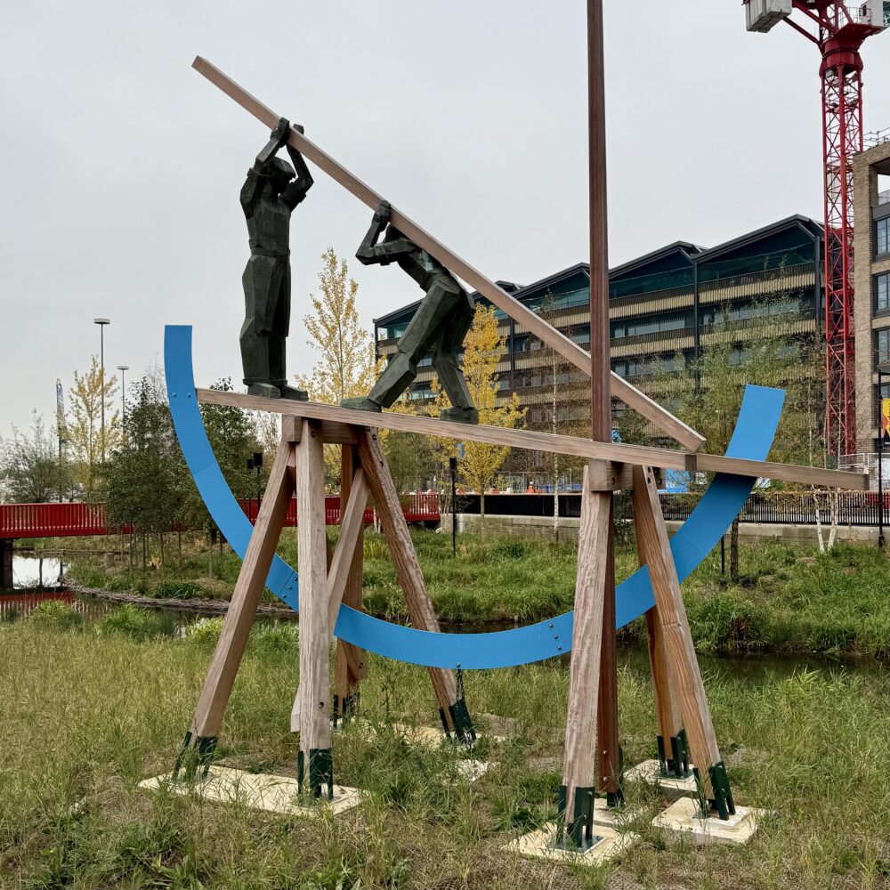
In the first half of the twentieth century, the area around Rotherhithe in London did a roaring trade in importing ‘deal’—large pieces of timber. In order to import it, it needed to be unloaded from incoming ships, and ‘deal porters’ were the answer to that problem.

Working in pairs, one worker would lift one end of a stack of deal, and their partner would stand at the deal’s mid-point and heave it up onto his shoulder. The worker would then walk, carrying this extraordinarily long and heavy deal, across a gangplank to the dock and into nearby warehouses. You could, I guess, say that this method was ‘the art of the deal’—and it was backbreaking work. There’s some archive footage on Youtube. Much of the wood was turned into paper to supply the nearby newspaper presses, while the rest was used in construction and furniture carpentry.

In 1990, Philip Bews and Diane Gorvin created a sculpture in steel and oak to sit among the greenery on the edge of Canada Dock commemorating this work. It was well-received, though as the trees and greenery grew around it, the sculpture became difficult to see during the more verdant seasons.

Last year, the sculpture was taken away for refurbishment. A few weeks ago, it returned to the newly redeveloped Canada Dock. The workers now look out over a vermillion bridge of thousands upon thousands of pieces of timber, as though their work will never be completed. I’m not sure whether I’m more depressed by that idea, or by seeing how the greenery which previously stretched higher than the seven metres of the statue now doesn’t even hide its base.

Still, I do rather like the sculpture, even if it’s a bit figurative for my usual taste.

This post was filed under: Photos, Travel, , , , .

‘Elantica: The Boulder’

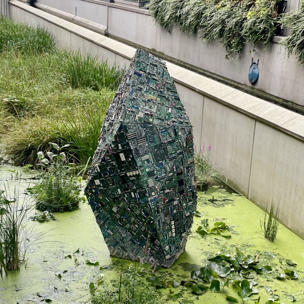
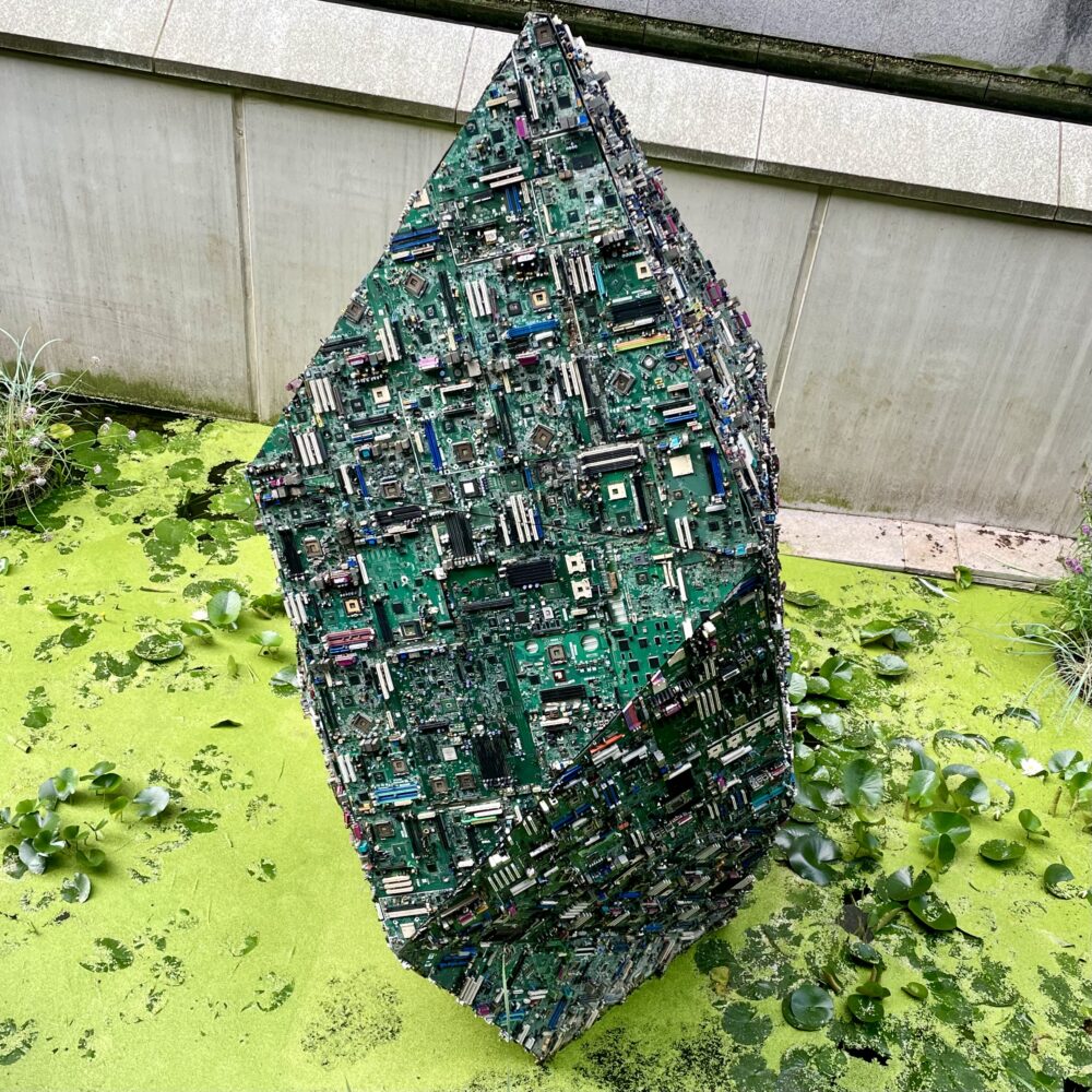
This artwork by the Belgian couple Tom and Lien Dekyvere was part of Canary Wharf’s festival of winter lights, but has since been adopted into the permanent collection.

It is a boulder made from discarded circuit boards. It lights up, but I vastly prefer it in its daytime mode, where it looks much more like a boulder and much less like a twinkly trinket.

When I’ve seen this work previously, I’ve taken it as a commentary on the impact of technology on the earth’s natural resources: all those rare earth metals returning to the rocky form from whence they came. The growth of artificial intelligence, with its outsized carbon emissions, felt like it lent the sculpture extra contemporary relevance.

In the course of writing this blog post, though, I’ve discovered that my interpretation does not align with the artists’ intention, which is more about highlighting the imperfection of digital representations of the physical world—which, I suppose, explains the garish light display.

I also thought the label was misprinted, and should have been ‘El Antica’, which I assumed to be Belgian for ‘the antique’, but that’s a load of rubbish too.

This post was filed under: Art, Photos, Travel, , , , .

‘Gabrielle Chanel: Fashion Manifesto’

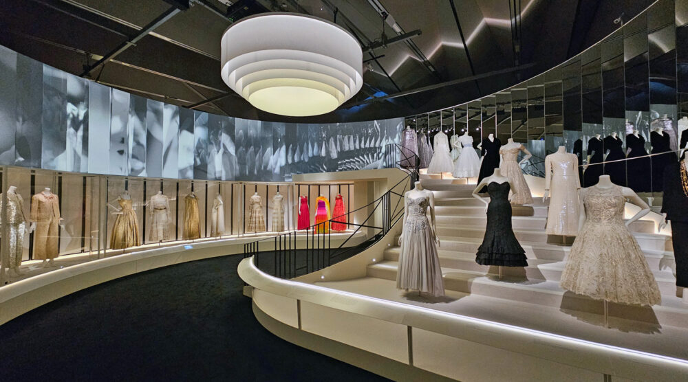
This is another V&A exhibition for which you can chalk my attendance up to having complimentary access. I’ve no particular interest in Chanel, and certainly wouldn’t have paid twenty-odd quid to wander round it. Could it pull off the trick of Diva and reel in even this sceptical visitor? In a word: no.

If you covet Chanel clothing, this is the exhibition for you: hundreds of dresses, suits and more are assembled for you to gawp at. And gawp people did: it’s clear that this is why the vast majority of the crowd had come. The gender balance in the crowd was, shall we say, uneven.

However, if you’re more interested in Coco Chanel as a person, the influences behind her designs, or her creative and professional journey through significant social changes, you’ll likely be disappointed.

I might have felt differently if this were an art gallery exhibition, and I was being invited to contemplate the pieces and draw my own interpretations and conclusions. I’m not that into fashion, so I still doubt it would have moved me, but the lack of analysis would have ranked less than it did in a museum exhibition promising a named designer’s manifesto.

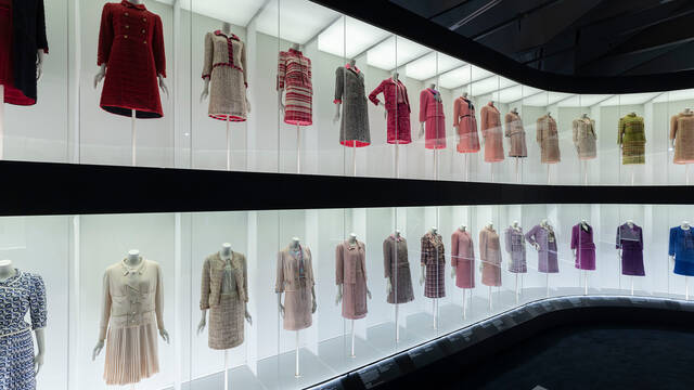
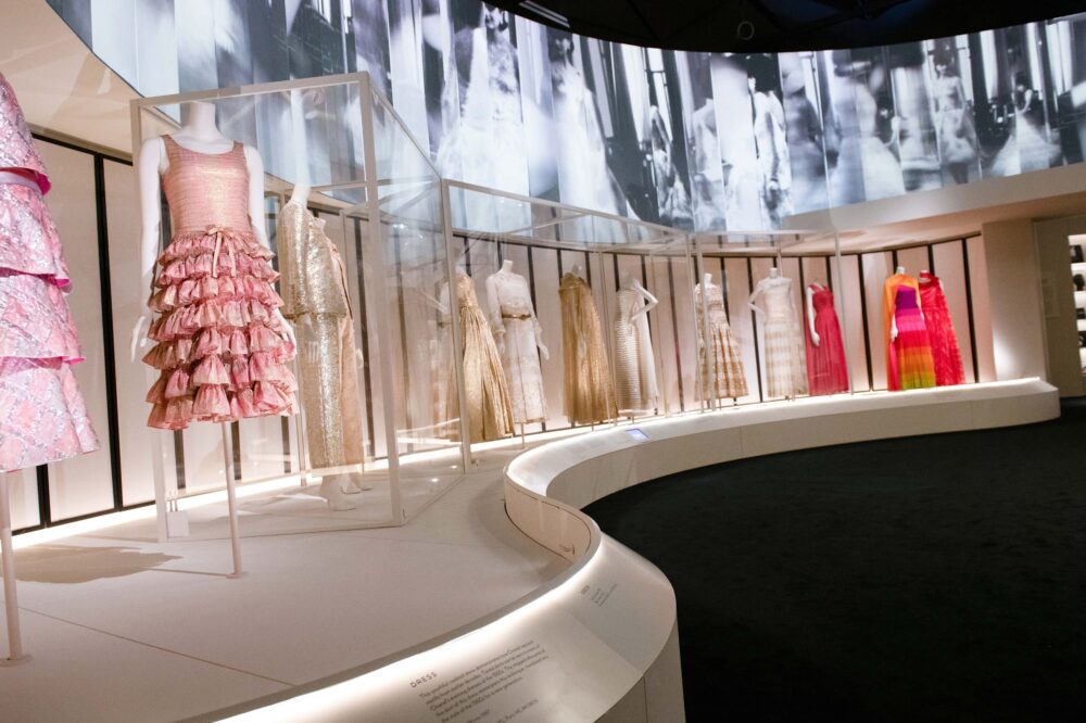
There’s a room in this exhibition with a gracefully curved, back-lit, two-storey display case filled with dozens of Chanel suits. I witnessed people enter this space and gasp, their eyes dazzling. If you’d gasp, you’d probably enjoy this show. If, like me, you’re vaguely baffled that the interpretation panels for so many suits amount to perhaps 100 words in total, leaving you to wonder what the hell you’re supposed to take away from this bit of curation, you probably won’t like it.

I learned that from early in her career, Chanel preferred simple garments that were comfortable to wear, generally featuring white, cream and black—the latter formerly shunned as appropriate only for mourning. And, it seemed to me, she stayed that course for the remainder. She was a visionary genius, we’re constantly told, but we never quite explore why, or where anything besides her core ideas propagated outside her fashion house.

Chanel experimented with different materials now and again, but I didn’t get a sense of progression. She leant her brand to a perfume line, but as this was hived off into its own space in the exhibition, I didn’t really get an appreciation of whether (or how) the progression of that line influenced her fashion, and vice versa. There was a nice hand-written letter from the late Queen in the perfume section, displayed much more prominently than any description of Chanel’s unsuccessful attempt to seize control of the perfume business from its Jewish owner during the mid-century rise in antisemitism. This is surprising, as one might imagine that the latter gives greater insight into Chanel’s character and ‘manifesto’ than the latter.

During the war, Chanel temporarily closed her fashion house, and possibly became a spy, possibly for one side, possibly for the other, possibly for both. ‘We can’t be sure,’ says the exhibition, ‘as she never finished her autobiography.’

It’s hard not to see that sort of thing as a cop-out. Surely, we couldn’t be sure even if she had written an autobiography? Interrogation of secondary sources would be essential, but here we just brush over the whole episode, but ooh, here are some more dresses.

It feels like the exhibition promotes Chanel, the brand. It tells us repeatedly how wonderful Chanel is, inviting us to stand and stare, while minimising the bits of the story that might seem, at best, a bit awkward to modern eyes. It seems to lack critical analysis, offering little dissection of the brand’s projected image versus the reality.

Walking past a large ‘exhibition supported by Chanel’ logo on exiting gave me a sinking feeling. Was the support contingent on the lack of criticism? Is this actually just an advert, rather than merely feeling like one?

And mostly: does something which lacks criticism, lacks analysis, and lacks proper context really belong in a museum?

I’m not sure it does.


Gabrielle Chanel. Fashion Manifesto continues at the V&A until 10 March, but it’s sold out, so you’re too late if you haven’t already got tickets.
This post was filed under: Art, Museums, Travel, , , .

‘Orchids: the beauty of Madagascar’

When I think of orchids, I think of my grandparents, who used to take great pride—and occasionally some frustration—in cultivating them on their windowsill.

Yet, they took on a slightly different meaning when I worked at the Department of Health in London. Much as fevered talk of Glyndebourne took over later in the year, February was dedicated to chatting about whether people ‘had seen the orchids yet’. The reference was to the annual orchid festival at Kew Gardens.

Until the other day, I’d never visited the orchid festival before. As a visit to London happened to coincide with the festival, and since I’m a member of a scheme which gives me free access to Kew Gardens, I thought I’d pop in.

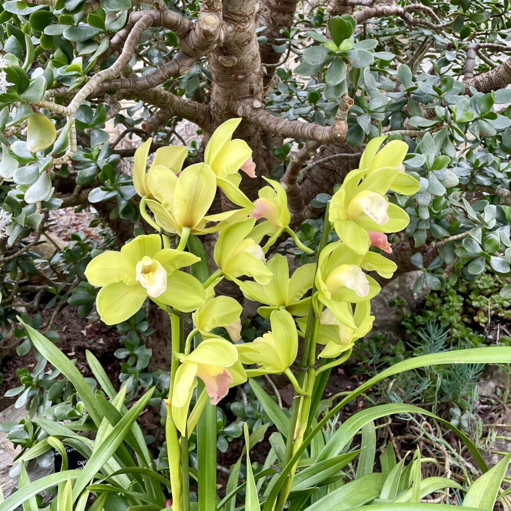
I expected a sort of exhibition: some plants, perhaps with little interpretation boards explaining what was so remarkable about them. I expected to come away with at least a vague appreciation of what makes an orchid an orchid, perhaps having learned a thing or two.

The first thing I learned is that one does not simply ‘pop in’ to the orchid festival. This is a ‘book a time slot’, ‘stand in queue’, ‘bags searched on entry’ experience. If you’re not up for crowds, this isn’t for you: it’s a slow-moving snake of people, mostly looking at flowers through their phone cameras. Don’t expect to stand and admire or stop and contemplate: unless, of course, you temporarily detour off the route into a designated ‘quiet space’, the existence of which is a clue to the atmosphere in the main conservatories: expect piped-in music from Madagascar and plenty of crowd noise.

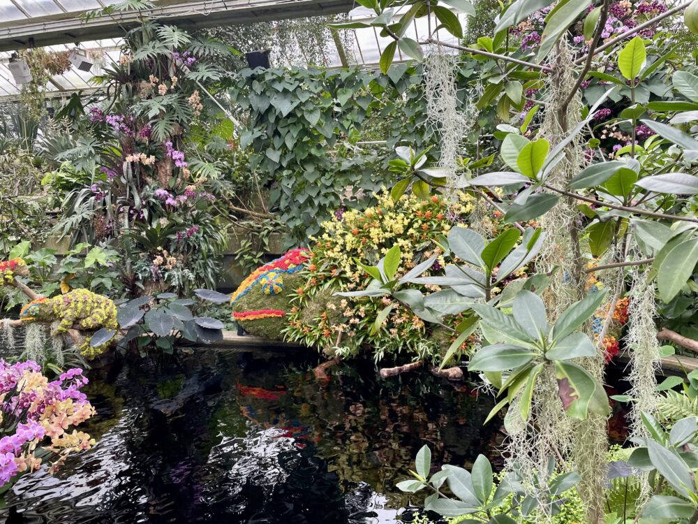
The second thing I learned is that this isn’t primarily an educational experience: it’s a gawp-at-that, take-a-photo-for-instagram experience. Don’t expect interpretation boards explaining the life cycle of the orchid; do expect orchids arranged to look like giant chameleons, birds, lemurs and the occasional turtle. Kew’s preferred description is ‘horticultural spectacle’, which is a bit like describing the Blackpool illuminations as a ‘photometric panorama’.

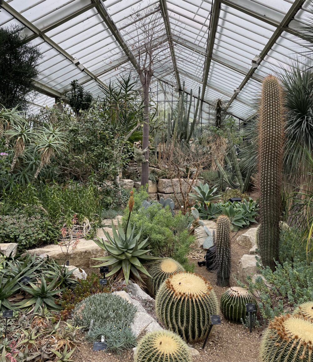
As I wandered around, I kept thinking that it felt a little like parading around a ‘plant zoo’: this was an environment created for the visitors’ entertainment, not to demonstrate the plants in their natural habitat nor really to educate to any meaningful degree. The concentration on Madagascar specifically felt a bit culturally off, too: I kept wondering what would be in the ‘UK’ greenhouses in the Botanical Gardens of Antananarivo.

But none of this takes away from the astonishing achievement of putting on some impressive orchid-based dioramas: it just isn’t at all what I expected it to be, and nor is it up my street. I won’t be rushing back next year, but don’t let that put you off visiting this year.


The orchid festival continues at Kew Gardens until 3 March.

This post was filed under: Art, Travel, , .

‘Diva’

If someone was describing an exhibition which would be of minimal interest to me, this one at the V&A would superficially come close to the result. It’s mostly a fashion exhibition—not something that would usually appeal—heavily promoted as featuring outfits worn by pop music heroines, many of whom I wouldn’t recognise on the street. My sole reason for popping by was that I have complimentary access and happened to be in the area.

I was unexpectedly engrossed and impressed.

In terms of the actual exhibits, this was primarily a fashion exhibition. Its success came from using the exhibits to explore a wider story. In this case, the running theme was feminism and its relationship to the shifting meaning of the word ‘diva’.

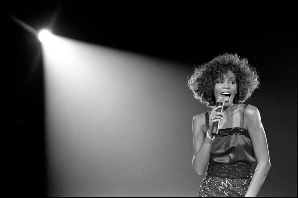
We start with ‘diva’ in the 16th-century sense of ‘goddess’, as applied to opera singers—primarily sopranos—whose voices were so spectacular as to be considered virtually supernatural. This is also where we first encounter the subversive power of the ‘diva’: as those voices become the driver of ticket sales, works begin to be written around them, and the ‘divas’ attain power and independence far beyond that offered to a woman in virtually any other walk of life. Indeed, they attain more than the men: these ‘divas’ were not just singers, but captains of industry in their own rights, using their platform to promote ‘female’ issues. Yet, often, these ‘divas’ failed to find happiness in their own lives, the persona—the costume—becoming a kind of gilded cage.

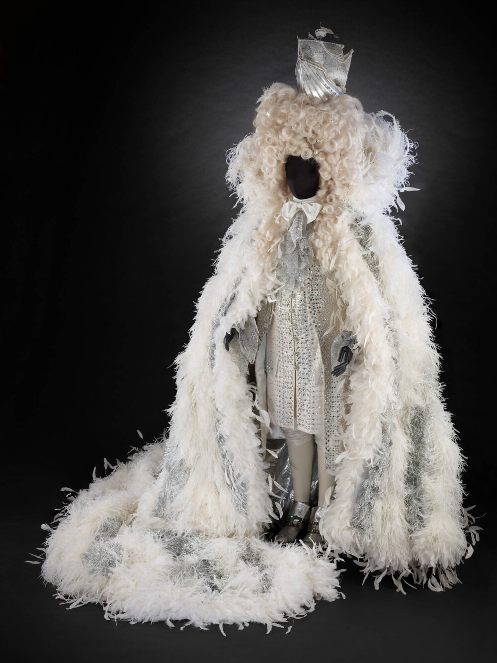
And so the pattern repeated, from opera, to jazz, to theatre, to movies, to pop music. The same tropes crop up again and again, each time bringing forth viewpoints from the latest wave of feminism. Since the 1960s, but even more so in the fourth wave of feminism, one needn’t be a woman to be a diva: and so we see Elton John’s startling Louis XIV fiftieth birthday outfit.

It’s interesting to contemplate the layers of meaning in ‘diva’—given our collective history, it’s no surprise that there’s an element of disparagement in a term describing a woman who wields her own influence.

It’s an exhibition that provides plenty of facts, and plenty of provocations for reflection. If you’re interested in fashion, there’s a whole other layer of interest here that mostly passed me by. I also enjoyed the clever use of audio headsets, which responded to each exhibit: I might not have known all the featured artists by name, but I recognised more for their music. The audio also helped to illustrate the connection between fashion and music, and cleverly synced with film clips in the exhibition.

For all that: the thing that has stayed most with me from this exhibition is a huge looping timeline of feminism from the 1800s onwards, titled ‘Redefining the Diva’. The final point on the timeline, coming after fourth-wave feminism and dated 2022, is the US Supreme Court’s overturning of Roe vs Wade. If ever there was a reminder that we still need feminism—and divas who push the boundaries—then that has to be it.


Diva continues at the V&A until 10 April.

This post was filed under: Art, Travel, , .

I’ve visited ‘Donatello: Sculpting the Renaissance’

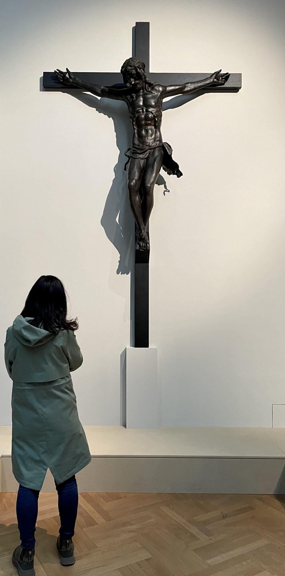
Wendy and I have been lucky enough to visit the blockbuster Donatello exhibition at the V&A. As the museum puts it, this was an opportunity for us to ‘explore the exceptional talents of the Renaissance master Donatello, arguably the greatest sculptor of all time’.

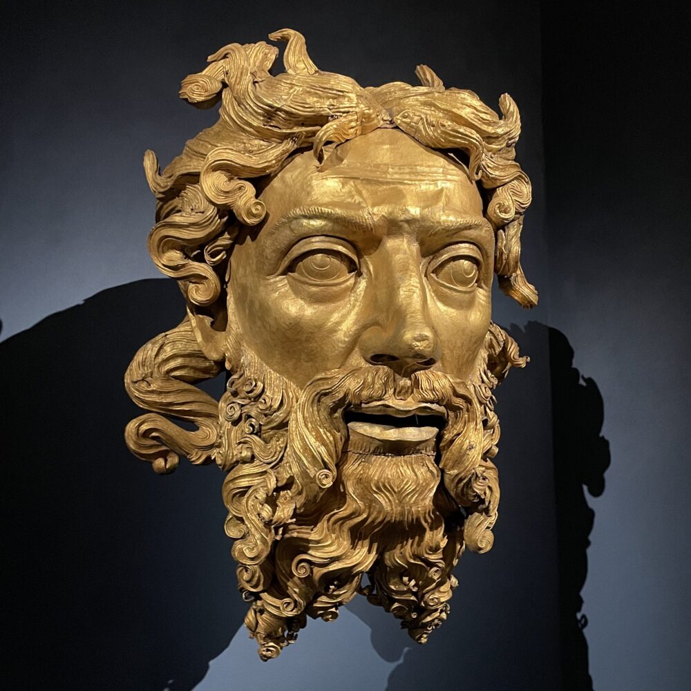
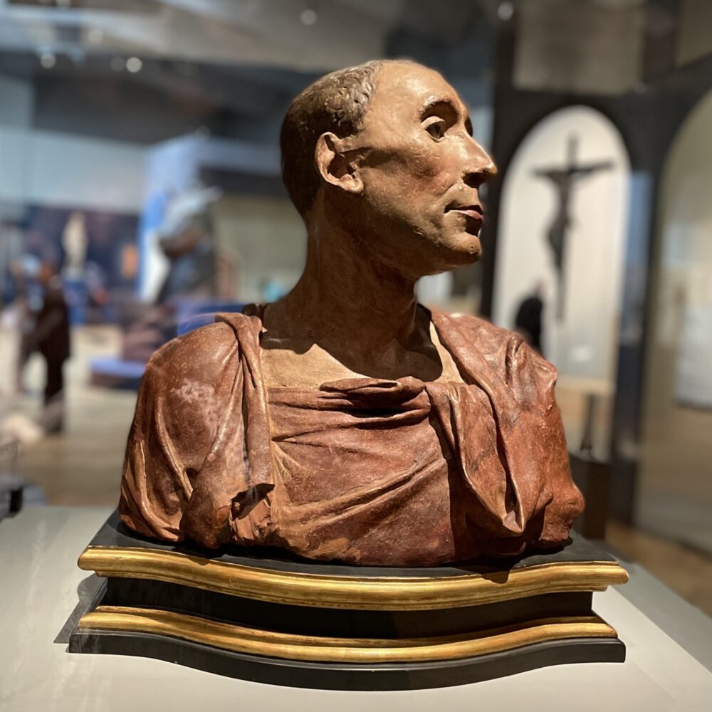
Except… well… it didn’t feel that way. We were a little pushed for time, but found it a bit of a challenge to work out what we were supposed to take from each item. For example, the ‘God the Father’ from Milan Cathedral, above, has no connection whatsoever with Donatello. The label suggested that the technique used to make it was uncertain, but that it might have been a technique that Donatello might have also sometimes used. Right.

And the exhibition rather continued in this vein. Neither of us knows the first thing about Renaissance art, and so perhaps we’re not really the target audience, but we left with no real appreciation for why Donatello was so especially revered.

We did both comment that the Donatello works seemed to stand out in the exhibition, thought couldn’t quite work out whether that was due to an inherent quality of them or the curation.

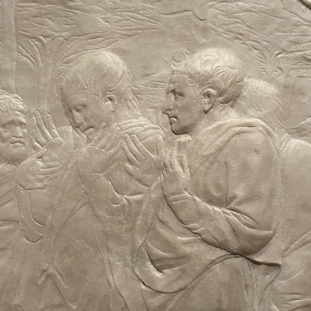
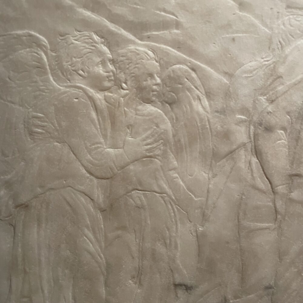
I was struck by the incredible detail of Donatello’s rilievo schiacciato, a phrase I’ll never remember a week from now which refers to the low-relief marble carvings like the one above. Weirdly, these felt a bit tucked into a corner in the exhibition, with more space and focus seemingly given over to Donatello’s possible (but uncertain) training as a goldsmith.

I think maybe I’ve been spoiled by Vermeer, but I was left thinking that I’d have preferred there to be less in this exhibition to allow the Donatello to breathe, and to help us understand why he’s so revered.


‘Donatello: Sculpting the Renaissance’ continues at the V&A until 11 June.

This post was filed under: Art, Post-a-day 2023, , , .

I’ve visited Outernet London

Plenty of people (though not all) seem to be somewhere between angry and disappointed at the existence of Outernet London, a new venue next to Tottenham Court Road tube station that has live performance venues and stuff. Most of the opprobrium at what has been built—rather than what has been knocked down—seems to be a result of the wander-off-the-street area. I happened to be in the area so, well, wandered in off the street.

It’s basically a space with a huge advertising screen on the outside, and a series of hall-like interior spaces in which the walls and ceiling are covered with high-resolution screens. It’s been described as an “immersive experience” and “the world’s foremost bridge between the real world and the digital world”—which is basically marketing guff.

I was reminded most of the 360-degree cinemas at Epcot in the 1990s, except with the addition of images on the ceiling: the experience didn’t feel new or unique to me. There was an advert playing while I was there, but I can’t remember what company was footing the bill: I remember it was an office-space company, and I remember not being able to work out how the imagery connected with that, but I couldn’t tell you the brand. I suppose that also indicates my level of immersion.

But all of this is okay: I’m not the target audience, and their arrows flew right past me. I wouldn’t bother wandering in again, but then I’m not someone who’d go and see a 3D film at my local IMAX either, nor someone who’d pay more than passing attention to the screens at Piccadilly Circus.

I don’t think a room with screens on the walls is the end of good taste, I don’t think it’s an affront to civic decency, but I also don’t think it’s for me. And that’s fine.

This post was filed under: Post-a-day 2023, Travel, , .


The content of this site is copyright protected by a Creative Commons License, with some rights reserved. All trademarks, images and logos remain the property of their respective owners. The accuracy of information on this site is in no way guaranteed. Opinions expressed are solely those of the author. No responsibility can be accepted for any loss or damage caused by reliance on the information provided by this site. Information about cookies and the handling of emails submitted for the 'new posts by email' service can be found in the privacy policy. This site uses affiliate links: if you buy something via a link on this site, I might get a small percentage in commission. Here's hoping.