About me
Bookshop

Get new posts by email.

About me

Party affiliation in the afterlife

Earlier this week, John Prescott sadly died. Here’s the headline on the Sky News article reporting his death:

Former Labour deputy prime minister John Prescott dies aged 86

Long-term readers may think that I’m going to rant about the use of the present tense “dies” rather than the past tense “has died”—this is a persistent and widespread bugbear—but I was more intrigued by the use of the word “Labour” in that headline.

He was—as anyone would be—”deputy prime minister” for the whole country, not just for Labour. It felt an odd, somewhat tribal, somewhat divisive qualification to make, and it didn’t feel familiar.

I suspected that, previously, the headlines have just reported the office of state, not the party affiliation. It seems like this might represent further tribalisation of our politics. But I chose to suspend my disappointment for a bit while I checked my facts.

This is a tricky thing to do: there have only been eight formally appointed deputy prime ministers in the UK, two of whom were Dominic Raab, and all of which—barring John Prescott—are still alive. Sky News has never had to report the death of a former deputy prime minister before.

Reporting on the death of a former prime minister feels qualitatively different from the death of a former deputy, so that doesn’t seem like a fair comparison. But what about holders of the other great offices of state?

The most recent former chancellor to die was, of course, Alastair Darling, late last year. The Sky News headline:

Alistair Darling: Former Labour chancellor dies aged 70

The most recent former home secretary to die was Lord Waddington, in 2017. The Sky News headline:

Former Conservative home secretary Lord Waddington dies aged 87

The most recent former foreign secretary to die was Robin Cook, in 2005, which is further back than the Sky News website archive stretches… but from the examples above, I think we can safely conclude that this isn’t a new practice after all. Sky News has been headlining the party affiliation of dead politicians for years. For what it’s worth, this doesn’t seem to apply to prime ministers (“Margaret Thatcher dies at 87 after stroke”).

So why did it feel unusual? I suspect it is because the BBC doesn’t do it. Their headlines for each of these stories:

Former deputy PM Lord Prescott dies aged 86

Former Chancellor Alistair Darling dies aged 70

Former Home Secretary Lord Waddington dies at age of 87

Former minister Robin Cook dies

Just because the BBC does something doesn’t mean it’s right—in fact, the BBC News house style often riles me. It’s curious that it often nonetheless sets expectations.


The image at the top of this post was generated by DALL·E 3.

This post was filed under: Media, News and Comment, , , .

Moaning to the media

Every now and again, I find myself moaning to Sky News about some report or other they’re running, usually on a medical topic. This might put me in the same box as the green-ink angry brigade of old, but I kind of hope it doesn’t.

Sky News is normally the outlet on the receiving end of my moans because Wendy likes to watch Sunrise in the mornings, so they tend to be the ones to irk me when I’m sleepy-eyed and vulnerable. Usually, they’ve misunderstood the findings of some piece of research, or are giving advice that needs a little more nuance. Generally, I fire off an email to them, and they correct either their script or package pretty quickly, or else get back to me to explain why they won’t. I actually think I have a pretty good relationship with them.

A few years ago when the whole MTAS debacle was kicking off in the medical world, I helped Channel 4 News with some of their reporting, and also found them really helpful, willing to listen to my explanations, and good at accurate reportage.

Until a couple of weeks ago, I don’t think I’ve ever complained about a BBC News report. But then, the BBC News website published this article about the Queen’s faith role. This couldn’t be further from the stuff I’d usually moan about, but the report was based on a COMRES poll, and originally opened with the claim that 80% of the population supported the Queen’s faith role. I didn’t believe this, and so checked out the original data on the COMRES website, which revealed that 80% responded positively to a question about whether the Queen has a faith role. This is, of course, different from giving support – it’s a question of fact, and, as the Queen is the head of the Church of England, it seems pretty undeniable that she has a faith role, whether or not it’s supported.

So I fired off an email. And, within hours, the article was changed to the current version, which reports the actual survey findings more accurately. What I hadn’t anticipated, and hadn’t had from any other outlet, was that the Religion Editor gave me a call. We had a great chat in which he explained how the article had come about, how the mistake had been made, and also a general talk about the complex rules that the BBC has around commissioning surveys. This was fantastic.

So what’s my point? Essentially, any time I personally have moaned to a media outlet about a factual reporting error, I’ve received a positive response. Granted, it would be better that the mistakes weren’t there in the first place, and it’s probably true that not all sections of the media are as responsible as those I’ve been involved with.

But journalists are humans too. They make mistakes, and many of them seem happy to have these corrected. Leveson might give the impression that all journalists are unethical idiots, and Blair might think they’re feral beasts, but some journalists are just doing a bloody hard job as well as they can, with the utmost professionalism.

I know it’s not a popular view at the moment, but maybe we can consider giving journalists a break sometimes? Just a thought.

This post was filed under: Media, News and Comment, , , , .

iPad App Review: Sky News

I am a Sky News viewer. That’s my guilty confession. I don’t so much sit and watch it as have it on in the background when I’m at home. It’s essentially moving wallpaper for my living room, often ‘watched’ without sound.

I choose Sky News because it’s the least distracting of the news channels. That used to be true of BBC News 24, but there’s something about the presentational style now that distracts me. I don’t know what it is, or whether that’s a good thing for attracting viewers who actually want to watch, but it’s turned me off.

I also like the fact that they respond and change scripts when I send them moany emails pointing out the factual errors in their medical reportage, whereas the BBC generally ignore me.

20110329-083626.jpg So, as a Sky News viewer, the iPad App has been marketed very heavily at me. Frankly, I’m fed up of seeing the adverts.
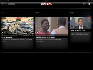
The app is fairly new, and has received a lot of praise from all over the place: Tech Radar basically loved it, Zath thought it was one of the iPad’s best apps, and Crowded Brain gave it 9/10.

The app is often praised for its innovative presentational style and ‘immersive’ experience. It has two main gateways, both of which are video focussed. There is a traditional ‘order of importance’ approach, where videos and headlines from stories are dynamically (read: messily) arranged with size and position indicating importance. Hit a video and it starts to play, while contextual information flies in from the sides. The contextual information is generally more video content on the same story, textual content, or interactive graphics.

Alternatively, the ‘timeline’ view gives me a virtually minute-by-minute index of what has been presented on Sky News over the last 24 hours, and allows me to jump to any bit of it, with the contextual fly-ins as above.

20110329-083751.jpg Conclusion: I hate it.

I really do very strongly dislike this app. I just don’t think I’m a person who enjoys consuming news through video. I might have Sky News on all the time, but I guess I don’t really watch it. Save for some recent very big stories, few newsworthy items lend themselves to videos – moving pictures rarely add all that much to understanding. I’d far rather scan-read a written article than spend three times the time being spoon-fed a simplified version of the issue via video.

I didn’t realise how strongly I felt about this until this app came along. I rarely click the videos in online news articles, but they don’t bother me – I just ignore them. But when you go down this Sky News route of removing almost everything but the video it becomes painfully clear that this isn’t the way I like to consume my news.

I’ll concede that the app is visually striking – though I wouldn’t necessarily call it attractive. I’ll concede that it’s innovative – I’ve never seen anything quite like it before. But I’ll conclude that it’s not for me – when it moves to a subscription model, I won’t be paying.


This is the third in a series of posts reviewing iPad Apps. Yesterday’s review was of the iWork Apps. Check back tomorrow for my review of Who Wants to be a Millionaire HD. Yes, really.

This post was filed under: iPad App Reviews, Media, Reviews, Technology, , , .


The content of this site is copyright protected by a Creative Commons License, with some rights reserved. All trademarks, images and logos remain the property of their respective owners. The accuracy of information on this site is in no way guaranteed. Opinions expressed are solely those of the author. No responsibility can be accepted for any loss or damage caused by reliance on the information provided by this site. Information about cookies and the handling of emails submitted for the 'new posts by email' service can be found in the privacy policy. This site uses affiliate links: if you buy something via a link on this site, I might get a small percentage in commission. Here's hoping.