About me
Bookshop

Get new posts by email.

About me

New masthead

I’ve decided to give the site’s masthead a bit of a makeover, as the old one was starting to feel more than a little dated. The new one still has elements of the old: the same background image, the guillemet, and a bit of bold-italic verdana being the most obvious examples. But I hope the overall effect is a bit more modern, and a bit more typographically interesting.

The old one (see here) had remained basically the same since 2005 (see here), albeit with various different tag-lines, a couple of different size variations, and a short-lived change of background image. I can’t think of another website that’s had the same basic masthead for seven years – and the last masthead itself was an updated version of the original 2003 logo (see here).

Anyway, I hope you like it. I’m sure I’ll tweak it over the next few days and weeks – the curse of perfectionism, I’m afraid – but it’ll settle eventually!

This post was filed under: Diary Style Notes, Site Updates, , .

Throw your money at Me(ncap)!

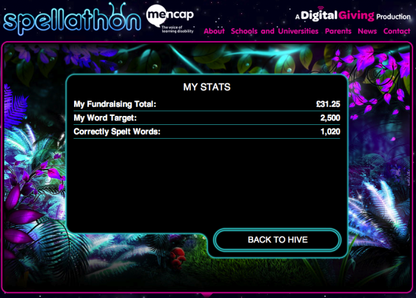
As you can see, I’m now 1000 words into my 2500-word Mencap spellathon challenge. I think I underestimated how many words make 2500 – it turns out that 2500 is quite a lot. So keep sponsoring me, and keep me spelling!

Mencap is a great cause, supporting the 1.5 million people in the UK with learning disabilities. If you gave me a penny for ever ten words – that’s just £2.50 – Mencap could make that go a long way. So get over to the JustGiving page Mencap have created for me, and give them some cash.

Thanks for your support!

This post was filed under: Miscellaneous, , , .

Tweaking the design of my blog

Those readers who view my posts directly on this site can’t have failed to have noticed a few design tweaks over the last couple of days. I’ve been attempting to improve the readability of the text, and make it easier to delve into the archive. There are a few graphical changes too, to make things look a bit more modern.

A lot of the changes are really tiny – text sizes, contrast and line spacing, for example – but some of the more obvious ones are the improved handling of archive pages (which now show full posts rather than lists of titles), the ability to flick through the blog chronologically, and the vastly clarified “calls to action” under posts on single post pages.

The latter includes one-click access to similarly tagged archive posts. Unfortunately, few of my posts actually have tags, as they’ve never had any practical function from the front-end until now, but I am determinedly ploughing through the archive tagging away.

I hope the changes are to your liking – as ever, I’d be delighted to hear your feedback.

This post was filed under: Diary Style Notes, Site Updates, , .

I’m coming home

I’ve been using Tumblr for a few months now, mainly because of ease of access on the move. However, having become frustrated with the limitations of a third-party service, I’ve leapt back to WordPress sjhoward.co.uk from today.

I’ve duplicated almost all of the posts from Tumblr – there weren’t all that many, and I don’t anticipate this transition shaking the Earth to the core. I tended to post more varied content on Tumblr that I historically did on here, and my posts were almost all shorter than typical posts here, and I plan to continue that style back on here. I’ll be doing my photo-a-day project via here, for example.

There’s bits of housekeeping to be done to tidy things up on here, which will no doubt get done in time. Feel free to comment on this post if you spot any glaring errors for me to pay some attention to.

Thanks for your support over the eight or so years that I’ve been blogging – I hope you’ll continue to enjoy reading!

This post was filed under: Site Updates, , , .

Introducing photo-a-day 2012

Happy new year!

Inspired by @sillypunk’s 2011 success, I’m going to try the Photo a Day idea for 2012… First picture to arrive shortly…

This post was filed under: Diary Style Notes, Photo-a-day 2012, , .

On Reflection…

Wow, you wait months for a post, and then get an X Factor liveblog. Yikes.

For something a little more like everything else I write, you might want to look at some contributions to The Pod Delusion that I’ve made and forgotten to point to – listen here and here.

Normal service will be resumed shortly.

This post was filed under: Diary Style Notes, , , , .

Brown’s record-breaking nose-picking

I’ve just noticed that my (infamous) YouTube video of Gordon Brown picking his nose has now been viewed over half a million times – 581,610 times to be precise – on YouTube alone. That’s on top of it’s appearance on Newsnight, and pretty much everywhere in 2007. It’s had 2,584 comments – more than the rest of the site put together.

It’s quite clearly the most successful thing ever to come from this site: A video of someone picking their nose. Crazy!

This post was filed under: Diary Style Notes, Politics, Site Updates, , , .

A little Monday morning inspiration…

Back in 2003, I pointed readers in the direction of a Guardian interview, by Decca Aitkenhead, with a teenage mother called Hannah White. She gave birth to Ebony in the middle of her GCSEs, and still managed to get great results.

The comment thread on my post turned into something of a support forum for teenage mums, which offers fascinating reading in itself. Hannah came along and contributed from time to time, but towards the end of last year it kind of petered out.

But now, Hannah herself has posted on there again, letting us know that she’s now got her degree and has started working full time in neurosciences, as Ebony has just turned five.

I just think this goes to show how the stereotypes of teenage parents can so often be wide of the mark.

Congratulations, Hannah, and all the best for the future. 🙂

This post was filed under: Classic Posts, Health, Media, , , , , .

Little design changes

I’ve made a couple of changes to the site’s layout, of which I hope you will approve.

Most noticeably, I’ve tidied up my handwriting a bit – if only it was so easy in real life! It is still very much my hand, but I’ve straightened out the baseline and reduced some of the letter spacings to more closely reflect actual handwriting. There are a couple of other tiny changes, too – it’s an addictive business, tweaking a font!

Also, I’ve stopped DailyBoothing. I’m not self-obsessed enough to take a photo of myself everyday as it turns out… Though notice that I am egotistical enough to keep a static photo in the corner up there… And to have a site of thousands of pages all devoted to me, of course…

As always, your comments on the above, plus the multitudes of other tweaks around the site, are most welcome!

This post was filed under: Diary Style Notes, Site Updates, , , .

Experimenting with DailyBooth

So I’ve decided to experiment with DailyBooth for a while, and stuck a big picture of myself in the sidebar.

While I get the impression that I’m about ten years too old to join in the DailyBooth phenomenon, I have been thinking for a while that I should stick a picture in the sidebar since I’m trying to make the site seem a bit more ‘personal’, with the handwriting and all… And this way, I get to play with a new website, and don’t have to stare at the same picture of myself for too long.

The implementation is clearly a bit slapdash at the moment (and I know my collar’s wonky in the first picture), but let me know your thoughts – is this a change for the better, or does my face make you want to vomit?

This post was filed under: Diary Style Notes, Site Updates, , .


The content of this site is copyright protected by a Creative Commons License, with some rights reserved. All trademarks, images and logos remain the property of their respective owners. The accuracy of information on this site is in no way guaranteed. Opinions expressed are solely those of the author. No responsibility can be accepted for any loss or damage caused by reliance on the information provided by this site. Information about cookies and the handling of emails submitted for the 'new posts by email' service can be found in the privacy policy. This site uses affiliate links: if you buy something via a link on this site, I might get a small percentage in commission. Here's hoping.