About me
Bookshop

Get new posts by email.

About me

Digital transformation in healthcare

Later today, NHS England will release quarterly waiting time statistics for A&E attendances and emergency admissions. This will doubtless spark political discussion about ‘reform’ of the NHS, including greater digitisation.

In the latest Wired, Yinka Makinde (Director of Digital Workforce at NHS England) talks briefly about some of the reasons that ‘digital’ projects in the NHS fail:

70 percent of digital transformation programs in the NHS, particularly complex ones, will fail to meet their desired objectives. There are many reasons for this. For one, we focus too much on technology and often forget to ask what problem our clinical staff and patients are facing and how they want things to change. We also have organizational silos, where digital is still often seen as the IT department with the office in the basement, rather than something more integral to the health service.

I’m not an expert in digital technology, and my personal experience of leading ‘digital transformation’ is limited to upgrading the router at home. Yet, as a doctor, I’ve been on the receiving end of these programmes more times than I’d like to count, sometimes in the NHS and sometimes in allied organisations. It almost always feels like something that is being done ‘to’ me—not ‘for’ me or ‘with’ me—and a seventy percent failure rate sounds about right. Some projects ‘fail’ in the sense of never reaching full roll-out, usually after a last-minute screeching emergency stop; others ‘fail’ in the sense of rolling out, but not delivering the intended outcome.

Today, I’d like to offer a few reflections on where—from my perspective—some of those programmes have gone wrong.


Failing to understand the problem

Lots of projects I’ve been involved in seem to start with process mapping. Someone might ask to interview me, or to observe me, and to diagrammatically represent what I am doing, often concentrating on the ‘information flows’ that I’m generating. This raises a practical problem and a philosophical problem.

The practical issue is that the generated process map is a subjective abstraction of reality. It does not completely record what is done, and some of what is recorded will be scenario-dependent. This ought not to be an issue, as the map ought only to be an aide memoire and understanding of the problem ought to be regularly checked back with the person observed. In my experience, this rarely happens. Worse, the opposite often happens. The process map is redrawn, refined, and reinterpreted, abstracting it further and further from reality.

I vividly remember one occasion on which someone misunderstood what was meant in a process map by ‘agreeing’ a decision. In practice, this meant chatting it over and sense-checking it with a senior member of the team, most often retrospectively, possibly up to a week or so after the decision was made. The resulting software had a mandatory field to be completed at the time the decision is made, including the name of the senior person ‘agreeing’ the decision. The team responded through a workaround, replacing the ‘name’ with a standard phrase regarding delegation; the bug was never fixed. The software misunderstood the process, and the resulting workaround means that records are slightly worse than they were before, as the name of the person providing ‘agreement’ is no longer recorded in a standardised form.

The philosophical problem is that process mapping does not always provide insight into why something is done, which can be valuable information. It appears to be common that processing mapping results in a finding that a particular process is stunningly inefficient: for example, it can be suggested that telephoning someone as part of a process is much less efficient than using some form of asynchronous communication. This is often true, but if the phone call has multiple purposes, only one of which is caught in your process map, then the phone call is still going to have to happen. The ‘more efficient’ approach will be an additional, and therefore inefficient, step.

I’m reminded of an IT-driven project in a general practice surgery which recalled patients for annual reviews pertaining to specific diagnoses—say asthma, or hypertension—using text messages, allowing them to use an automated system to book themselves in at a convenient time. The aim was to reduce pressure on receptionists. The project missed that a large proportion of the patient population had multiple conditions, and that many of them called for multiple reasons. The consequence was that patients ended up attending multiple appointments for annual reviews of multiple conditions, instead of them being covered in a single appointment. Call volumes also dropped less than expected because people were still calling about the ‘other business’ they would have completed during their appointment booking phone call.


Failing to set limits

In large organisations, everyone wants any new IT system to do something specific for their part of the business. Some requirements will inevitably be mutually incompatible—or, at least, not best suited to be completed on a single platform. All too often, the response of the developer seems to be to say ‘yes’ and add to the project cost, rather than setting limits.

This comes up in my field all the time. One common issue is the conflict between surveillance and case management. Surveillance is knowing how much of a disease is in the population at any given period of time. Case management is responding to each individual case. These sound superficially like sensible bed fellows, but they are not.

Surveillance requires very rigid, fixed case definitions: a person is a countable, confirmed case of Disease X if liver enzyme Y is above standard value Z. Absolute certain is required. The real world of case management is much murkier: the validity of interpreting a person with liver enzyme Y above standard value Z to be a confirmed case of Disease X might be questionable if their liver is already inflamed by disease A. The case might be epidemiologically confirmed, but in terms of individual case management, found to have something else entirely. Keeping those two seemingly contradictory facts in the same system is probably not advisable: the potential for confusion is endless, even with the best system architecture in the world. But that doesn’t stop people…


Failing to understand the environment

This is the error I find least straightforward to understand: people creating ‘IT solutions’ that fail to understand the environment in which they are being deployed. Some of these seemed screamingly obvious: rolling out electronic prescribing to wards with one or two computers, or asking care homes without computers to fill in an online dashboard.

Others lacked a more subtle kind of awareness: developing a system to communicate with staff across multiple Local Authorities which required the IT teams in each Authority to install specific software on their systems, for example, or expecting a website which required an up-to-date browser to be accessible in NHS hospitals running on ancient versions of Windows.

The common factor tends to be that it’s the environment external to the organisation commissioning the ‘IT solution’ that is often poorly understood. For a project to succeed, it needs to understand the limitations faced by its users, not just its commissioners.


Failing to plan to evaluate

In medicine, we’re almost obsessive about assessing outcomes. All too often, IT projects only plan to evaluate processes. This is a mistake: an inability to show that a system improves outcomes is often an inability to argue for continued funding.

I was once involved in a project which replaced emailed reports with an online dashboard. The function of the reports was to generate ‘awareness’: for example, to give people a bit of background awareness as to where in the country there might be outbreaks of a specific disease, to help inform risk assessments about individual potential cases who have travelled to the area.

The evaluation plan was entirely about the accuracy of the data on the dashboard and whether the dashboard was accessible to staff. That makes sense if viewing this as an ‘IT problem’: but the actual requirement was for awareness: moving from a model which pushed information to staff to one where staff had to pull information in from a dashboard was an unlikely way to achieve that goal. If those designing the system had planned a proper evaluation up front, that significant hurdle would have revealed itself early on, and they may have taken a different approach.


It’s interesting to reflect that these problems are not just problems with ‘digital transformation’: the broad topic areas are exactly the same as those that trip us up in outbreak management. Sometimes, we don’t understand the problem, perhaps because we misinterpret clinical results or talk to each other in language that means different things to different groups.1 Occasionally, we don’t properly set limits around what we’re managing, and so end up with outbreak control groups that last for eternity and consider every issue under the sun. We don’t always properly understand the environment, and can give advice that makes no sense on the ground.2 And we aren’t perfect at remembering to evaluate our approaches and share our learning, however much we try.

Perhaps these issues are universal. Perhaps they are problems of professional life—or just _life_—rather than anything specific to IT projects. The thing they have in common is that they seem superficially simple, but are hard to both spot and tackle in practice. Communication and teamwork are crucial to solving them: as Makinde says, organisational silos are unhelpful.

And, perhaps, we all need to be a bit—or maybe a byte—more humble in the face of complexity.


  1. Communication is the hardest bit of my job. I’ve reflected before about how I’ve gone wrong by fundamentally misunderstanding what someone is saying to me. I’ve mentioned the example of ‘vulnerable’ prisoners, which are two completely different groups of people from a health perspective (likely to become unwell) and from a justice perspective (likely to be attacked by other prisoners). Another example, which often caused confusion in the covid pandemic, is ‘contact tracing’, which can sometimes mean tracing those who have been in contact with an infectious person (to see if they’ve caught it) and can sometimes mean tracing those who were in prior contact (to see where the known case has caught it. The result is that doctors in my profession spend a huge amount of time and effort in trying to make sure that everyone has a shared understanding of what we’re trying to say, but even then, we sometimes fail.
  2. I’m a big advocate of visiting places and seeing them with my own eyes when trying to give outbreak advice… which has made recent times challenging.

The image at the top of this post was generated by Midjourney.

This post was filed under: Health, Post-a-day 2023, , , .

Moaning about NHS Mail’s terrible user interface

There’s a certain air of truculence on this blog at the moment. Yesterday, I took NatWest to task (again) over their awful customer charter, and only last Thursday, I slated Who Wants to be a Millionaire HD. And now, I’m about to moan again. Sorry about that – I know it’s spring, and perhaps my disposition should be sunnier, but there seems to be a queue of things I have to get off my chest at the moment.

Today, I want to moan about NHS Mail. This may seem utterly irrelevant to those outside of the NHS, and, in fact, to the majority within the NHS who choose not to have an account, but actually I hope it gives a reasonable insight into how not to design a user interface.

The user interface of NHS Mail is bloody awful. Really, really terrible. It’s designed by Microsoft, which perhaps goes some way to explaining that, but even for them, it’s bad. Let me give you a tour.

Firstly, the homepage, conveniently located at nhs.net. This looks utterly different depending on whether you are accessing it from an N3 connection, or a plain old internet connection. Neither of the homepages is particularly pretty, but the inconsistency bothers me in particular.


This is a bad thing for a whole plethora of reasons, but primarily because a lack of consistent branding surely presents a security risk. Anyone could knock up a log-in page in a couple of minutes, and a lack of branding would not make it appear untrustworthy.

Now, let’s look at that ex-net login page more closely. The password must be entered in two parts – the first three characters must be entered using the on-screen keyboard, presumably as some sort of protection against keystroke logging software. Yet this isn’t explained anywhere on screen, and it clearly reduces the accessibility of the site for those with disabilities. And the username and password boxes don’t even line up, which is just irritating.

You’re also asked to select whether the computer is private or public – but no explanation is given of the impact of this choice. It took me some considerable time to discover that the impact was actually that selecting ‘public’ prevents download of email attachments. This is hardly common behaviour for email systems – perhaps a little explanation might have been useful.

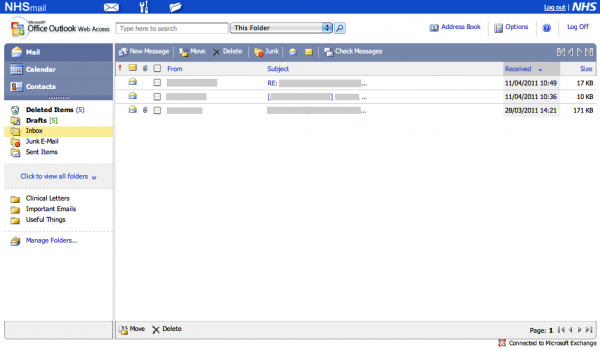
Assuming you manage to log in, you’re presented with this page.

Now consider some common – perhaps predictable – workflows.

Let’s imagine that  I want to send a new fax message. Where do I click? Logically, I would choose to click “New Message”. That sounds sensible. But it’s also very wrong. Perhaps the envelope in the blue bar at the top? No, that just reloads the current page.

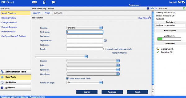
In fact, the correct place to click is the “Spanner and Screwdriver” icon at the top – tool-tipped as “User Tools”, which brings up the following page.

From here, you jump to the icon at the bottom-left of the page labelled “SMS and Fax”, followed by a button on the top-left of the resulting page labelled “Create Fax”.

In precisely whose world is that a logical series of clicks?

Another example. We’re back at the inbox, as pictured above. I want to change my password. Simple – I click “Options” in the top-right. Wrong. On some pages, there’s a “Preferences” button appears the top-right, above “Options”. Is it there? No. Sharper readers will already have noticed from the above screenshot that it is, in fact, in “User Tools” again. Bizarre.

Something I frequently forget is the IMAP settings for NHS Mail. So where would one hope to locate those? Perhaps you’d consider clicking the “?” help icon? You’d be wrong. “User Tools”? Yes.

Perhaps you’d then be tempted to click on “Configure Microsoft Outlook”. That would be wrong. Perhaps you’d click “Help”. That would also be wrong. You must click “Guidance”, down on the bottom right, followed by “Training and Guidance” – not any of the other options, which include “User Guide”.

Again, something which should be really easy to locate is hidden away.

Frankly, the organsiation of the UI of NHS Mail is not fit for purpose. It’s virtually unusable, and I suspect that goes a long way to explaining why so few NHS people have NHS Mail accounts. And yet, I understand that Connecting for Health pays Microsoft £1.90 per user per month – that’s over £12m per year – for the service.

You’d think that, for that money, there would be at least some usability testing, yet it’s hard to see that assumption evidenced by results.

This post was filed under: Health, Reviews, Technology, , , , , .

In support of a national NHS computer system

The inefficient status quo

The inefficient status quo - surely there's a better way?

There’s been a lot of heat about the NHS National Programme for IT recently, with both Labour and the Conservatives suggesting that it will be, at best, scaled back. Often referred to as “the £12bn NHS Computer”, the idea of having a national IT system for the NHS is often ridiculed as one of Whitehall’s biggest white elephants.

But, contrary to what almost everyone else thinks, I firmly believe that a national NHS computer system is a good idea. I think it has the potential to revolutionise healthcare, and vastly improve the health of the British population in a much more meaningful way than anything else the NHS has ever done.

As a doctor, I’ve worked with a variety of NHS IT systems, some of which are brilliant, and some of which are terrible. On the one hand, I’ve worked with an electronic patient record system in a hospital Trust that is an absolute disaster of a system. It does not fit in to the way anybody works, it is obstructive, and it actually provides less data in a less useful manner than the paper system it replaced. It is terrible, and should never have been introduced. Projects like this give NHS IT a bad name.

On the other hand, I’ve worked with SystmOne in Primary Care, which is a Department of Health endorsed Über success of a computer system. The data is stored in a secure cloud, the program auto-updates, and it is constantly being improved. It’s a massively powerful system. When recent research showed that a high proportion of patients with diabetes and a history of heart attacks would have undiagnosed heart failure, it was the work of moments for a practice near me to generate a list of such patients and invite them for screening. The upshot was that the detection rate for heart failure soared by a factor of ten, and those patients are on the right treatment for their condition.

Without the IT system, this could not have been efficiently acheieved. It would have involved looking through thousands of sets of paper notes, which is just not practically possible. The implications for the availability of this sort of intervention are manifest. And that’s on top of the often sold benefits of all doctors, wherever you go, having access to the same set of complete medical records.

The disease-coding in SystmOne is done in an intelligent and unobtrusive way. If I type someone’s blood pressure in as part of a consultation, this is coded instantly and automatically by the computer, which merely highlights the data to show that it has been entered into an encoded database. Similarly for when I enter a diagnosis – coding is quick, automatic, and accurate. If, for example, I note that someone has diabetes, this is automatically captured and the patient is automatically sent letters for diabetic annual reviews. That is astoundingly clever, and stops individuals falling through nets.

Incidentally, the crap IT system does none of this. It is badly designed by people not familiar with the day-to-day workings of individuals in the hospital, and is actually obstructive when it comes to getting things done.

In most hospitals which remain paper-based, data intelligence just does not exist. The data on millions of pages of paper notes cannot be effectively mined. In order to receive payment for the services an NHS hospital provides, all the paper notes are shipped to a department named ‘coding’, where they are combed through by a team of non-medically trained secretaries, who decide from the often illegible medical notes how many patients with a given condition have been treated, and what interventions have taken place. It is slow, innaccurate, labour intensive, and doesn’t result in a patient identifiable database for mining. It is an extraordinary waste of time and money.

If a system like SystmOne could be extended to cover all NHS care, all over the country, the database it would produce would be immense, and the opportunities for mining of that data would be far more advanced than anything else undertaken by any country on earth. We would know at a glance if an outbreak of a disease was happening in a paticular area of the country. Research could be acted upon in a flash with intelligent, national, targeted screening programmes. And that is just the start.

A well implemented national NHS IT computer system would revolutionise care in the NHS – and frankly, for that, £12bn is an absolute steal.


This post is based on my contribution to Episode 17 of The Pod Delusion, originally broadcast on 15th January 2010. Other topics that week included “The Big Freeze”, Google, and ITV’s regional decline. How could you not want to listen to the whole thing at poddelusion.co.uk?

This post was filed under: Health, News and Comment, Politics, , , , .

Pod Delusion Episode 17

I’ve recorded a bit on IT in the NHS for this week’s Pod Delusion. Other topics covered include “The Big Freeze”, Google, and ITV’s regions – how can you resist?

I intend to try and remember to add a note here each time I contribute, given that this site was intended to bring all of my writing from all over the internet into one repository – even if that ideal has never really come to fruition.

Plus, I wanted an excuse to use this ‘Diary’ template which hasn’t seen service in some considerable time, but which I think is rather pretty. So there.

This post was filed under: Diary Style Notes, Writing Elsewhere, , , , , .


The content of this site is copyright protected by a Creative Commons License, with some rights reserved. All trademarks, images and logos remain the property of their respective owners. The accuracy of information on this site is in no way guaranteed. Opinions expressed are solely those of the author. No responsibility can be accepted for any loss or damage caused by reliance on the information provided by this site. Information about cookies and the handling of emails submitted for the 'new posts by email' service can be found in the privacy policy. This site uses affiliate links: if you buy something via a link on this site, I might get a small percentage in commission. Here's hoping.