When I was 12 years old, my geography teacher sprang a test on us. Part of the test was to draw various Ordnance Survey map symbols.
I am red-green colourblind. I had learned that a youth hostel was represented by a pink triangle, but I couldn’t identify the pink colouring pencil. I tried my best, and wrote alongside something to the effect of ‘I am colourblind—this symbol is supposed to be pink, but I’m not sure whether I’ve chosen the right pencil.’
The teacher marked my answer as incorrect, noting that she ‘had’ to mark what I had drawn, and what I had drawn was a green triangle. I was annoyed. My mum’s brilliant solution, which saved any future embarrassment, was to use stickers to write the name of the colour on each pencil.
I gave up studying geography less than a year later, though I can hardly claim that colouring-pencil based trauma was the reason for that.
This article by Andy Baio on The Verge made me think about this. He talks about the colourblindness and accessibility in everyday life.
This crops up from time to time in my work, too, though less so these days than it used to. I used to struggle with spreadsheets where people RAG rated things by shading cells. These days, at least in my line of work, people are generally too indecisive to rate things as ‘red,’ ‘amber’ or ‘green.’ Things are generally classified as ‘amber/red’ or ‘green/amber’ or ‘red/amber.’ This replaces a simple three-point rating scale with an absurdly complex seven-point scale, totally negating its effectiveness in a way which would usually irritate me… except for the fact that it means the ratings appear in text, not as shading.
But it still happens: guidance has ‘red’ and ‘green’ pathways; our clinical record system has red and green dots to indicate especially high or low consequence diseases; our professional appraisal system colour codes my appraisal form sections as green for ’complete’ and red for ‘incomplete’; people produce wholly inaccessible charts and maps; people like to add comments to text in red and green.
I recently expressed disappointment at Caroline Creado-Perez’s Invisible Women for asserting ‘that if women are the majority practitioners of an activity, then barriers to that activity are automatically a gendered issue.’ Given that about 10% of men are colourblind and only about 0.5% of women, it occurs to me that this is a great reverse example. By Creado-Perez’s yardstick, I should criticise my (female-majority) employer for gender-based discrimination when they produce documents which don’t account for the needs of colourblind people. But that doesn’t seem like it would be a helpful approach to life.
Most of the time, I don’t really think about it, though I’m not shy about pointing out the issue when it arises (and the examples in Baio’s article feel very familiar). Wendy occasionally feels mildly sad at the thought that I’ve ‘never seen the true beauty of a rainbow,’ and is occasionally surprised at my fashion choices, but otherwise… it’s all good.
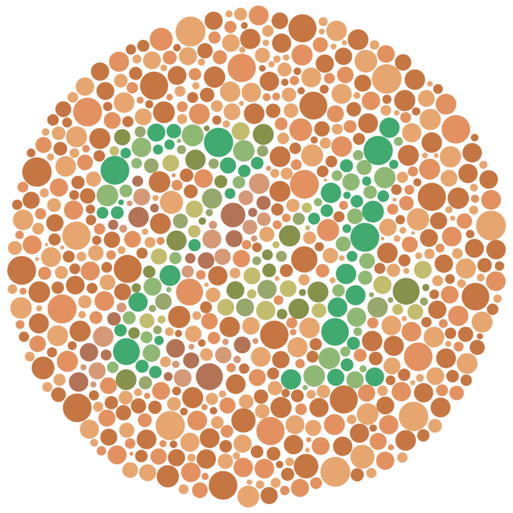
The Ishihara image at the top looks to me like it has a hazy, slightly wobbly ‘21’ in it. It probably looks like a ‘74’ to you.
- Some morons even extend the schema by adding a ‘black’ category, to add an additional three points to the scale (‘black,’ ‘black/red,’ ‘red/black’). This is unforgivable. ↩


