There’s a certain air of truculence on this blog at the moment. Yesterday, I took NatWest to task (again) over their awful customer charter, and only last Thursday, I slated Who Wants to be a Millionaire HD. And now, I’m about to moan again. Sorry about that – I know it’s spring, and perhaps my disposition should be sunnier, but there seems to be a queue of things I have to get off my chest at the moment.
Today, I want to moan about NHS Mail. This may seem utterly irrelevant to those outside of the NHS, and, in fact, to the majority within the NHS who choose not to have an account, but actually I hope it gives a reasonable insight into how not to design a user interface.
The user interface of NHS Mail is bloody awful. Really, really terrible. It’s designed by Microsoft, which perhaps goes some way to explaining that, but even for them, it’s bad. Let me give you a tour.
Firstly, the homepage, conveniently located at nhs.net. This looks utterly different depending on whether you are accessing it from an N3 connection, or a plain old internet connection. Neither of the homepages is particularly pretty, but the inconsistency bothers me in particular.

This is a bad thing for a whole plethora of reasons, but primarily because a lack of consistent branding surely presents a security risk. Anyone could knock up a log-in page in a couple of minutes, and a lack of branding would not make it appear untrustworthy.
Now, let’s look at that ex-net login page more closely. The password must be entered in two parts – the first three characters must be entered using the on-screen keyboard, presumably as some sort of protection against keystroke logging software. Yet this isn’t explained anywhere on screen, and it clearly reduces the accessibility of the site for those with disabilities. And the username and password boxes don’t even line up, which is just irritating.
You’re also asked to select whether the computer is private or public – but no explanation is given of the impact of this choice. It took me some considerable time to discover that the impact was actually that selecting ‘public’ prevents download of email attachments. This is hardly common behaviour for email systems – perhaps a little explanation might have been useful.
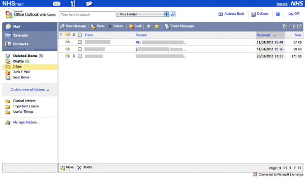
Assuming you manage to log in, you’re presented with this page.

Now consider some common – perhaps predictable – workflows.
Let’s imagine that I want to send a new fax message. Where do I click? Logically, I would choose to click “New Message”. That sounds sensible. But it’s also very wrong. Perhaps the envelope in the blue bar at the top? No, that just reloads the current page.
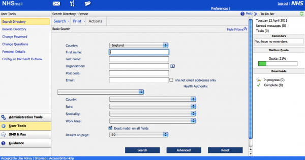
In fact, the correct place to click is the “Spanner and Screwdriver” icon at the top – tool-tipped as “User Tools”, which brings up the following page.

From here, you jump to the icon at the bottom-left of the page labelled “SMS and Fax”, followed by a button on the top-left of the resulting page labelled “Create Fax”.
In precisely whose world is that a logical series of clicks?
Another example. We’re back at the inbox, as pictured above. I want to change my password. Simple – I click “Options” in the top-right. Wrong. On some pages, there’s a “Preferences” button appears the top-right, above “Options”. Is it there? No. Sharper readers will already have noticed from the above screenshot that it is, in fact, in “User Tools” again. Bizarre.
Something I frequently forget is the IMAP settings for NHS Mail. So where would one hope to locate those? Perhaps you’d consider clicking the “?” help icon? You’d be wrong. “User Tools”? Yes.
Perhaps you’d then be tempted to click on “Configure Microsoft Outlook”. That would be wrong. Perhaps you’d click “Help”. That would also be wrong. You must click “Guidance”, down on the bottom right, followed by “Training and Guidance” – not any of the other options, which include “User Guide”.
Again, something which should be really easy to locate is hidden away.
Frankly, the organsiation of the UI of NHS Mail is not fit for purpose. It’s virtually unusable, and I suspect that goes a long way to explaining why so few NHS people have NHS Mail accounts. And yet, I understand that Connecting for Health pays Microsoft £1.90 per user per month – that’s over £12m per year – for the service.
You’d think that, for that money, there would be at least some usability testing, yet it’s hard to see that assumption evidenced by results.

