About me
Bookshop

Get new posts by email.

About me

Desktop app of the week: YoruFukurou

YoruFukurou icon

YoruFukurou is my favourite desktop twitter app. In most apps, it’s simplicity that I like, but YoruFukurou is one of the more complex, deeply customisable twitter apps. I like the fact that I can customise everything about it, picking colours carefully and getting everything just right.

Other twitter apps all seem to have something missing, or just don’t feel right for me. That said, if a desktop version of Tweetbot was released, I’d ditch YoruFukurou in a second. Tweetbot is an absolutely exceptional iOS twitter client that I use constantly and really love. But, having tried lots of different desktop options, it’s currently YoruFukurou that does it for me.

This post was filed under: Favourite desktop apps, Technology, , , .

Desktop app of the week: Reeder

Reeder icon

I’ve used Google Reader for years. I find it a really useful way of managing the many RSS feeds I subscribe to, but I hate its online interface. This means that I’ve spent years using various desktop applications that work with it. I’ve tried lots of them, but the one that’s currently occupying a space on my dock is Reeder, which I also use on my iPhone.

Reeder has everything I want in an RSS reader. It allows me to manage my Google Reader subscriptions from within the app, which many alternatives don’t. It clearly shows my entire RSS inbox on the left, and the contents of each individual item on the right. The weblink to the full article is a click away, as is the Readability version, which I usually try first. It will allow me to tweet or email articles with a single click, and also has a button to send them straight to Pocket. There are built-in options for loads of other services too.

I think Reeder is brilliant, and I highly recommend it.

This post was filed under: Favourite desktop apps, Technology, , , , .

Desktop app of the week: Papers 2

Papers 2 icon

I spent five years at university studying medicine, yet somehow remained completely unaware of the existence of referencing software. I don’t know how this came about, but I manually referenced every single assignment I did during my medical degree – and so did Wendy. How the existence of EndNote in particular passed us both by, I’m not entirely sure.

By the time I embarked on my Masters in 2010, I was aware of EndNote, but we were far from friends. The couple of times I’d tried to use it, I’d had nightmarish corruption errors, and had always quickly reverted to referencing by hand. With the prospect of a whole load of Masters assignments and a dissertation looming, I thought that there must be a better way. And I discovered Mendeley.

Mendeley is an excellent free reference manager. It stores your reference library in the cloud, so that you can (should you so choose) even access it via an iPhone app. I never really found a use for that feature, but Mendeley did see me through a number of Masters assignments. But Mendeley, like Endnote, has an occasional irritating moments of stubbornness, where it will claim that a document connection has become corrupted, or some such nonsense, and will require a bit of sorting out. Generally, copying and pasting the entire text into a new document did the trick, but the frequency with which this happened make me nervous.

Then, I discovered Papers 2. It’s completely brilliant. I actually don’t really understand how it works, but it doesn’t rely on flaky plugins, or any requirement to use specific word-processing software. It just works, has fully cite-while-you-write functionality with a global shortcut, and is a joy to use. It isn’t free, but does have a free trial, and offers a generous academic discount for students. It has an iOS app too, but I’ve never used it, as I still don’t understand why I’d want that functionality. It’s available on Windows as well as Mac, though I’ve never tried that version.

Before using Papers 2, I’d thought that the whole software category of reference managers was, by definition, flaky and unreliable. Yet I don’t think I’ve ever seen Papers 2 crash, and it has certainly never messed up the references in an actual written document.

Papers 2 is a total, total joy to use, both for organising papers, and for citing them. It’s an app I cannot recommend highly enough for anybody who does even vaguely academic writing. It’s completely brilliant.

This post was filed under: Favourite desktop apps, Technology, , , , , , .

Desktop app of the week: Evernote

Evernote icon

My life runs on Evernote. Evernote is my virtual filing cabinet, which contains both my work and my life. Evernote means that I can access important documents from anywhere – including my iPhone and iPad. It means that I don’t lose scraps of paper, either because things never make it to paper, or because I scan and upload to Evernote. Evernote means that I can search everything, including all of my scanned documents via OCR. And Evernote is fast, reliable, and has a generous free provision (though I pay for extra storage).

The best bit about Evernote is that it allows me to appear far more organised than I actually am. If anybody ever asks if I have a copy of something, I almost always know that the answer is yes, and I can find it in seconds with a simple search. That’s something that my haphazard filing system (comprising mainly a pile of documents on my desk) could never achieve.

I know that many people are evangelical about Dropbox for similar reasons to my Evernote evangelism. I understand why people love Dropbox, and I use it myself (mainly for backing up certain files that aren’t in my Evernote), but Evernote is something slightly different. I could replicate my Evernote organisation with a hierarchy of folders, but it wouldn’t feel the same, mainly because it would be displayed differently. I like that a note can contain multiple files as well as text – admittedly, a folder could do the same, but not in the same integrated way.

I was very sceptical about Evernote at first, but thought I’d give it a go. I was sold mainly on the search and anywhere-access capabilities, but have come to appreciate the whole way Evernote works. I’d strongly suggest giving it a go, and seeing if Evernote might just fit into your life and workflow.

This post was filed under: Favourite desktop apps, Technology, , , .

Desktop app of the week

I frequently recommend some of the apps I use on my Mac to other people, and generally get a positive reaction. However, I’ve never really written about them on this blog.

From tomorrow, that changes. For the next few weeks, I’ll be writing about a different desktop app that I love each week. It will appear online on a Wednesday morning, and will continue for as long as I have an app in mind that I use regularly, really love, and want to recommend (about ten weeks, I imagine). I hope you’ll enjoy it.

I’m also working on my “personal canon”, inspired by Robin Sloan’s excellent Fish (and David Cole’s excellent example). That won’t include apps, but I am planning to include books, music, and television alongside weblinks. That’s probably a few weeks away from being finished (or, as finished as the first iteration will ever be), so keep an eye out for that.

This post was filed under: Diary Style Notes, Favourite desktop apps, Technology, .

Lovefilm and Blockbuster: Which online DVD rental service is better?

Since the launch of Netflix in the UK earlier this week, there’s been a fair amount of chatter on Twitter about the relative merits of this and the major DVD rental services. Having used it for a couple of days, I think the selection on Netflix is awful: If you’re hoping to watch the latest series of blockbuster TV shows like Mad Men or 24, you’re out of luck with Netflix, and it doesn’t fare much better with films. That said, it does integrate well with devices including Apple TV, and has a decent free trial, so give it a go.

I’m a fan on online DVD rental services. I’ve used Blockbuster and Lovefilm regularly recently, and so thought that it would be fun to do a quick comparison of the two for anyone considering signing up.

In the best tradition of blog posts like this, I’ve divided the comparison into sections. These are, of course, fairly arbitrary, but the overall conclusion reflects my true opinion. If you’re of a different opinion, feel free to use the comments to make the points I’ve missed. Both also offer game rentals, but as I don’t rent these, I can’t really comment on that part of their service.

Selection

Lovefilm and Blockbuster have much the same selection of items. It’s impossible to compare the size of the overall catalogue because they count them differently: somewhat oddly, Lovefilm counts all the DVD “extra” discs in its catalogue as separate titles, whereas Blockbuster doesn’t. Both Lovefilm and Blockbuster appear to have a similar blu-ray selection.

However, if you want to rent anything put out by Universal since September 2009 – titles like Inglorious Bastards or The Invention of Lying – you’re out of luck with Lovefilm, as a dispute with the studio means they aren’t available to rent. They are all available with Blockbuster.

Winner: Blockbuster

Availability and turnaround times

I’ve never experience any major problems with availability of titles from either Lovefilm or Blockbuster, except for Lovefilm’s inability to stock Universal titles as discussed above. Blockbuster fairly often has exclusive titles available for rent before they are available elsewhere, but I’m rarely on the edge of my seat waiting for a title to come out, so this isn’t a big thing for me.

Blockbuster’s Top Ticket system does enhance the perception of availability to a degree: I can choose the title which I will receive next, guaranteed. There are some limits to this system: Some titles aren’t available on Top Ticket, but the number of these is so small as to be almost insignificant.

Turnaround times are crucial for a DVD rental service, particularly if you have an “unlimited” package, as it’s one of the main rate-limiting (and therefore quantity-limiting) steps in the process. My experience has revealed no difference between the two – both are equally quick.

However, Blockbuster have, on occasion, voluntarily sent discs early. An email has pinged into my inbox saying “We think you’re probably really keen to receive x, so we’re going to send it to you immediately as an extra disc. We’ll send your next one when you’ve returned two discs.” This is great service, and really improve the perception of the speed of turnaround times.

Since there’s nowhere else to mention this, it’s also worth saying that Blockbuster’s mailing packs are much neater: blue plastic envelopes rather than paper ones used by Lovefilm. The Blockbuster ones look much neater when sat next to my Blu-ray player, which is a relatively small and insignificant advantage.

Winner: Blockbuster

Instant gratification

Sometimes, you don’t want to wait for discs to be posted out to you. Sometimes, you think of a film and you want to watch it now.

Lovefilm offers online streaming of a very limited selection of movies. If you have a method of hooking this up to your TV, through connecting your computer to your TV or through and XBox 360 or PS3, then this is great for seeing films immediately.

Blockbuster has the major advantage of a store network. Most Blockbuster packages include access to inshore rentals, and the stores have, of course, a huge selection. It’s even possible to reserve titles in-store for collection the same day. Not only that, but Blockbuster generally lavishes extras on its online customers: Currently, if I take an in-store rental for free as part of my package, they will throw in either popcorn, mints, or cola to munch on while I watch. That’s true movie-night instant.

However, Blockbuster’s offering does mean trekking down to a Blockbuster store, so is hardly instant, especially if you don’t live near to a store. And you have to return the disc to the store as well, making it two trips.

Overall, I think the Blockbuster offering is the most generous and the most genuinely useful, but it’s not really instant gratification. Lovefilm clearly outstrips Netflix in this department. Overall, I declare this section tied.

Winner: Tied

Website design and functionality

Lovefilm’s website is legendary, and stuffed full of trailers and customer reviews. It’s brilliant for making sure you never rent something you won’t enjoy, as the wealth of content about each film provides a real sense of what it’s like. By comparison, Blockbuster’s site is confused, mainly as it’s trying to serve so many different functions: Purchase of films, store reservation, online pay-per-rental, online rental subscription, etc. It has far fewer reviews and far fewer trailers. The same goes for their relevant mobile apps.

On actual functionality, the two are a closer match. Blockbuster insists upon or allows, depending on your point of view, the ranking of all titles in your queue, whereas Lovefilm permits or restricts to a three-tier priority level system. Blockbuster allows has a genre-mix function, whereby you can, for example, request that you always have at least on TV title on rent. Lovefilm has a multiple lists function, which allows you to state that you always want a title from each of several lists on rent.

Functionally, it’s a bit of a toss-up, but Lovefilm’s system is probably a bit more flexible. Content-wise, Lovefilm wins hands-down.

Winner: Lovefilm

Pricing

There’s really little to choose between the two services on price. Their packages differ slightly, and, on the whole, Blockbuster tends to be cheaper, but the price differential is marginal. Also, Lovefilm has branded services like Tesco DVD rental, which often work out as more competitively priced than going direct, reducing the differential further.

Lovefilm tends to offer free trials, whereas Blockbuster tends to offer £1 trials. In terms of lifetime cost, that’s not likely to make a huge difference to anyone’s finances, but it might swing newcomers in the direction of Loevfilm. Blockbuster has the in-store freebies, like popcorn and cola, discussed above.

Both services allow “holidays” of up to three months, during which no payments will be taken nor discs sent. Cancellation is a pain with both services: both require you to phone their call centres. However, Lovefilm will allow you to cancel online if their call centre is closed (i.e. between 8pm and 8am), which is a bonus. Also, a Lovefilm subscription can be given as a gift voucher, whereas a Blockbuster subscription cannot.

Winner: Tied

Overall winner: Blockbuster

Overall, I prefer Blockbuster‘s service. The Top Ticket functionality and in-store rentals swing it for me, as does the hard-to-define “keenness” factor. Despite providing the same basic functionality, it feels as though Blockbuster go the extra mile for customer satisfaction. They’ll occasionally send extra discs; if I haven’t rented anything for a while they’ll email to ask if everything’s alright; they email in advance to tell me what they’re sending me; and they send their discs out in neat little plastic envelopes, not tatty rip-open paper ones. And, something’s a two-disc set, they send both discs at once, as a single rental.

Lovefilm, whilst providing a comprehensive service, are constantly trying to up-sell. They’re always pushing pay-per-view online streaming at me, and trying to get me to take out a package with more discs. They pester me to have more discs on my “TV List”, whereas Blockbuster are quite happy to sequentially send me the discs of a single box set. Adding a two-disc set without sufficient care frequently results in being sent a solo “extras” disc, separate from the main feature disc, which is just irritating. And the lack of a fine-grain priority setting system or a “top ticket” system, they always seem to send the relative “dud” on your list.

So, my recommendation is Blockbuster.

Links to services in this post are affiliate links. I’ll receive about £2 if you sign up to Blockbuster via these links, or £20 if you sign up to Lovefilm. Those values demonstrate that my opinion was not unduly influenced by these payments!

This post was filed under: Reviews, , , , , .

Amazon’s great service on Kindles

A couple of weeks ago, my Kindle developed a small hairline crack in its case, just at the corner of the screen. My Kindle was well outside it’s 12-month warranty, but having heard previous stories of excellent service, I called Amazon after work one evening.

I hoped they might offer me a discount off a replacement. What they actually did was courier me a brand new replacement, set up on my account and ready to go, which was in my hands the very next morning. And they didn’t charge me a penny, not even for postage. And, what’s more, they even arranged a courier to pick up the old one. Free.

What utterly brilliant service!

This post was filed under: Reviews, , , .

Moaning about NHS Mail’s terrible user interface

There’s a certain air of truculence on this blog at the moment. Yesterday, I took NatWest to task (again) over their awful customer charter, and only last Thursday, I slated Who Wants to be a Millionaire HD. And now, I’m about to moan again. Sorry about that – I know it’s spring, and perhaps my disposition should be sunnier, but there seems to be a queue of things I have to get off my chest at the moment.

Today, I want to moan about NHS Mail. This may seem utterly irrelevant to those outside of the NHS, and, in fact, to the majority within the NHS who choose not to have an account, but actually I hope it gives a reasonable insight into how not to design a user interface.

The user interface of NHS Mail is bloody awful. Really, really terrible. It’s designed by Microsoft, which perhaps goes some way to explaining that, but even for them, it’s bad. Let me give you a tour.

Firstly, the homepage, conveniently located at nhs.net. This looks utterly different depending on whether you are accessing it from an N3 connection, or a plain old internet connection. Neither of the homepages is particularly pretty, but the inconsistency bothers me in particular.


This is a bad thing for a whole plethora of reasons, but primarily because a lack of consistent branding surely presents a security risk. Anyone could knock up a log-in page in a couple of minutes, and a lack of branding would not make it appear untrustworthy.

Now, let’s look at that ex-net login page more closely. The password must be entered in two parts – the first three characters must be entered using the on-screen keyboard, presumably as some sort of protection against keystroke logging software. Yet this isn’t explained anywhere on screen, and it clearly reduces the accessibility of the site for those with disabilities. And the username and password boxes don’t even line up, which is just irritating.

You’re also asked to select whether the computer is private or public – but no explanation is given of the impact of this choice. It took me some considerable time to discover that the impact was actually that selecting ‘public’ prevents download of email attachments. This is hardly common behaviour for email systems – perhaps a little explanation might have been useful.

Assuming you manage to log in, you’re presented with this page.

Now consider some common – perhaps predictable – workflows.

Let’s imagine that  I want to send a new fax message. Where do I click? Logically, I would choose to click “New Message”. That sounds sensible. But it’s also very wrong. Perhaps the envelope in the blue bar at the top? No, that just reloads the current page.

In fact, the correct place to click is the “Spanner and Screwdriver” icon at the top – tool-tipped as “User Tools”, which brings up the following page.

From here, you jump to the icon at the bottom-left of the page labelled “SMS and Fax”, followed by a button on the top-left of the resulting page labelled “Create Fax”.

In precisely whose world is that a logical series of clicks?

Another example. We’re back at the inbox, as pictured above. I want to change my password. Simple – I click “Options” in the top-right. Wrong. On some pages, there’s a “Preferences” button appears the top-right, above “Options”. Is it there? No. Sharper readers will already have noticed from the above screenshot that it is, in fact, in “User Tools” again. Bizarre.

Something I frequently forget is the IMAP settings for NHS Mail. So where would one hope to locate those? Perhaps you’d consider clicking the “?” help icon? You’d be wrong. “User Tools”? Yes.

Perhaps you’d then be tempted to click on “Configure Microsoft Outlook”. That would be wrong. Perhaps you’d click “Help”. That would also be wrong. You must click “Guidance”, down on the bottom right, followed by “Training and Guidance” – not any of the other options, which include “User Guide”.

Again, something which should be really easy to locate is hidden away.

Frankly, the organsiation of the UI of NHS Mail is not fit for purpose. It’s virtually unusable, and I suspect that goes a long way to explaining why so few NHS people have NHS Mail accounts. And yet, I understand that Connecting for Health pays Microsoft £1.90 per user per month – that’s over £12m per year – for the service.

You’d think that, for that money, there would be at least some usability testing, yet it’s hard to see that assumption evidenced by results.

This post was filed under: Health, Reviews, Technology, , , , , .

iPad App Review: Flipboard

20110329-111000.jpg 
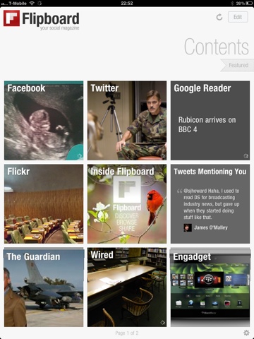
Of all the apps I have installed on my iPad, Flipboard is probably the one that has had the greatest impact on my digital life.

Prior to getting my iPad, I used to view my Facebook and Google Reader feeds via Socialite on my MacBook, and Twitter via the Twitter App for Mac of iPhone, depending on where I was.

Flipboard has now taken over from all the above.

It sucks in all of the above feeds, and produces a personalised ‘social magazine’ that just looks great on the iPad. Twitter links are sucked in, so that the linked webpage is transformed into a magazine article, while non-linking Tweets just appear. TwitPics appear as pictures in my magazine. It really is quite incredible, and very fast – probably quicker to refresh than the Twitter app on my iPhone.

But, importantly, it doesn’t just look good – it is brilliantly functional.

20110329-111113.jpgFlipboard allows me to cross post anything anywhere, so I can share that interesting Tweet on Facebook or post that interesting article from Google Reader to Twitter with just a tap. You can also elect to ‘ignore’ people, without having to ‘unfriend’ or ‘unfollow’ them, which comes in handy.

Flipboard is now the primary way I interact with all of the above feeds. It’s brilliant.

Brilliant, but not perfect. I’d like to see threading of conversations on Twitter. I’d like to see whether Facebook statuses had comments without having to tap on them. I’d like Flipboard to see which Twitter and Facebook updates I’ve read and hide them, like it does with Google Reader (unless they have new comments). I’d really like Flipboard to learn what I like, and push those things to the front of the magazine rather than absolutely sticking to the timeline.

But still, Flipboard is great – in fact, I think it’s my favourite iPad app to date. I’m confident it will retain its place in my Dock for some time to come!


This is the fifth and final in a series of posts reviewing iPad Apps. Yesterday’s review was of Who Wants to be a Millionaire HD. If you enjoyed the series, let me know in the comments or on Twitter (@sjhoward), and maybe I’ll do something similar again sometime.

But that’s it for now… Stay tuned for more posts on different topics coming soon(er or later).

This post was filed under: iPad App Reviews, Reviews, Technology, , , , , , , .

iPad App Review: WWTBA Millionaire HD

I’ve chosen to write about this App not because it’s good, but because it’s not.

That isn’t out of some kind of sadistic wish to be mean, but because I want to demonstrate how it’s hard to get an iPad App just right. But first, a little background.

When Millionaire first burst onto our screens in 1998, I was hooked. The very idea of giving away a million pounds seemed incredible to my teenage brain, and I couldn’t get enough of it.

Soon, the magic faded. I still watched, but mainly with the sound down unless someone got to the £32,000 “safe haven”. And, gradually, my interest waned still further, not bolstered by any revamps, clocks, or anything else that was thrown at it.

But one thing continued to preoccupy my mind – I badly wanted to play the game myself. I used to “play” the game with the quiz books and the CD soundtrack, but I desperately wanted a PC version of the game. Somehow, despite taking some time for the format to cross the Atlantic, they got their PC version out more quickly, and I was insanely jealous.

When eventually Celador got round to cashing in on the format, the resulting PC game seemed incredible to me. And when Version 2 turned up, and Chris Tarrant asked me the questions personally (after the first five), I loved it.

I also loved various Playstation versions of the game, and several phone versions – including the two I have on my iPhone at the moment. I even joined Virgin Mobile at one point because they had an SMS version of the game.

So I’m a bit of a Millionaire format fan, even if I don’t particularly watch the TV show anymore.

Naturally, when I got my iPad, I got the “Millionaire HD” app, which, like it’s iPhone cousin, bizarrely titles itself “2011” below the icon. And what did I get for my money? Essentially, a blown up version of the iPhone title. There really is no discernible difference between the two.

Now, by pure logic alone, that should be a good thing. I really like the latest iPhone version, and find it one of the most addictive editions I’ve ever owned. But it’s not an iPad App.

A screen the size of the iPad’s does not lend itself to blown-up display of a screen the size of the iPhone’s. It doesn’t work. It feels like a jumbo toy. And the great aspect of the iPhone App, which I’d guess you could call it’s “passiveness” in a loose sense, doesn’t work on the iPad. On the iPad, I want an immersive experience, not a passive one.

Now that’s really difficult to pin down. The difference isn’t obvious or clear-cut. Is it CGI video that’s missing, or would that just be deeply irritating? Is it the relatively poor use of music doing that’s stopping this being immersive? Is it the “clock” rushing me towards an answer? Well, no, it’s not the clock, because you can turn that off and it doesn’t improve things.

All the important things are there. The questions seem of the right level, the lifelines offer just the right degree ofdoubt, and even the graphics are slick if oversized.

But there’s an unknowable “something” that turns the iPad edition, in my eyes at least, from a “hit” to a “miss”. I just can’t bring myself to recommend it.


This is the fourth in a series of posts reviewing iPad Apps. Yesterday’s review was of the Sky News App. Check back tomorrow for my review of Flipboard.

This post was filed under: iPad App Reviews, Reviews, Technology, , , , .


The content of this site is copyright protected by a Creative Commons License, with some rights reserved. All trademarks, images and logos remain the property of their respective owners. The accuracy of information on this site is in no way guaranteed. Opinions expressed are solely those of the author. No responsibility can be accepted for any loss or damage caused by reliance on the information provided by this site. Information about cookies and the handling of emails submitted for the 'new posts by email' service can be found in the privacy policy. This site uses affiliate links: if you buy something via a link on this site, I might get a small percentage in commission. Here's hoping.